Portfolio
All ProjectsCASE STUDY: Iteration [KPI Dictionary]
The KPI Dictionary was an opportunity to improve on an existing workflow inside a global, multi-national company to create a more engaging digital experience.


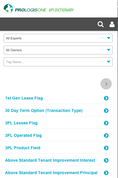
Key Performance Indicators and company metrics, defined and searchable
Hover over to scroll content
A thoughtful workflow for creation, approval and change
Hover over to scroll content
This is an in-depth case study; for a summary, please see KPI Dictionary in the Annex section
FUNCTIONAL GOAL AND EXPERIENCE PRINCIPLES:
Create a cloud-based ‘single source of truth’ for the company’s KPIs, metrics and definitions.
PROJECT
Agile/ Lean UX
UX: Myself
Team: Business + UX + offshore dev teams (Lviv, Ukrain)
COMPANY
large multi-national, low digital maturity (desired digital transformation)
Legacy form: spreadsheet housed on Sharepoint
PROJECT
Internal tool
Timeline: Timeline: 4 months, under budget (2016)
Desktop, tablet and mobile
TEAM: 3×3
- 1 Product Owner (business analyst)
- 1 UX (me)
- 1 Tech Lead
- 5 devs (Lviv, Ukraine)
PROCESS
- Discover Content audit, SME interviews, validation
- Design a digital solution Visual + interaction design: User validation, Agile development sprints, Stakeholder Alignment
- Evaluate Validate via user testing, usage metrics, top task analysis
- Extend Possible product iterations & roadmap, north star vision, lessons learned
ABOUT
The ‘KPI Dictionary’ is a comprehensive list of terms (hereafter called ‘metrics’) consolidated from across the whole company. It has workflow to add, change, delete, or approve a metric.
PROBLEM
One person was manually updating this spreadsheet manually. It was confusing, incomplete, and hard to find, leading to it not being used – and metrics were being used incorrectly. The misalignment of meaning caused problems in the company; the focus on one person to manage this caused burnout.
GOAL
Create a cloud-based ‘single source of truth’ for the company’s KPIs, metrics and definitions.
For higher level outcomes and impact goals see the Discover tab
EVALUATIONS
- Ease of Use: 92% Success (accomplish top 4 tasks in <2 minutes)
- Complete Context: 88% YES
- Sign Up/ Use: 78% of the employees; 100% of the Metric Owners used this in the first 2 weeks
OUTCOME: Created a sustainable process and place to look up metrics, increasing confidence and literacy (under the guidance of recognized Metric Experts) and decreasing confusion and errors. A solid step for this company toward modern and mature Business Intelligence.
MY ROLE: Digital Transformation
The Risk Register was a Lean UX hypothesis done over 4 months (8 sprints). I took on:
- Research, design, and user validation
- Created strategy and vision as well as buy-in through the org
- Coached the team on user-centered design
- Collaborated with the devs every day (agile development overlapped validation)

DISCOVERY
At this stage, we concern ourselves with
• Assessment (what is)
• Research (what could be)
• Specs (what we need)
• Alignment: find allies and share the vision
The Problem
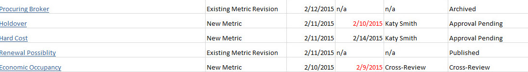
Charlene kept updates to all metrics, KPIs, terms and definitions in a spreadsheet on the internal Sharepoint intranet.
She also kept track of the creation of new terms and cross-company approvals in that spreadsheet, though the people collaborating and making decisions are often the Metric Owners.
You need to know how to use a term? Call Charlene – she’s your best bet.
This wasn’t sustainable – and certainly limited growth.
Many employees didn’t know this document existed. In addition, terms were being used incorrectly or ambiguously, causing miscommunication and confusion.
-

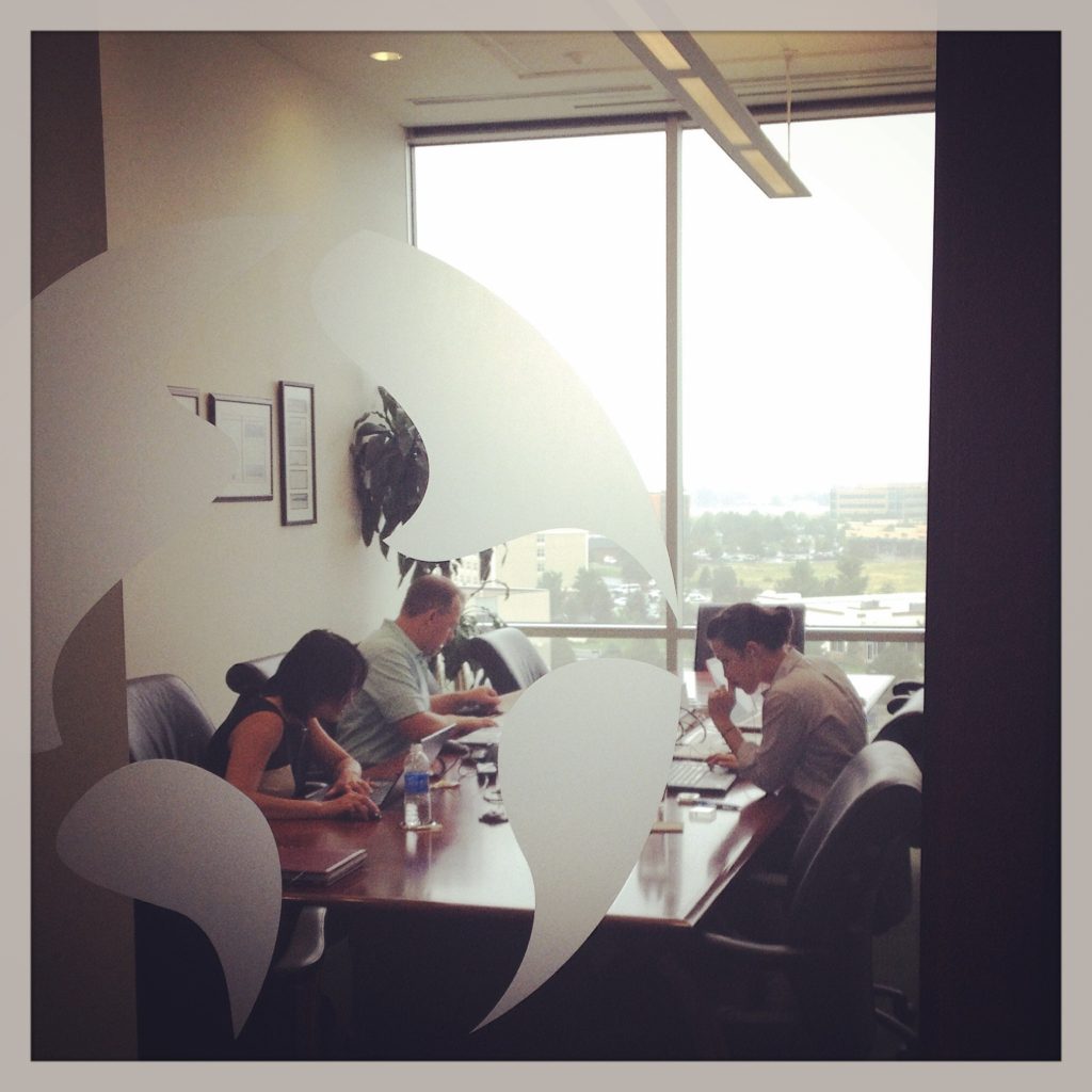
Charlene shows me how large the spreadsheet is -
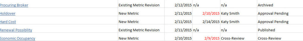
Activity Log
Discovery Process
User-Centered Research Processes: Interviews: Users, SMEs and Metric Owners Brainstorming Exercises Content Audit User Validation Methods (Talk Aloud, Contextual Enquiry)
Synthesising the research: Personas User Journey Map Mental Models (for ‘context’) Content Strategy Workflows Information Architecture (card sort) Mapping interdependencies of IT systems and other teams and projects Experience & Design Principles Slide Decks (Stakeholder Meetings) *Some assets not shown under NDA
-

Activity Log Wireframe (Annotated) -
Workflow via sketches -
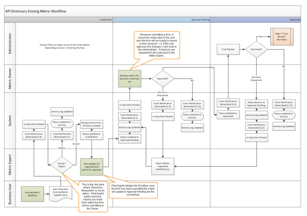
Existing Metric Workflow Annotated -
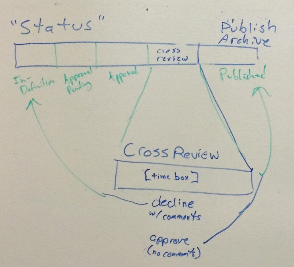
Stages

“I didn’t realize how much work I did all by myself until I saw all the workflows and list of terms – it’s incredible, isn’t it?!”Charlene
Strategy
1. UX Outcomes + Impact
If we do our job well, how will our internal colleagues’ lives change?
- Colleagues will be confident they’re using a term correctly.
- Increased efficiency, increased accuracy, and decreased confusion
- Metric Owners get recognition as being the experts.
- Increased appreciation for their work
Business Outcomes + Impact
If we do our job well, how will the business improve?
- The company will increase its trustworthiness because it consistently communicates clearly and accurately.
- Increased literacy, accuracy, and alignment across the company.
2. Experience and Design Strategy
FUNCTIONAL GOAL: Create a cloud-based ‘single source of truth’ for the company’s KPIs, metrics and definitions.
3. Metrics (and thresholds for success):
- Context: “Do you have all the info here to do your job?” (success is >75%)
- Ease of use: accomplish top 4 tasks in <2 minutes (success is >75%)
- Sign up/ use when invited specifically (success is Employees: >25% | Metric Owners: >50%)
Two Persona: Metric Owner and Employee
Metric Owner needs to be able to do work in the tool: create, edit, delete, change, discuss and approve
Employee/colleague needs to see & use the metric properly


DESIGN
At this stage, we concern ourselves with
• UX design processes
• (Agile) development
• Communication
Goal:
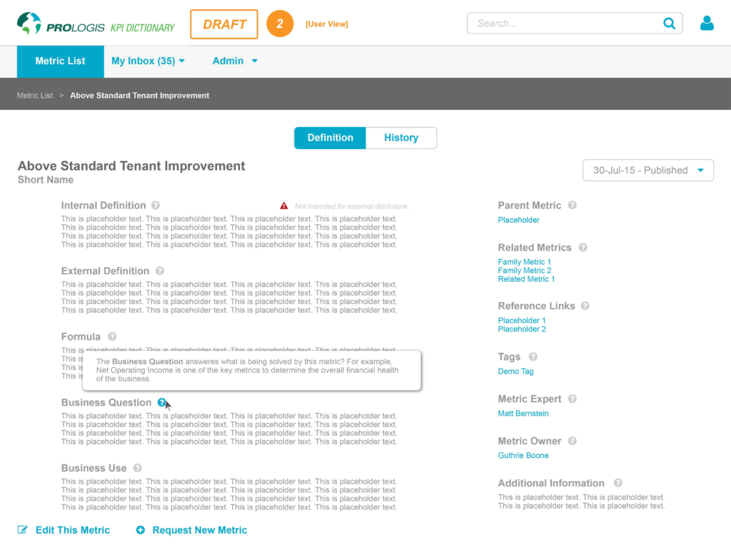
- The Metric page includes all the info needed to understand and use the term in context (but not too much!)
- Accommodates workflow
- Easy to use = a UI made to match the user’s mental models.
Functional needs:
Notable user tasks:
- Minimum content and functionality:
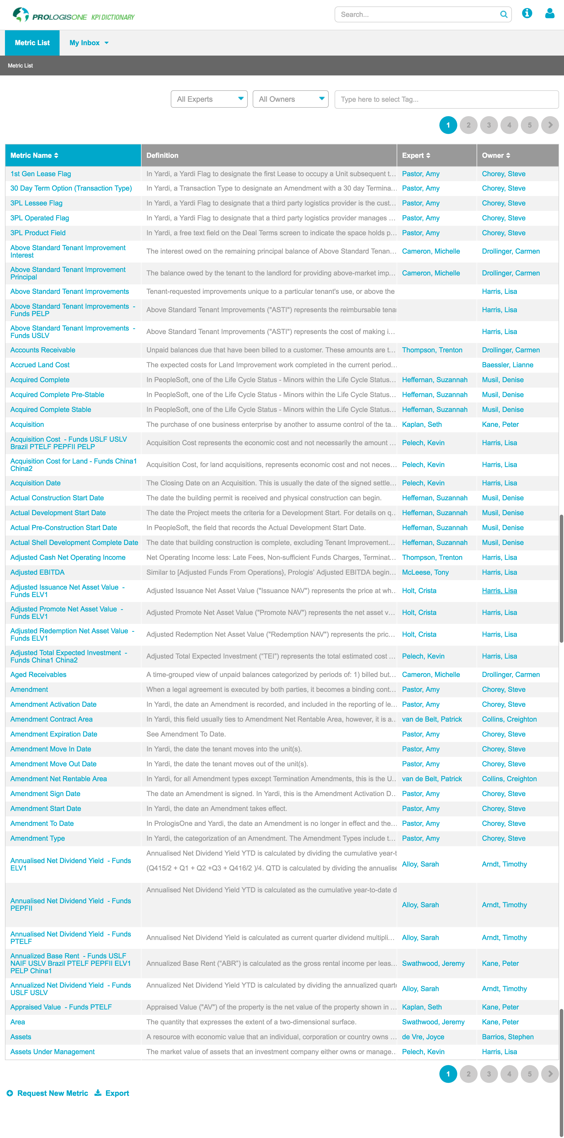
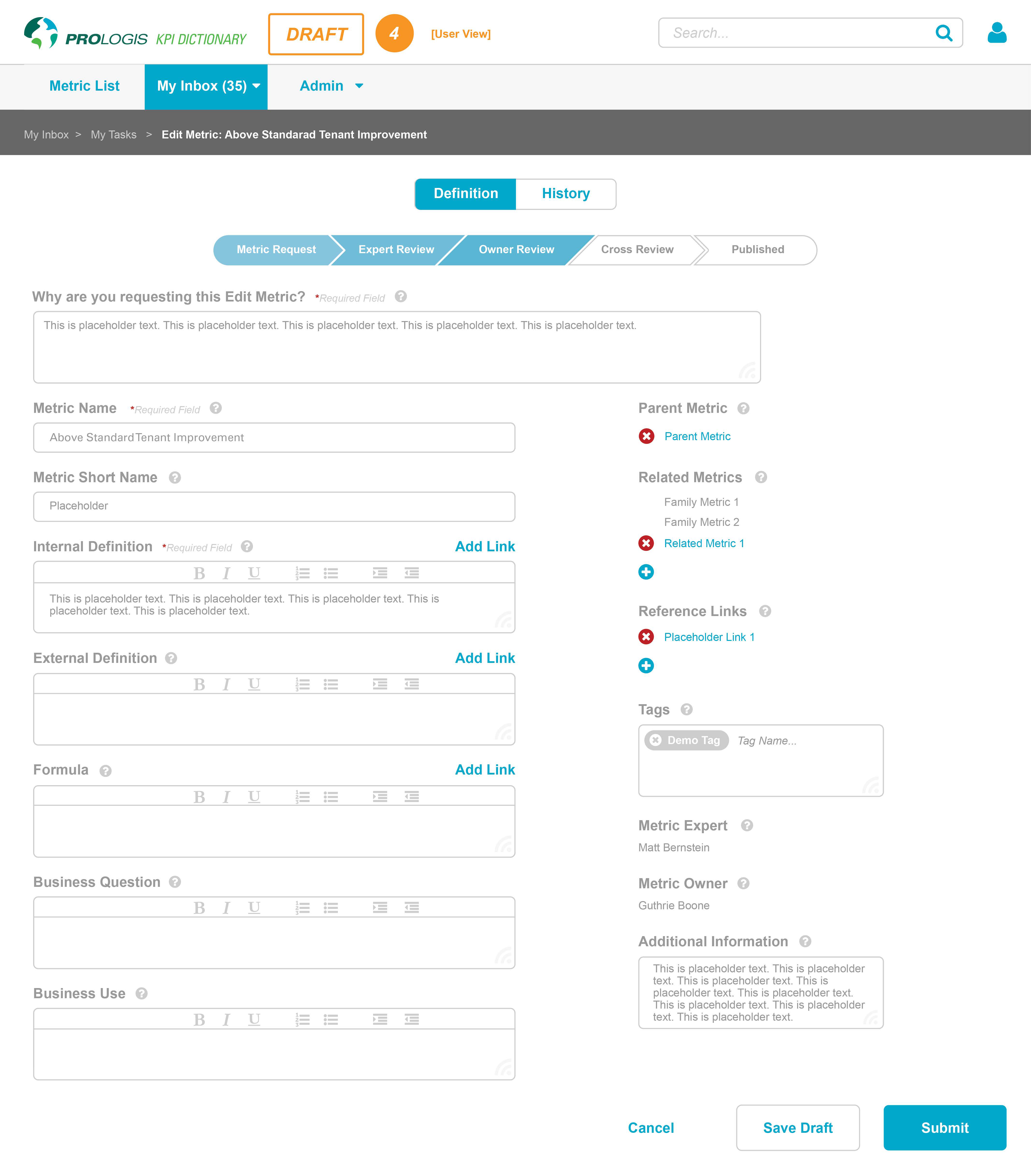
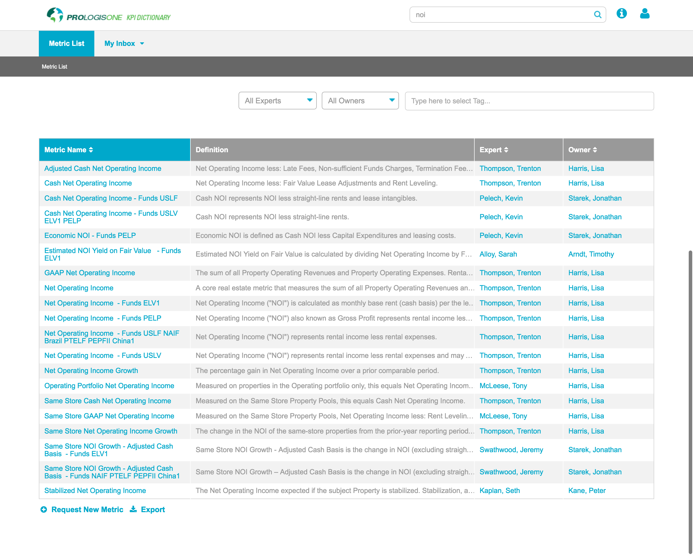
- Metric List
- View metric list + filter, sort, search
- Metric Page
- View individual metric with context (everyone)
- Add, edit, delete metric (Metric Owners)
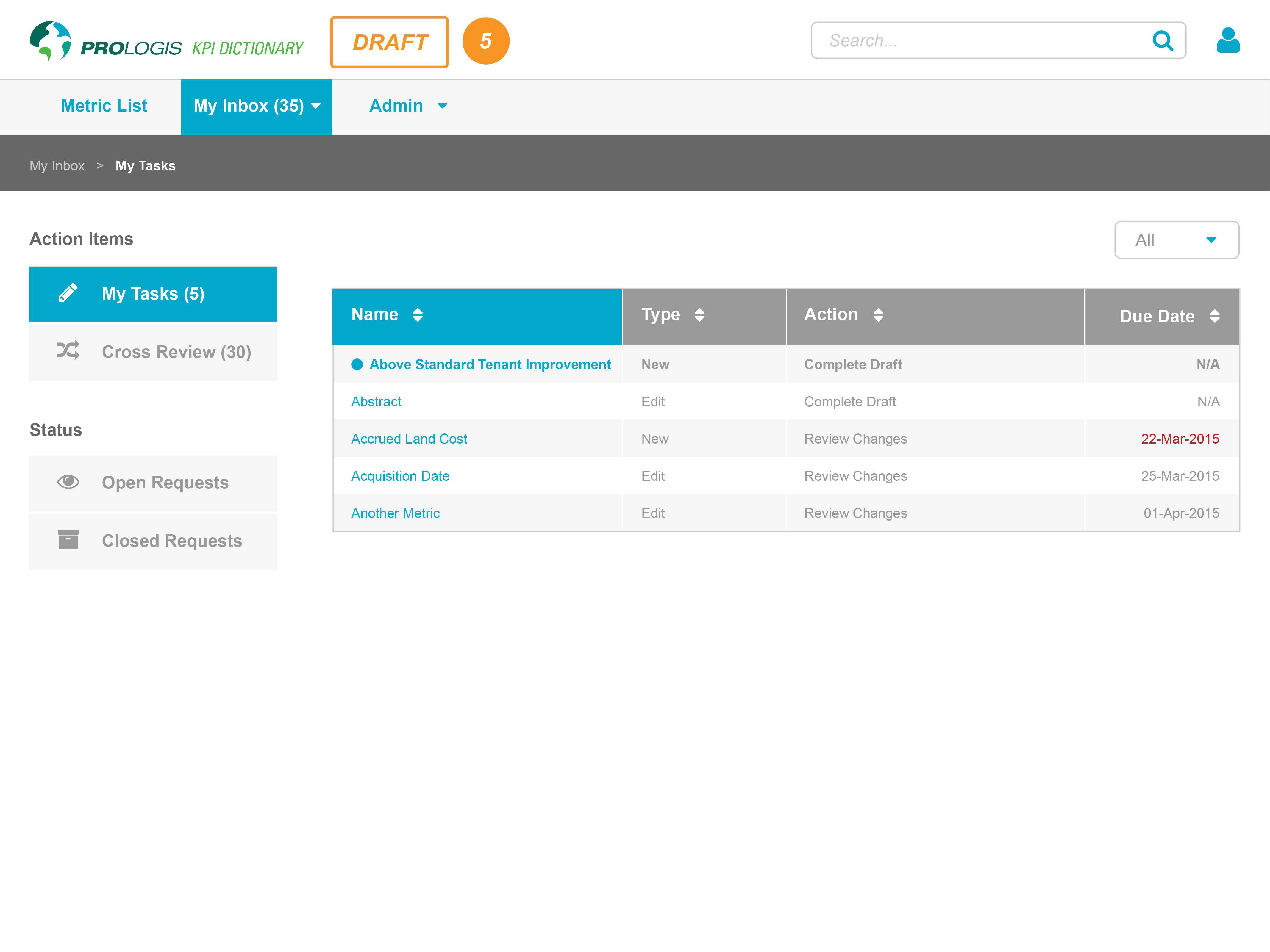
- Inbox
- workflow (approve, comment etc)
- Metric List
| Functionality + Experience | Feature/page | |
|---|---|---|
| Metric Owner | Can create, edit, delete, change, discuss and approve Make it clear but extensible |
– Inbox for collaboration – Edit view (Metric Page) – smart default fields; few ‘required’, more can be added – refresh often (info never out of date) – Help me in the UI |
| Employee | Let me sort, filter, and search a master list of metrics Show me the metric in context (so I know I’m using it properly) |
– Metric List: sort, filter, search – enough info for context, but not too busy! – Help me in the UI – print functionality |
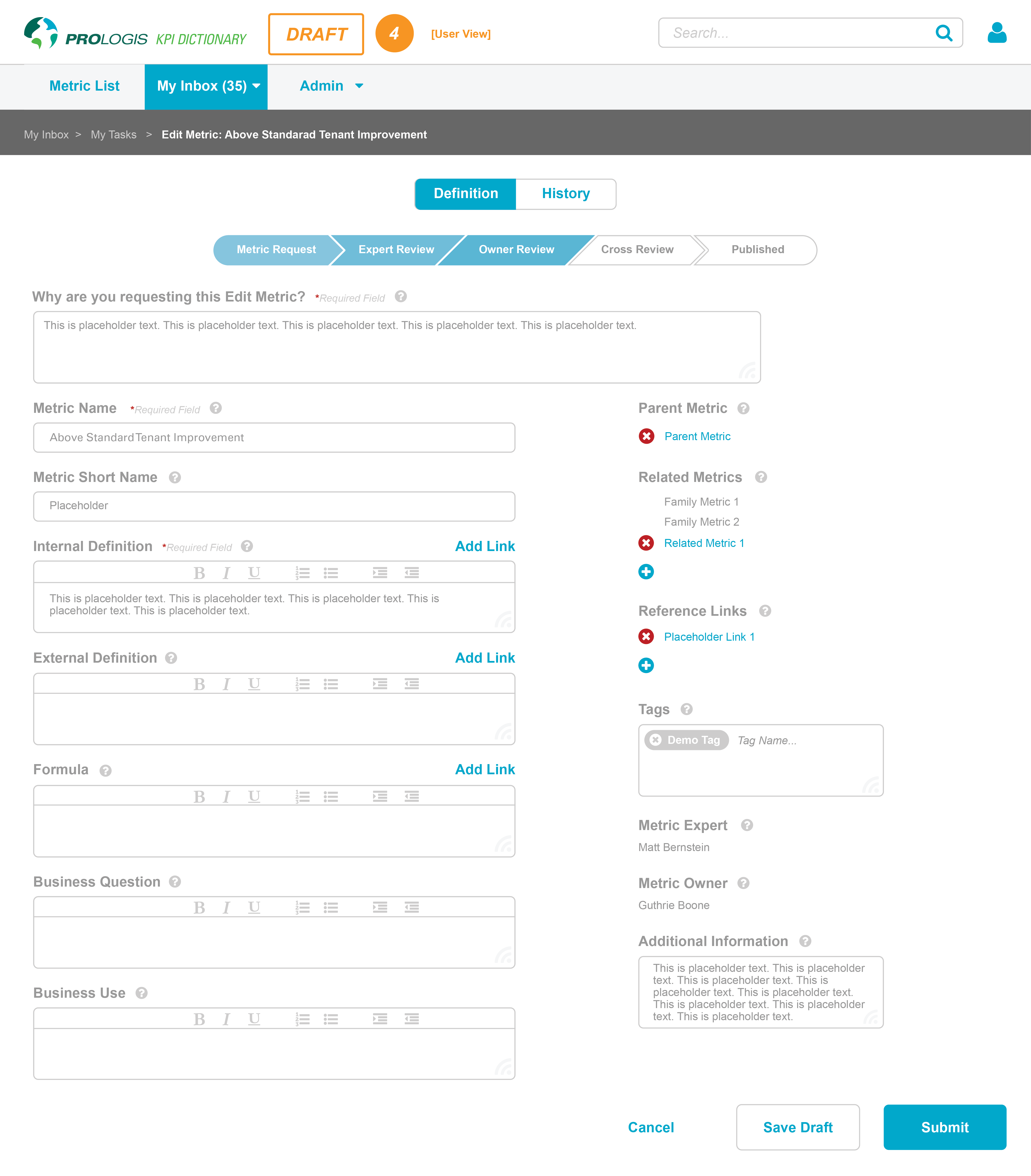
-

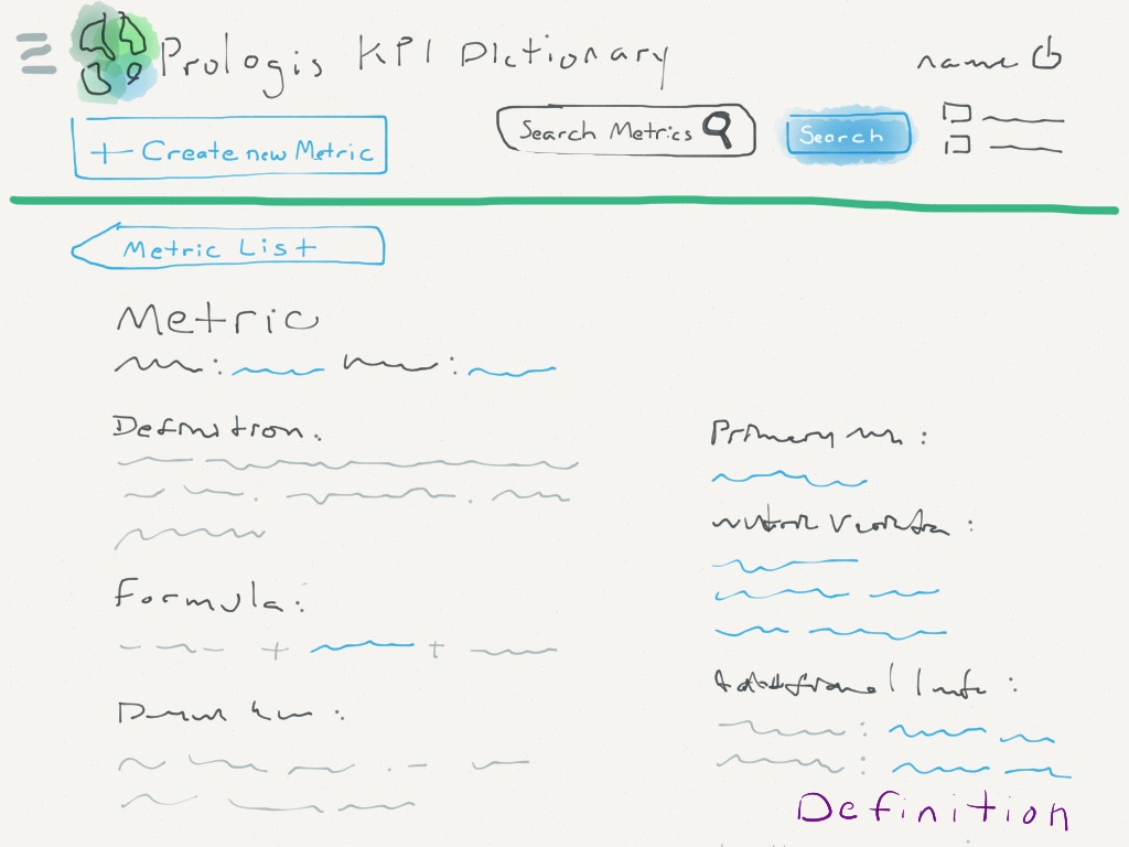
Metric page, ipad -

Metric page (edit mode)
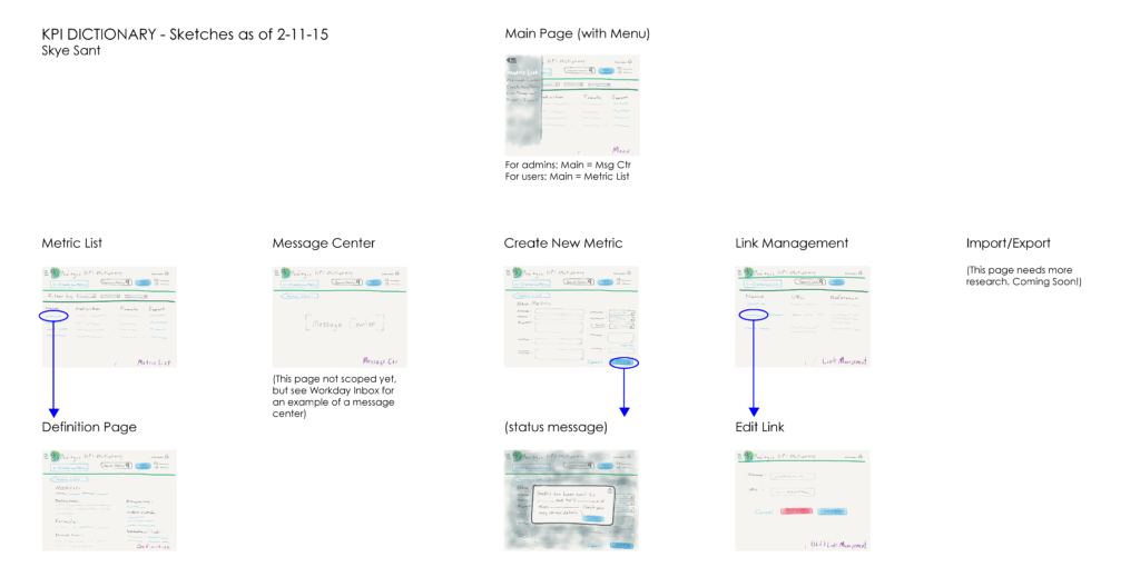
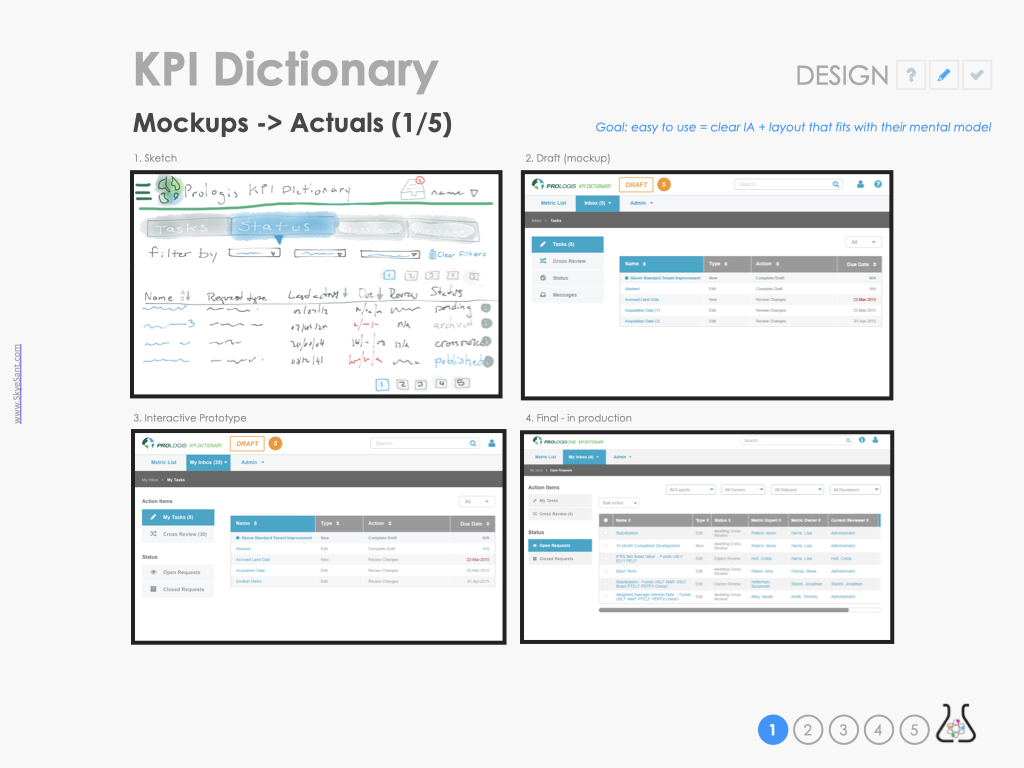
Sketches
Started with sketches to validate the best interaction patterns with a goal to stay consistent with the newly emergent pattern library, so as to be more intuitive for the user.
-
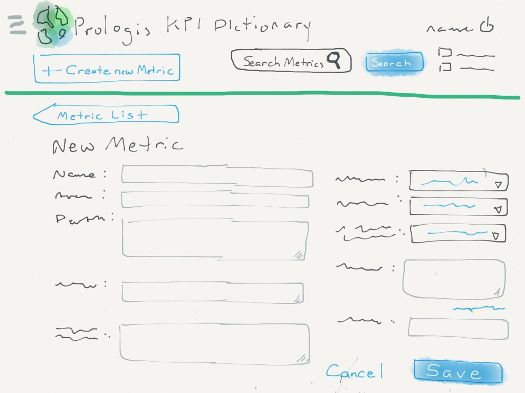
Edit metric v1 -
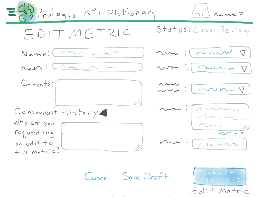
Edit Metric v2 -
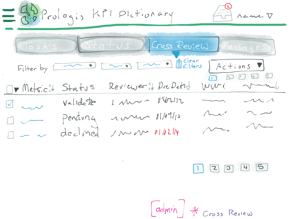
Inbox (workflow) -
Metric page (view mode) -
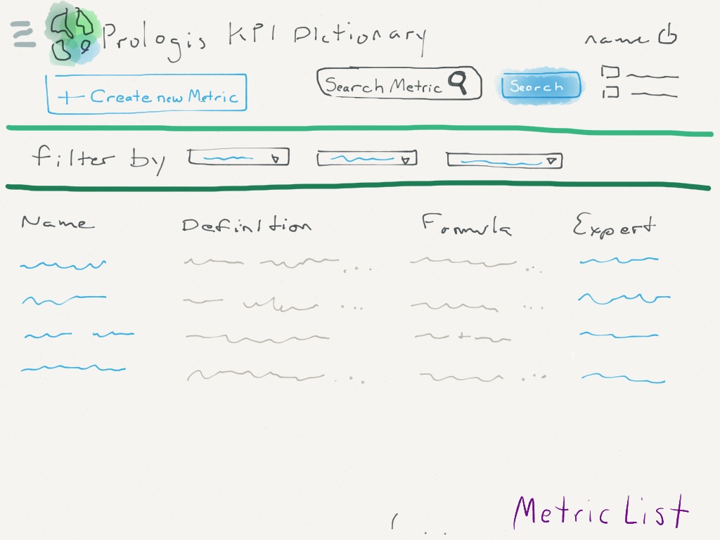
Metric List
Validation and iteration
Validation methods: Interviews: Users, SMEs and Metric Owners Brainstorming Exercises User Validation Methods (Talk Aloud, Contextual Enquiry)
Our mandate was to make a clear but succinct UI (, ) – but with so much complexity for each different term, this was a difficult proposition.
But our biggest breakthrough came when we realized that every term had its own special context of use, so to be complete, each term had to have a certain set of fields filled out …but this didn’t mean all our users needed to see, on the screen, every possible field.
To minimize cognitive load(, , , ):
- Show only the active fields in the View Mode (as seen by internal business users) on the Metric detail page
- Show all possible fields in Edit Mode
-
Internal User: Metric detail page -
Metric page (edit mode)

Watching people use the interactive prototype, other decisions included:
- Users grouped the side nav into two separate components, and some card sorting indicated they had clear names: Items and Status.
- Metric Page (edit view): Ability to add more fields (ie more than one related metric) was a business request
- In-context help: definitions on everything, all the time, increased user confidence that they were using the term correctly
-
Metric List -

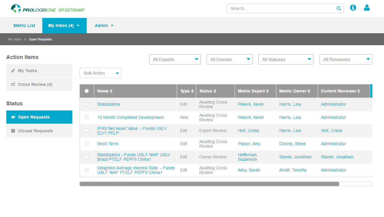
Inbox -
Metric page (edit mode) -
Metric Page (view mode) -
Metric page, ipad


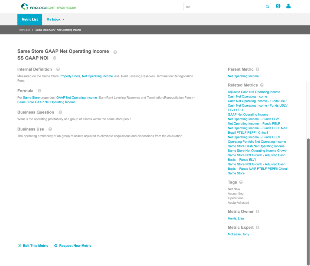
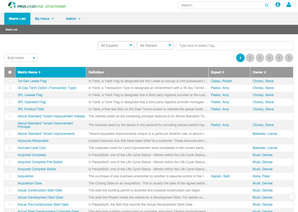
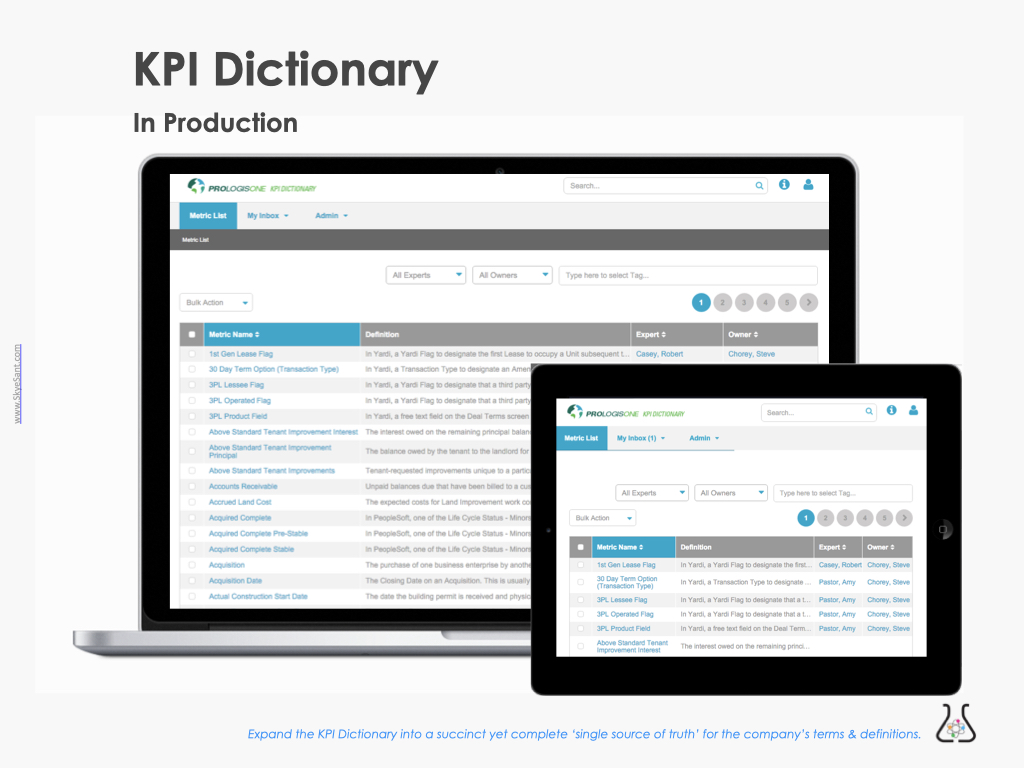
VISUALS
Screenshots – in production
-

Employee User: Metric List page -

Metric Owner: Metric detail page (view mode) -
Employee User: Metric detail page -
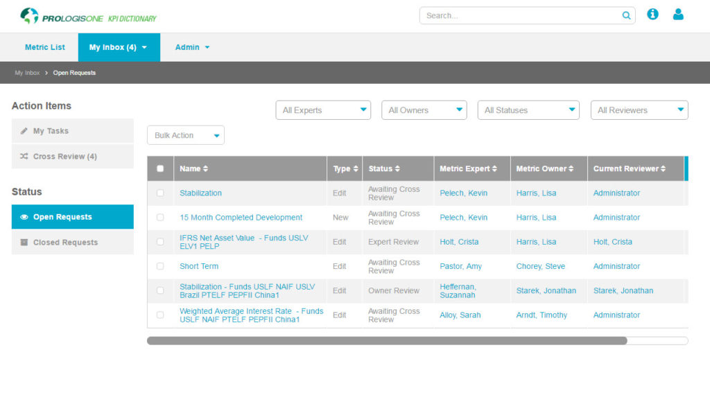
Metric Owner: Inbox, status tab

EVALUATION
At this stage, we concern ourselves with
• Test (user testing)
• Measure (metrics)
• Assess (outcomes)
Overall Assessment: GOALS ACCOMPLISHED
In this company, no qualitative or quantitative testing was planned for so I used beta users and SMEs for informal testing.
I took a limited assessment of these goals:
- A single source of truth: Includes all the info needed to understand and use the term in context
- Accommodates workflow
- Easy to use
- Digital workflow will replace Charlene’s manual, individual process

Sufficient Context?
88% said YES
Ease of Use: 3 top tasks in <2 min
92% success
Sign into tool
Internal employees: 78% signed in & used more than 1 time
Metric Owners: 100% signed in & used more than 1 time
| TEST | MEASURE | MIN GOAL | DATA |
|---|---|---|---|
| Task Analysis: success + speed (1) | Ease of Use: Accomplish top 4 tasks in <2 min | > 75% | 92% |
| Interviews: sufficient context? (2) | Context: “Do you have all the info you need to do your job, here?” | > 75% | 88% YES |
| Analytics: use | Sign Up/ Use: – Employees accessed the tool in the first 2 weeks – Metric Owners accessed and used the tool in the first 2 weeks |
> 25% > 50% |
78% 100% |
(1) 92% Tasks done in <2 minutes (12/13)
(2) 13/13 SMEs + 9/12 Beta users said yes when asked “Do you have all the information here you need to do your job?’
-
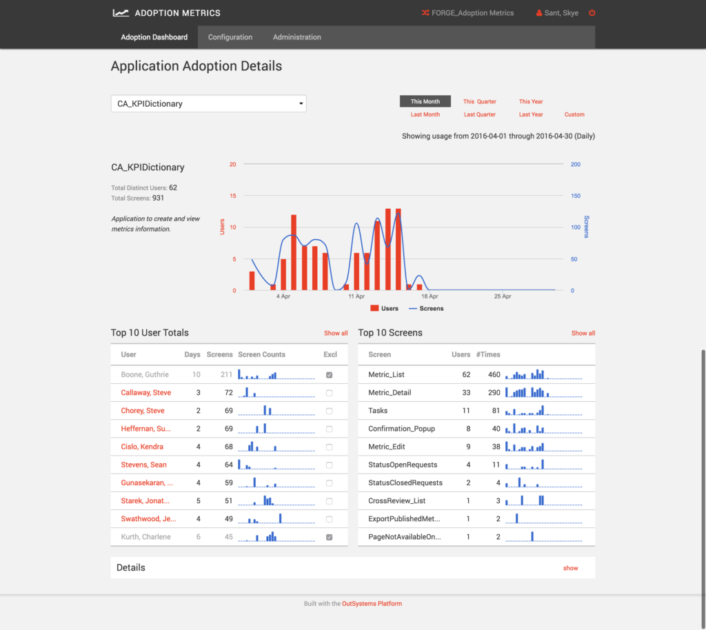
Usage Data -
Metric Owners in UAT
Other questions I would have liked to have answers for:
- Measure the cost of (pre-app) confusion
- Measure increased accuracy
- How long do users stay in the KPI Dictionary? % use/total employee – does this change over time? Measure return visits
- Top pages & back button clicks
- How much time is saved?
- How much more efficient is it?
- What errors are they seeing (if any)?
- Do they need to use Help?
- Retention and engagement
EXTENSIONS
At this stage, we concern ourselves with
• Iterations
• Extensions (roadmap)
• Standards & Documentation
• Communication/ Change Management
• Handout/ Interstitials (in-house TV)
Iterations and Extensions
Next on the list: more functionality, more workflow, and pushing a mobile design into production.
Rollout through the business to make sure everyone was aware of this new tool.
For the design and engineering team, templates and pattern library to codify what we’d made.
Marketing was busy, so I made handouts and interstitials (for the in-house TVs)
-
Mobile form factor -
Template library -
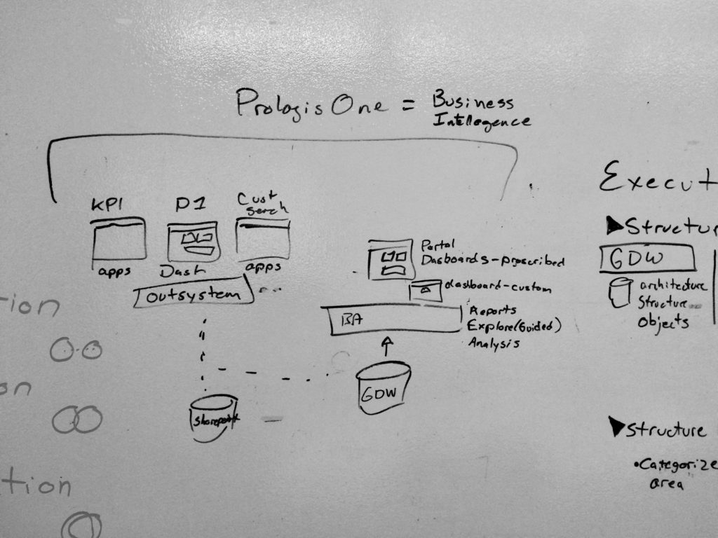
Business intelligence

Iterations:
- Usability testing
- User feedback – modify defaults
- Administration Settings
- Deprecate bulk import
Thematic roadmap:
- Extend the functionality (Link Management, Activity Log)
- Notifications (Notification Page, Notification settings)
- Metrics on the go (Responsive design (mobile))
- Dial into the context (executive reconciliation of standard terms)
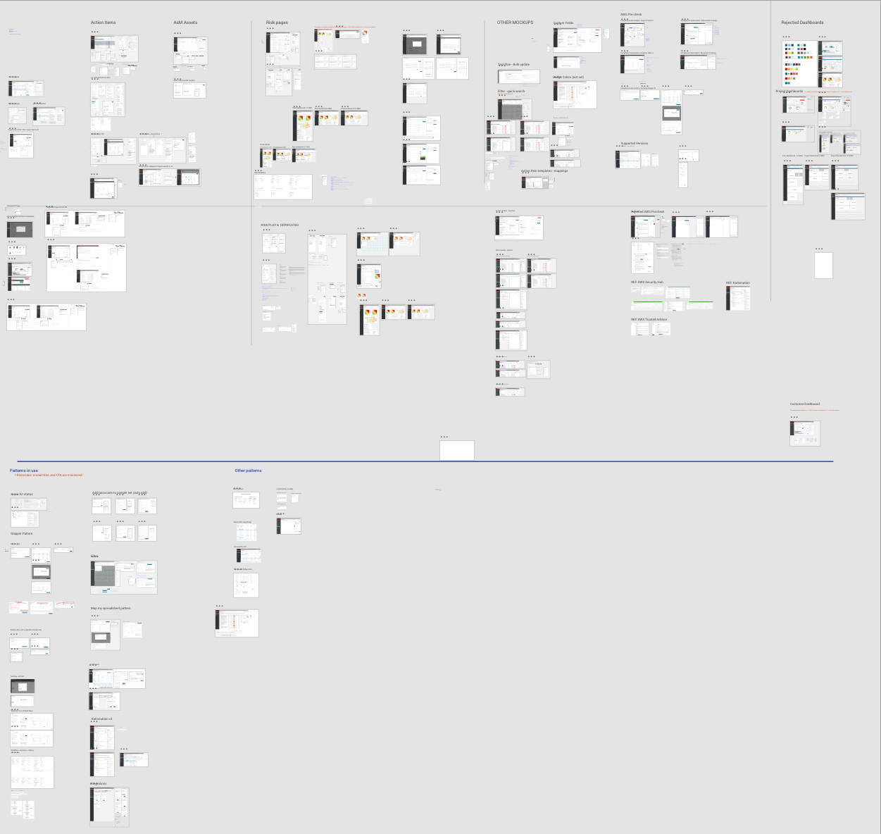
(Not pictured: Exec mtgs, ‘Training’ + rollout, change management, UX Dept wiki, handout, TV assets)
*Some assets under NDA
Outcomes and new North Star
- Metric owners get recognition as being the experts – appreciated for their diligent work (increase employee loyalty and retention; make this company a great place to work; increased confidence)
- Users become confident because they’re using a term correctly (decrease legal issues, increase loyalty and competence)
- This process is sustainable and decreases confusion (eliminates pain points)
Lessons
- It’s the ‘ol ‘flower metaphor’ – don’t rely on a single word; surround it with context.
- One-person manual processes are usually complex and much larger than they first appear. Take the time to talk it out.
- Employees want to do a good job, want to be seen and appreciated for what they do, and want to align with others doing similar things. This also benefits the business – make this obvious and transparent.