Portfolio
All ProjectsCASE STUDY: New Feature [Risk Register]
Increasing business capability with a B2B SaaS add-on inside an existing platform
FUNCTIONAL GOAL AND EXPERIENCE PRINCIPLES:
Create a modular add-on where customers can manage their Risks
PROJECT
Methodology: SAFe Agile + Lean UX
UX/ Project Design: Myself
Team: Product + UX + dev teams (South America)
COMPANY
Mid-level enterprise multi-national cybersecurity company with standard digital/UX maturity.
Created the original platform (for security certification) with engineering-focused processes.
PROJECT
B2B SaaS module add-on for small/medium businesses
Timeline: 3 months, under budget (2020)
Desktop and tablet
TEAM: 3×3
- 1 Product Manager
- 1 Product Owner
- 1 UX (me)
- Dev team: 3 teams 5-7 devs each (South America)
PROCESS
- Discover (SME interviews, competitive review, design exercises, user validation)
- Design (visual + interaction design: user validation, agile development sprints, stakeholder alignment, strategy/vision)
- Evaluate (interviews, user testing, top task analysis)
- Extend (possible product iterations & roadmap, supporting documentation, north star vision, lessons learned)
ABOUT
A risk register is a common function done in conjunction with a cybersecurity assessment; it’s a list of risks and a series of mitigating actions that would minimize the risk. Large companies buy an enterprise tool for this purpose; small or medium-size businesses often use a personal spreadsheet (if anything)
PROBLEM
SMBs (small/medium business) without a risk register weren’t sure exactly what to do, were neglecting to deal with risks which was a threat to their company. They needed a central place to assemble their cybersecurity assessment findings (weaknesses) in order to deal with these later.
GOAL
Create a modular add-on where customers can manage their Risks
For higher level outcomes and impact goals see the Discover tab
EVALUATIONS
- Ease of Use: 88% Success (accomplish top 3 tasks in <2 minutes)
- Positive Sentiment: 75% say it’s “Cool and Modern”
- Sign Up: 80% use (when invited specifically)
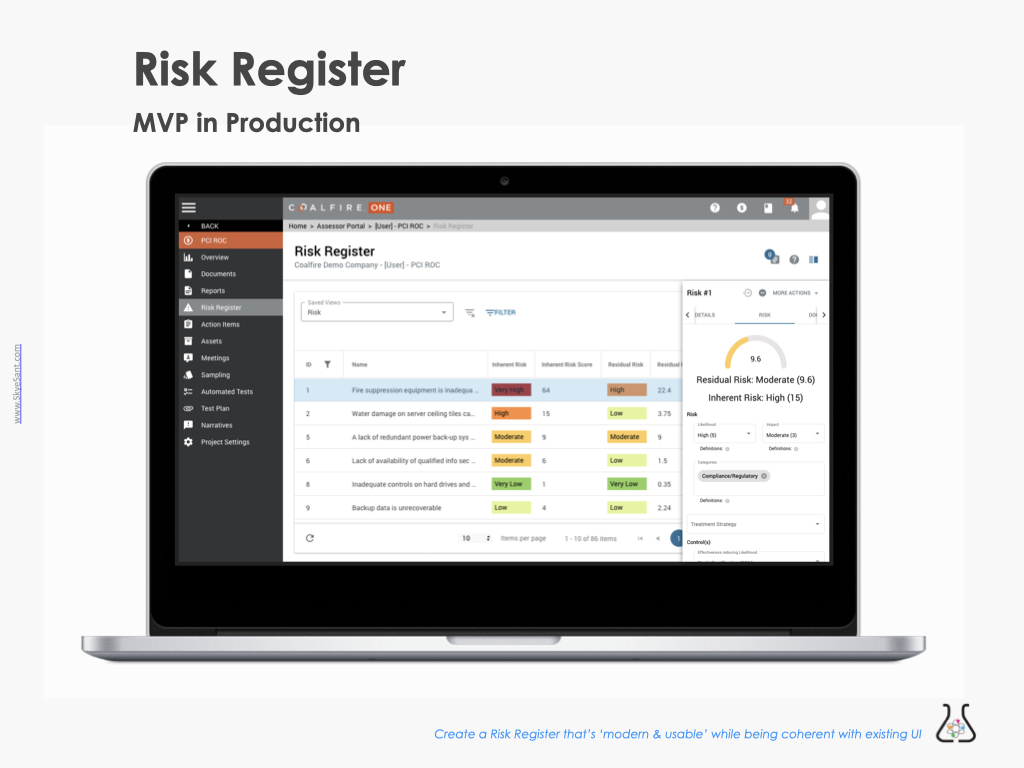
OUTCOME: Extended the company’s business capabilities, opened a new market and helped the users become skilled and competent in Risk.
MY ROLE: Introducing Lean UX Design
The Risk Register was a Lean UX hypothesis quickly done over 2 months (4 sprints). I took on:
- Design and user validation
- Collaborated with my PO and PM on strategy, buy-in through the org.
- Coached the team on interviewing.
- Collaborated with the devs every day (agile development overlapped validation)
-

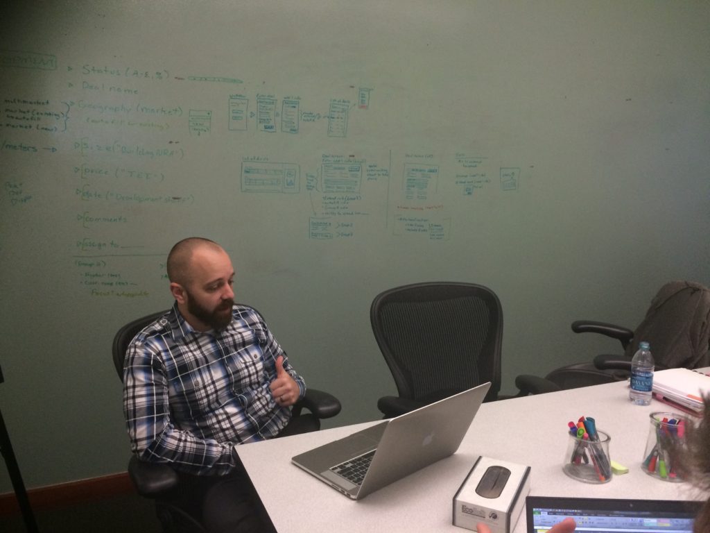
Dev team (Columbia) -
Myself + PO
DISCOVERY
At this stage, we concern ourselves with
• Assessment (what is)
• Research (what could be)
• Specs (what we need)
• Alignment: find allies and share the vision
The Problem
We first noticed a need for a risk register when we saw a gap in the user journey where an existing user would want to assemble their cybersecurity assessment findings (weaknesses) in a central place in order to deal with these later.
Our current platform had no Risk functionality.
-
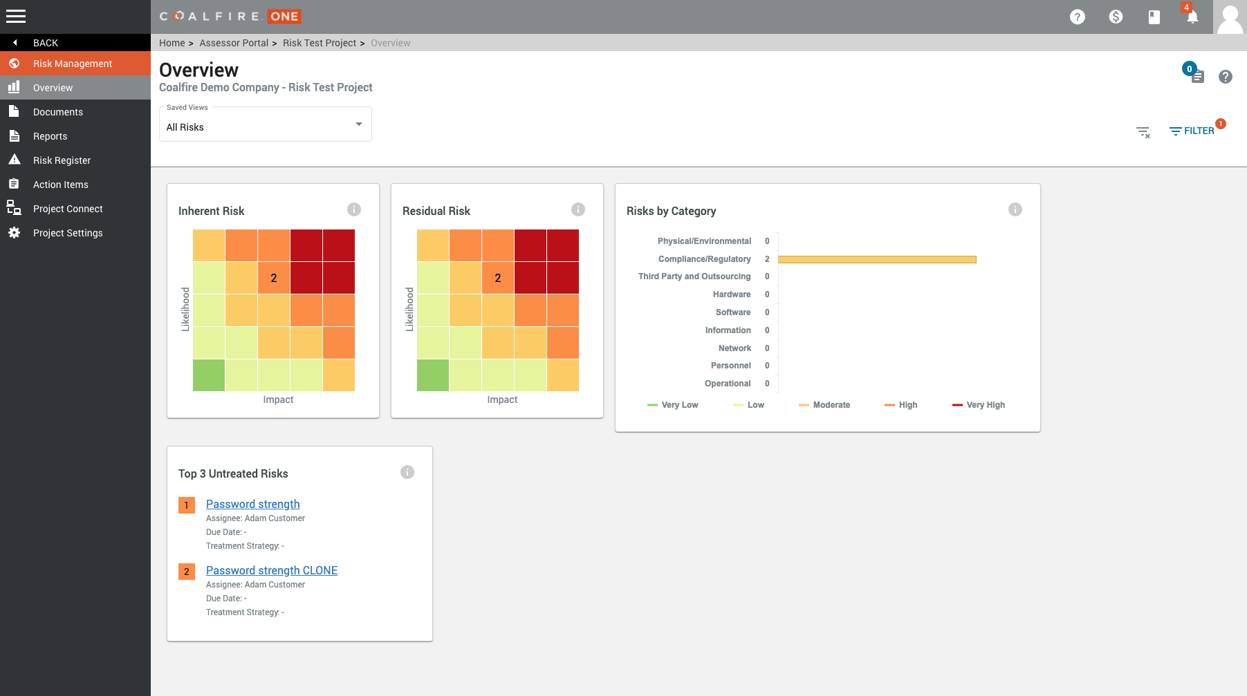
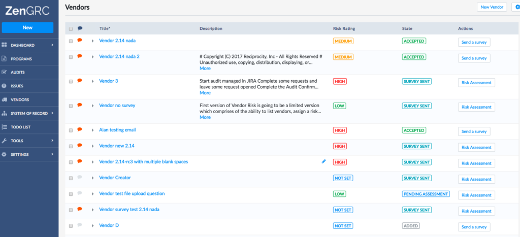
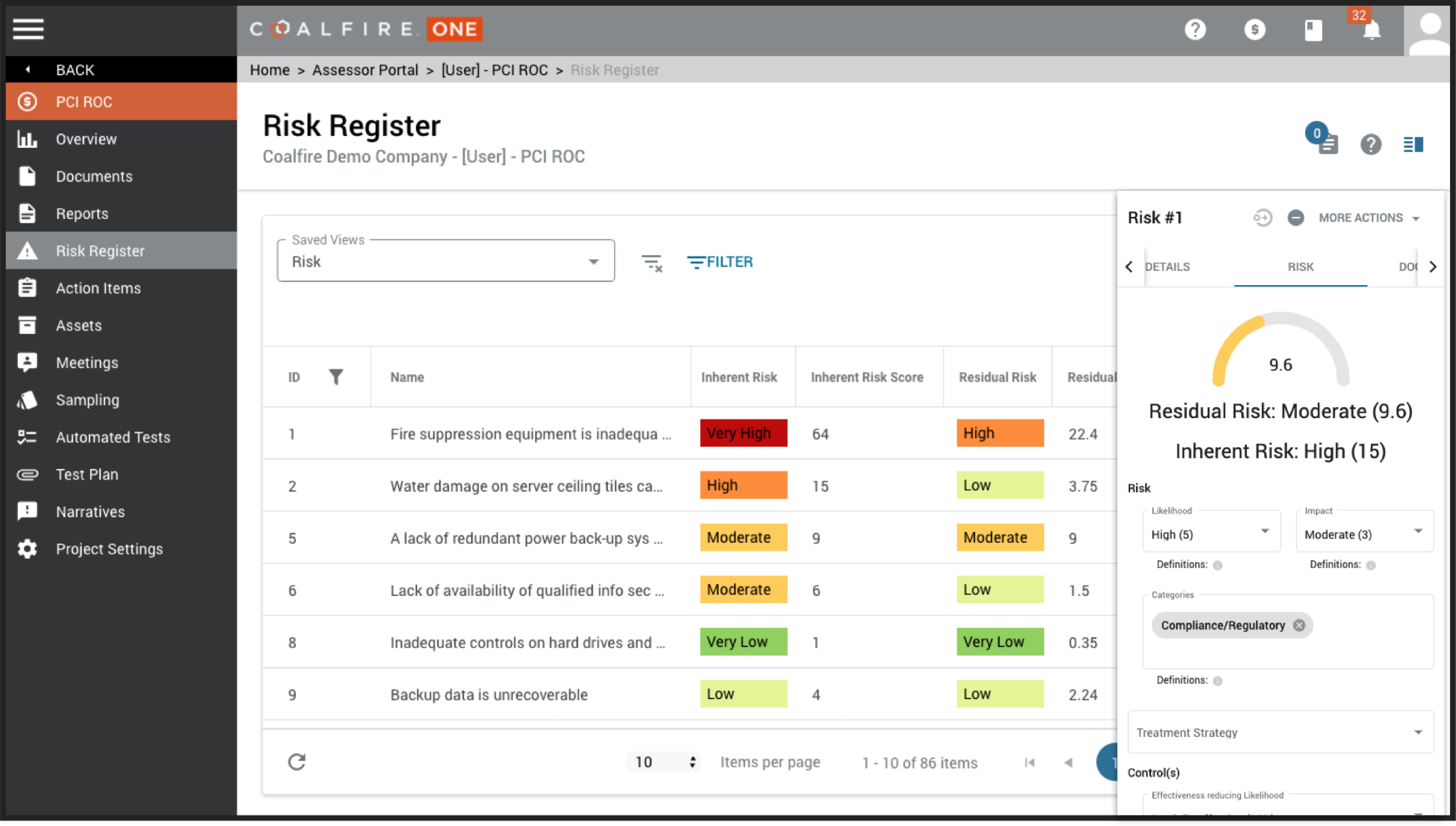
Example: Risk list -
Example: Risk table
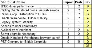
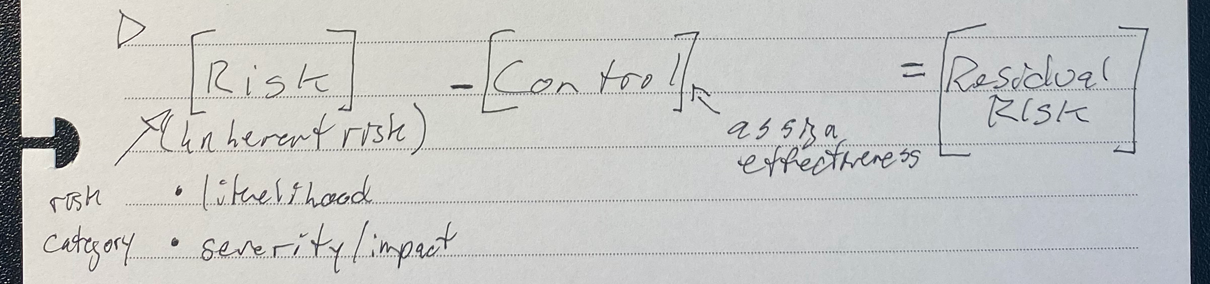
There are large and expensive Risk platforms for enterprise companies. But SMBs (small/medium businesses) needed a place to store these with a way to add, mitigate and approve a risk.
- They were using a manual spreadsheet to track risks, but this was often forgotten and unrealized risk were a threat to the company
- They often weren’t risk authorities, so they needed help understanding what to do and how to score risks and mitigations.
“We were keeping the company risk lists in personal spreadsheets: easily lost, not transparent to the business, often fragmented and duplicated …and certainly not very actionable!”Risk Authority re: 'the old way'
Discovery Process
User-Centered Research Processes: Interviews: Users and SMEs Competitive Reviews Design Exercises Content Audits User Validation methods (Talk Aloud, Eye Tracking, A/B Testing, Top Task Analysis, Ethnography/ contextual enquiries)
Synthesising the research: Personas User Journey Map Mental Models Content Strategy Workflows Information Architecture Experience & Design Principles Slide Decks (Vision/Strategy, Schedules & Project Management, Stakeholder Meetings) *Some assets not shown under NDA
-
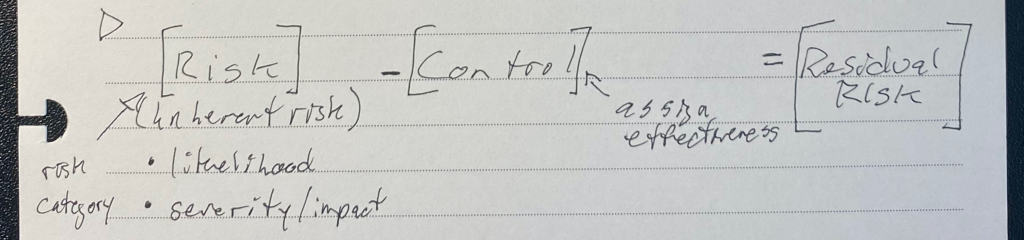
Interview notes + sketches -
Competitor: attempt at visual interest -
Competitor Risk Register -
Stakeholder Design Exercise -
Key Insight -
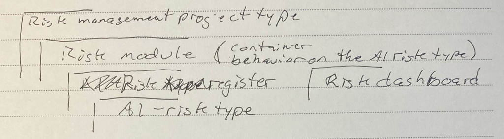
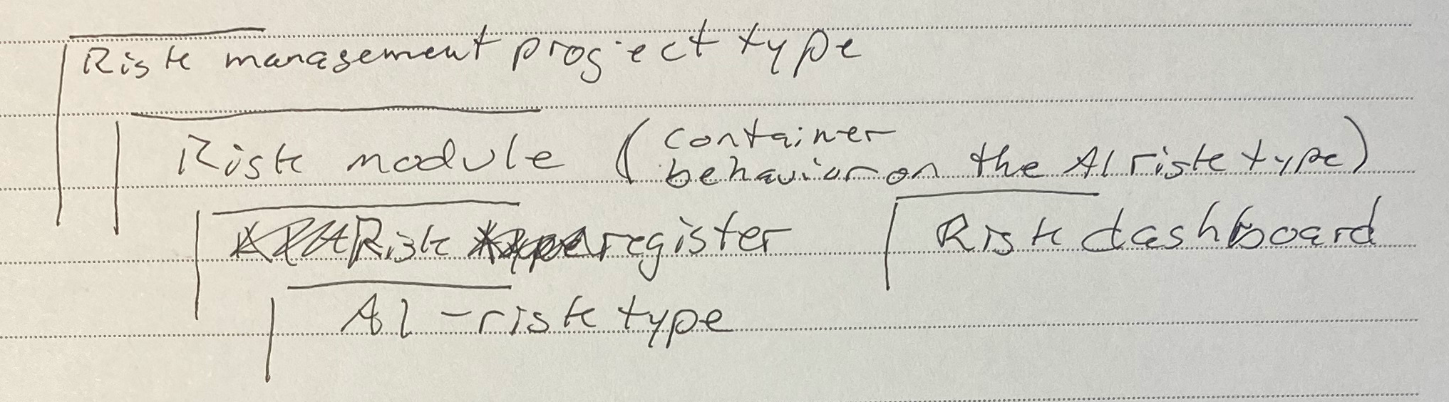
IA sketch
Strategy
1. UX Outcomes + Impact
If we do our job well, how will our internal colleagues’ lives change?
- The person in charge of managing risks is more professional and skilled (without having to be an expert)
- Their companies become more safe and trustworthy
Business Outcomes + Impact
If we do our job well, how will the business improve?
- The company becomes a trusted and helpful partner in risk management
- New capabilities and revenue stream
- increased retention and engagement
2. Experience and Design Strategy
FUNCTIONAL GOAL: Create a modular add-on where customers can manage their Risks
3. Metrics (and thresholds for success):
- Ease of Use: accomplish top 3 tasks in <2 minutes (success is >35%)
- “Cool and Modern” sentiment analysis – minimum functionality, visual appeal (success is >35%)
- Sign up/ use when invited specifically (success is >50%)
Persona: SMB Risk Authority
Unlike in an Enterprise company, in an SMB (small/medium business) this person is often wearing many hats and isn’t a dedicated Risk Authority.
Mostly, though, SMBs had little time, little money, and were not experts.
They DID want to espouse modern best practices and become more professional and skilled.
The SMB customer needs:
- To manage it all in one place
- To flow to and from other tools
- Simple, convenient, fast workflow
- Make sure it’s extensible, to grow with needs
- Flexible with how many people are involved
- Save time, money, or cycles compared with other/usual tools
- Remove barriers that exist with other methods/tools
- Use up-to-date processes, methods, patterns
- Decrease ‘tool time’, increase ‘goal time’
- To look professional and cool

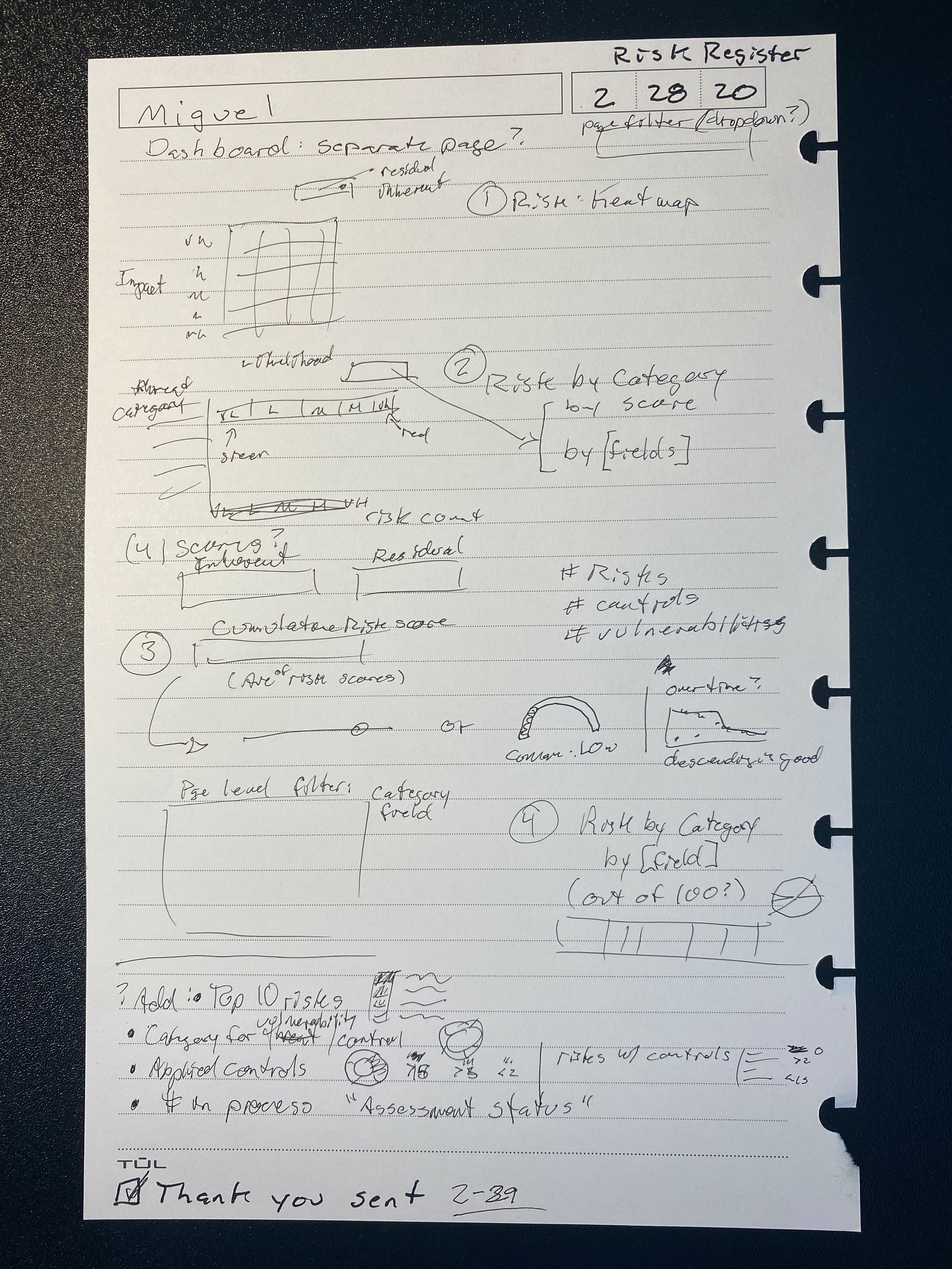
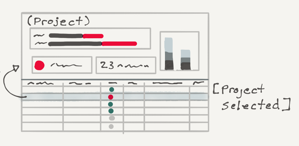
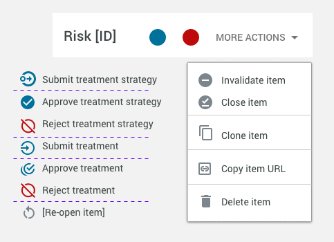
Risk Workflow (MVP)
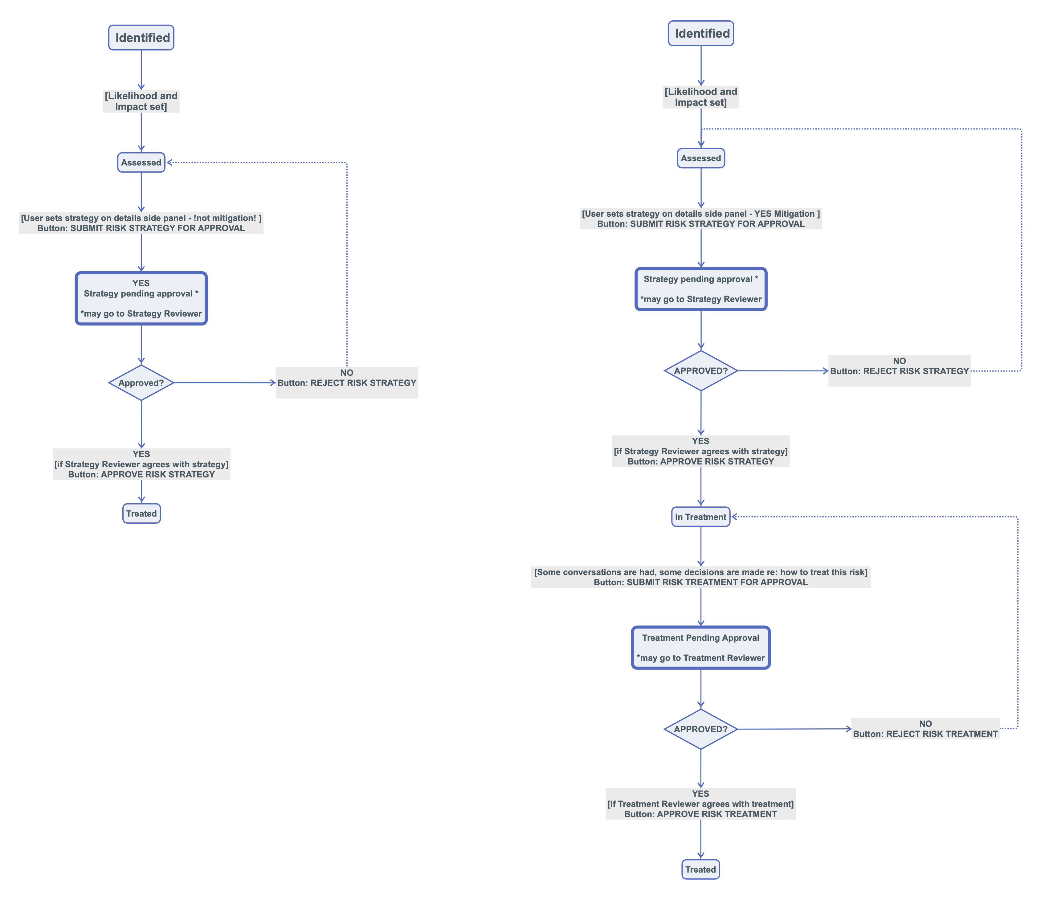
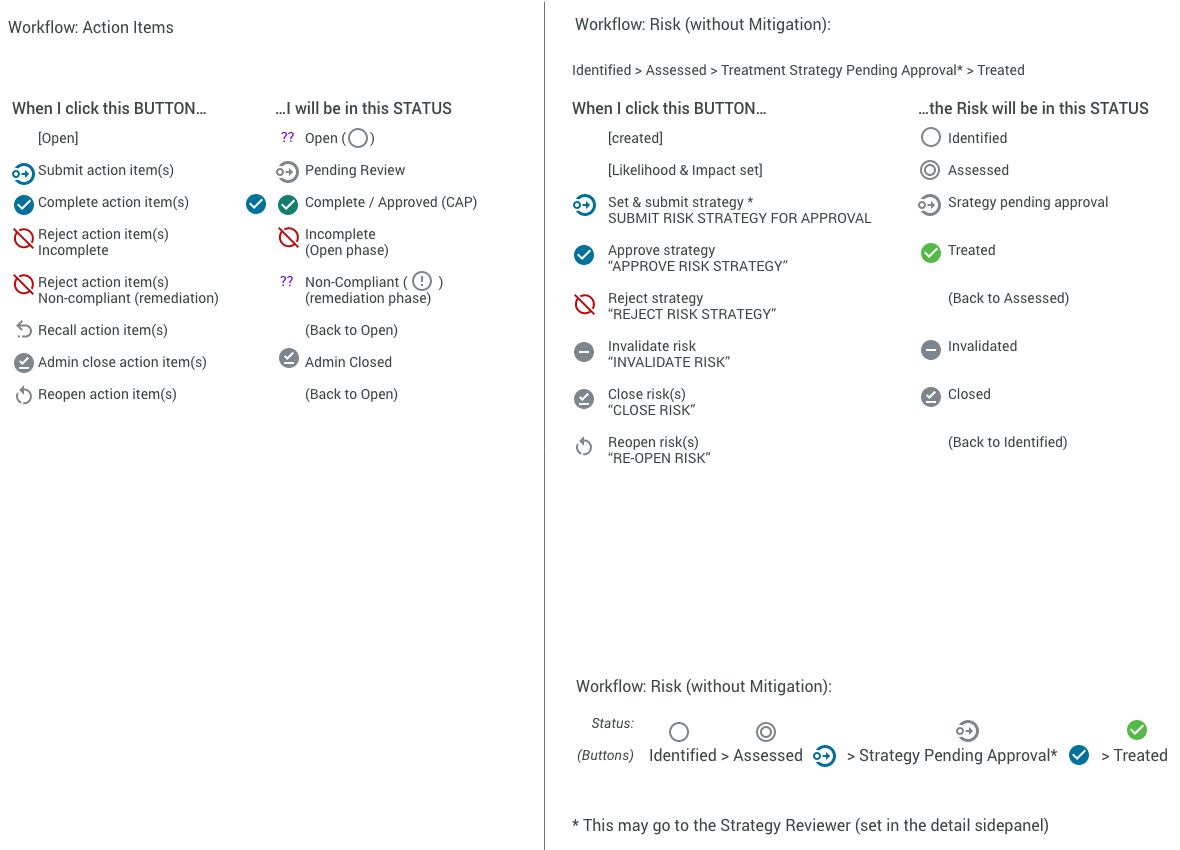
DESIGN
At this stage, we concern ourselves with
• UX design processes
• (Agile) development
• Communication
Because this was a new way of working for this particular tool, it was important to iterate on the design patterns while being mindful of our guiding Experience Principles, especially:
- Match existing design metaphors and use existing patterns where possible (coherence is more usable) ()
- Make a complicated workflow clear and intuitive ()
Notable user needs and constraints:
- Minimum content:
- List
- Sidepanel
- Minimum functionality
- Add, edit, delete risk
- Mitigate risk
- Approve risk (+ workflow)
| User Need | Considerations | Feature/page |
|---|---|---|
| FUNCTIONS: I need to be able to add, mitigate and approve a risk |
make it easy/ usable | – Risk Register: list of risks – Add a risk (quick add) – send a risk from my assessment to here – evaluate the risk (enter score) – mitigate the risk and score the mitigations —— – connect risks together – send this to someone for approval |
| The Platform needs to be the authority | walk me through suggest to me smart defaults |
– smart defaults – everything visible in one place – definitions and help for how to score risks and mitigations – help system with a walk-thru |
| Make it easy | connect to existing workflow low training easy add |
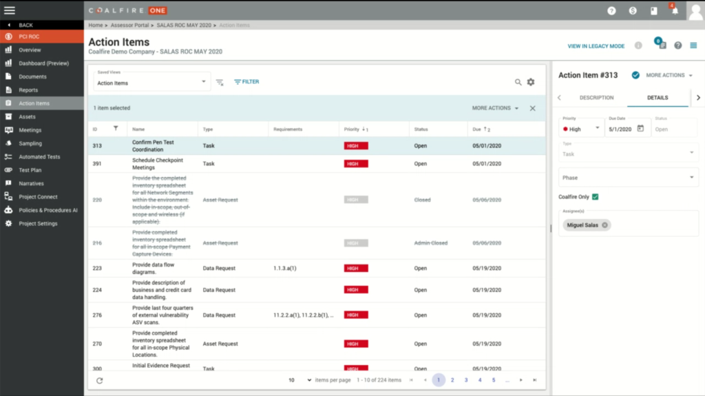
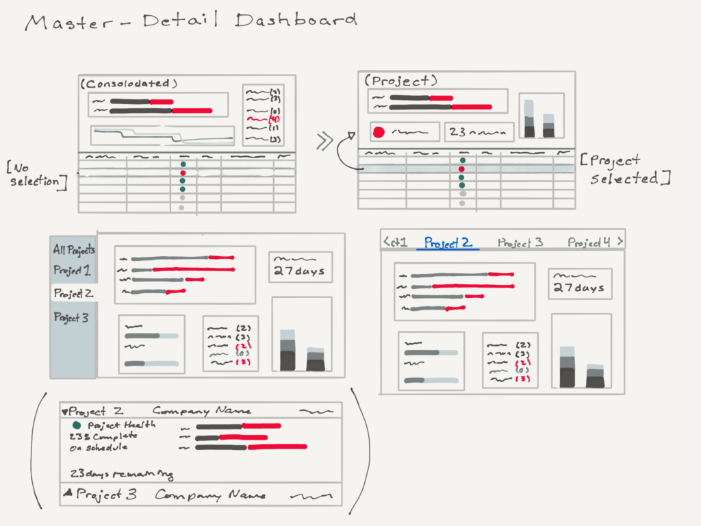
– use existing patterns (master-detail IxD pattern) – easy to add risk – connect with existing tool to ‘send’ a risk to the register – Limited pages: prioritized primary functionality over ecosystem visibility |
| Scalable for fast growth | tools to handle info overload add more seats |
– modules can be added – on table tools (sort, filter, search) to handle info overload |
| Delight me | better than what exists | – interactive ‘heat gauge’ functionality on the sidepanel – Expand/collapse and extendable functionality for the sidepanel (focus) – Adding color to the high-med-low status – Bonus: accessible (colorblind friendly) color palette |
Visual and interaction design details
Started with sketches to validate the best interaction patterns with a goal to align with our current UI patterns. ()
-
Existing UI table -
IxD Sketches (pattern exploration) -
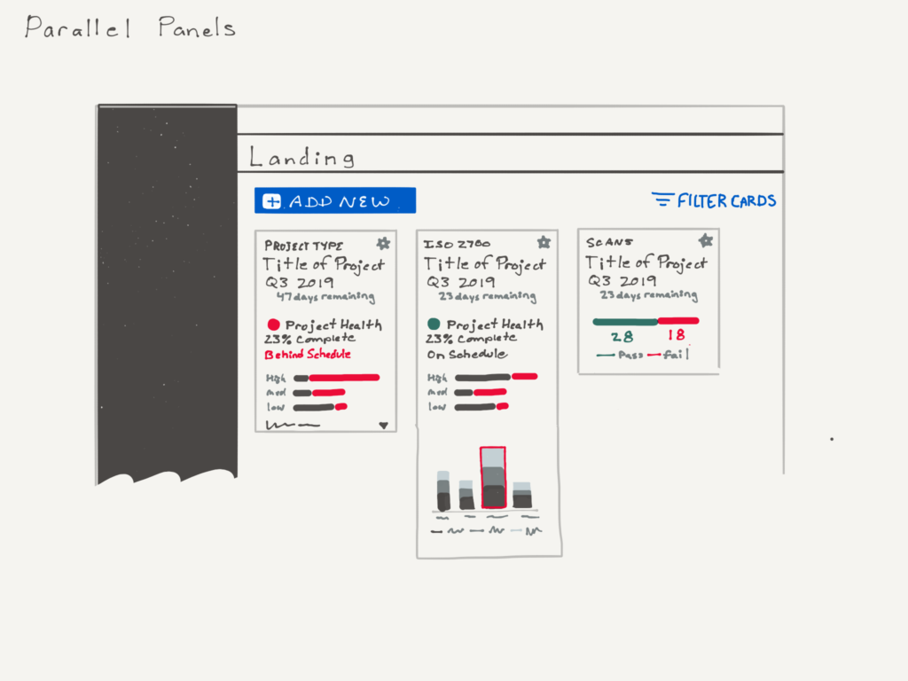
Rejected pattern: cards -
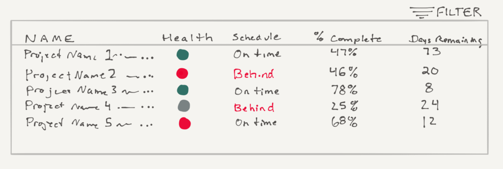
Table with list/ filter/ sort capability -
Master-Detail interaction pattern (table-dashboard)
Validation and iteration
Validation methods: Design Exercises User Validation methods (Talk Aloud, Ethnography/ contextual enquiries)
In conjunction with the dev team, we quickly prototyped this in production. Once users were using the prototype, we made some additional improvements to make the tool and interactions not just usable but delightful:
- Added the heat gauge (interaction) for excitement ()
- Renamed the sidepanel components (IA) to match the user’s mental model (, )
- Added colors (indicates severity) for quick identification and delight ()
- Expand/collapse functionality on the sidepanel to help users better focus (, )
-
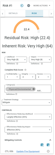
Sidepanel -
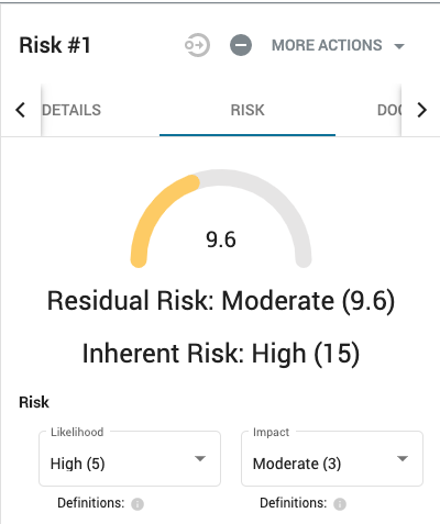
The interactive heat gauge
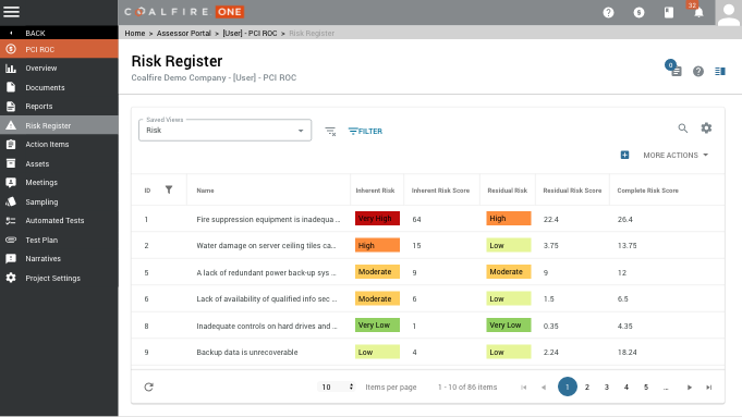
VISUALS
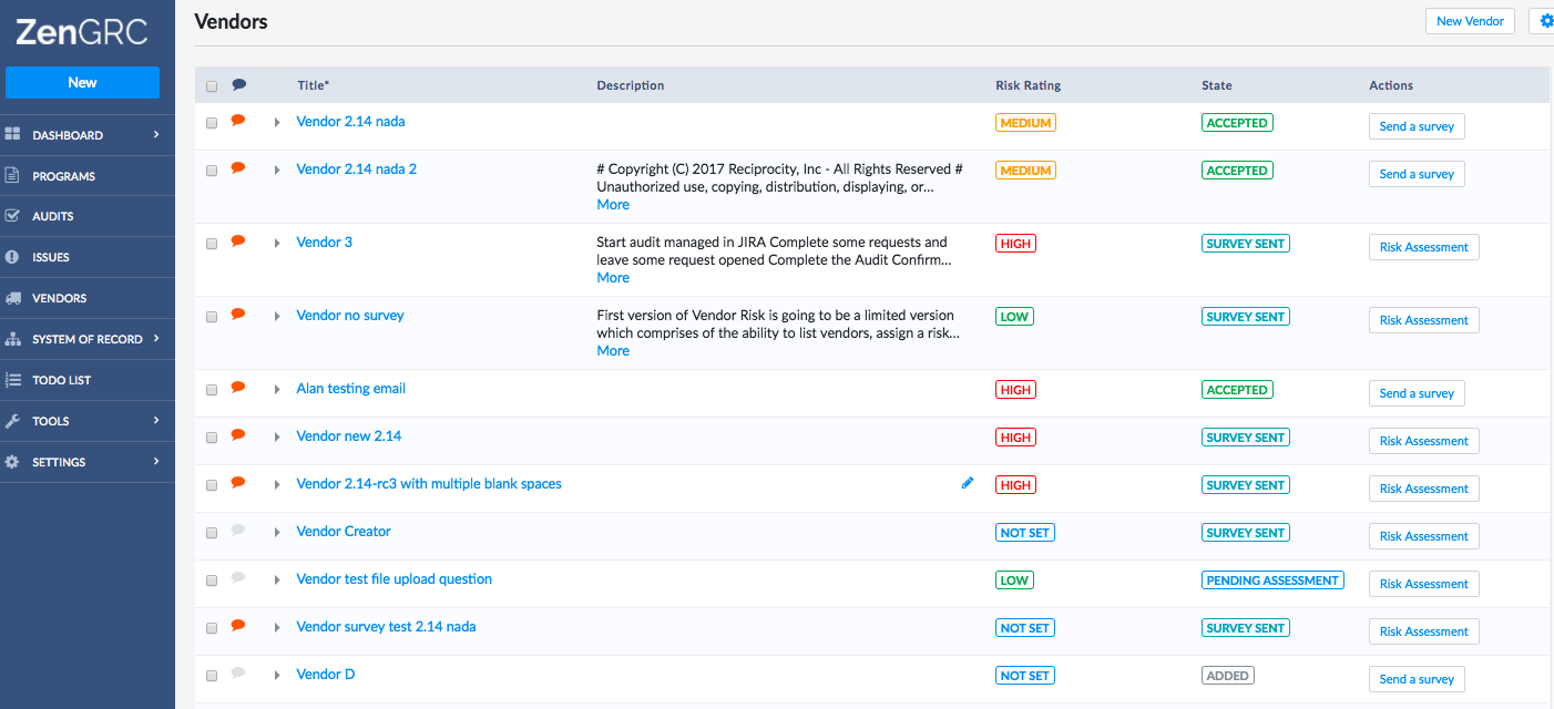
Screenshots (in production)
Video (user acceptance test)
EVALUATION
At this stage, we concern ourselves with
• Test (user testing)
• Measure (metrics)
• Assess (outcomes)
Overall Assessment: GOALS ACCOMPLISHED
In this company, there were no formal user acceptance tests or user testing program, so I used the beta testers, sales candidates and SMEs.
- Easy to use and at least as functional and visually pleasing as competitors
- Accommodates complex functionality while using visuals to clarify state changes
- Modern and coherent with existing UI

Positive Sentiment
- Interviews: beta users and SMEs
- Testing for positive sentiment
“Cool!”
Easy of Use:
- Task Analysis: 3 top tasks in <2 min
- Add, mitigate and approve risk
Sign Up
- Analytics
- % of invited candidates who signed up
| TEST | MEASURE | MIN GOAL | DATA |
|---|---|---|---|
| Qualitative Test: functional and visually pleasing? (1) | Positive Sentiment (“cool!”) | > 35% | 75% |
| Quantitative Test: Is it easy to use? (2) | Ease of Use: Do top 3 tasks <2 minutes | > 75% | 88% |
| Analytics: use (3) | Sign Up/ Use: – Out of invited candidates, how many used the Risk Register? |
> 50% | 80% |
(1) On the left, “Was this visually pleasing?” If the person being observed said some version of ‘nice!’ or ‘slick’ or ‘cool’, I took that to mean that it was visually pleasing. (5/6 SMEs, 4/6 beta users)
(2) On the right, a little more quantitative: 88% of beta users could do their top 3 tasks in 2 minutes or less. (14/16 users)
(3) Analytics: 16/20 prescreened candidates
Other things I would have liked to measure:
- The cost (in retention) of not having a Risk Register
- How much time is saved?
- How much more efficient is it?
- How long do users stay in the Risk Register?
- What errors are they seeing (if any)?
- When they access the page-level Help Docs, what are they looking up?
- Retention and engagement
EXTENSIONS
At this stage, we concern ourselves with
• Iterations
• Extensions (roadmap)
• Standards
• Documentation
• Communication/ Change Management
• Training (plan and deliverables)
• Help / FAQ/ Quickstart Guides
Iterations and Extensions
-

Risk module dashboard -
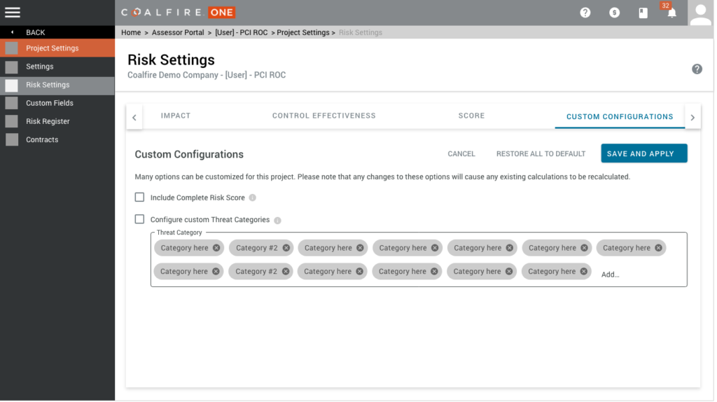
Settings: custom functions -
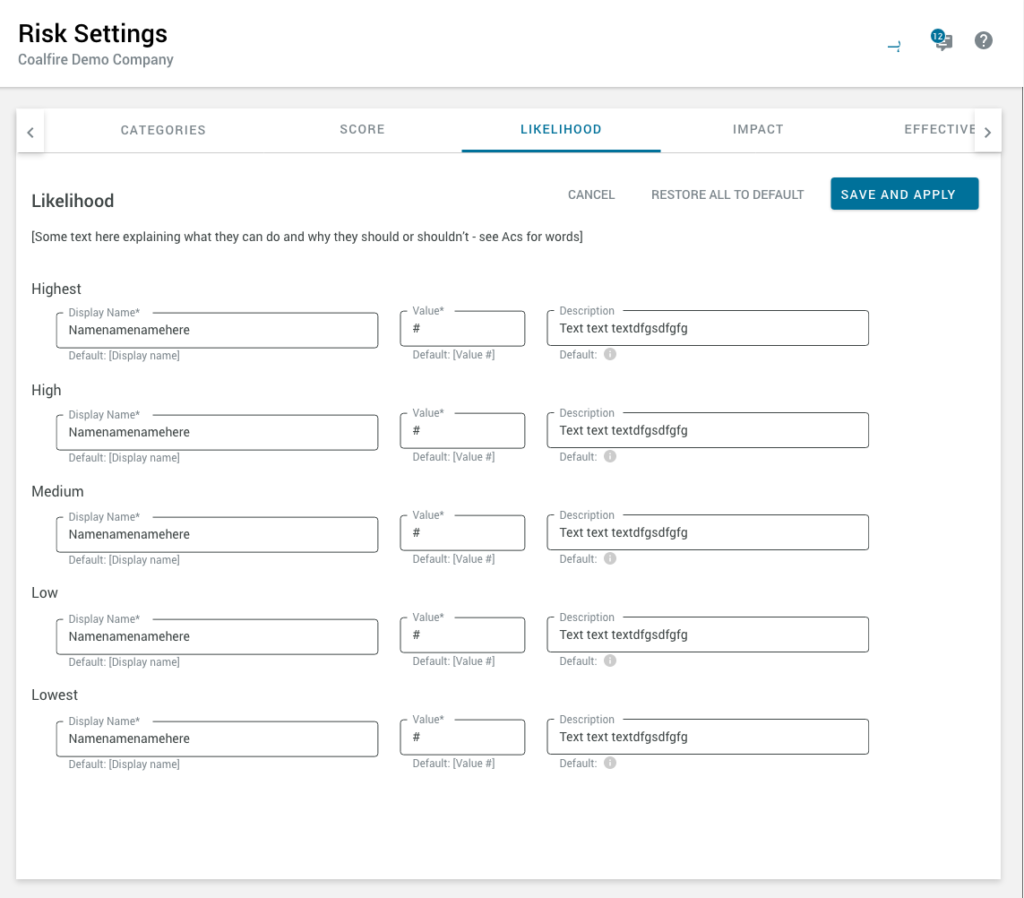
Settings: IA + Names -
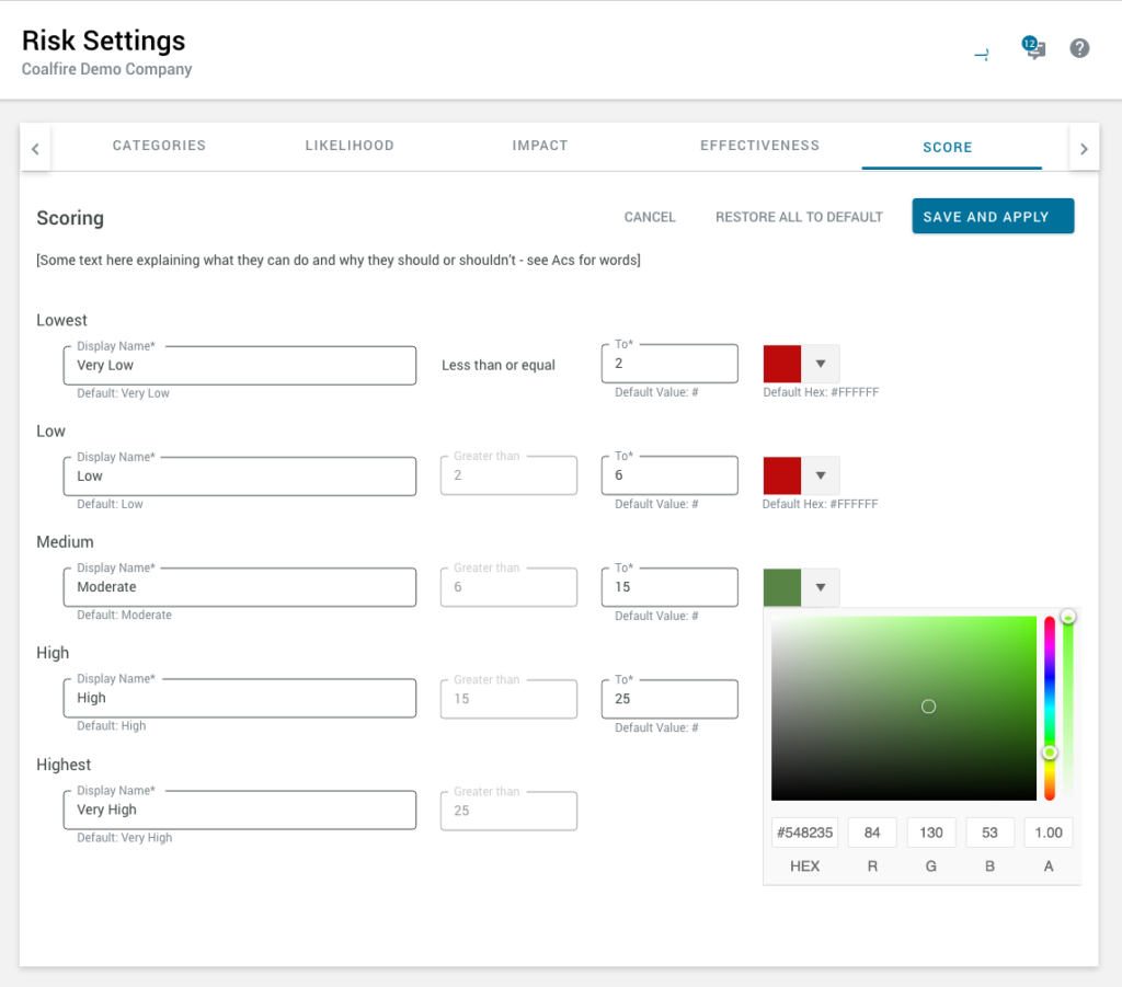
Settings: custom criteria and colors -
Added workflow -
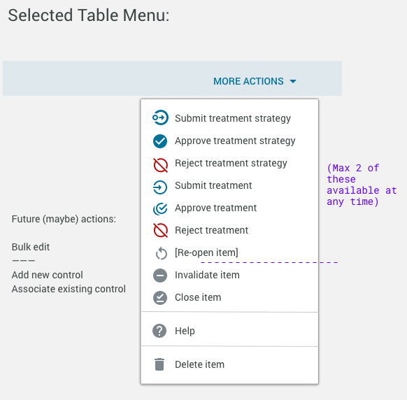
Workflow in menu
Of course, there’s always more to do on an MVP.
Iterations:
- Length and IA of the sidepanel (better usability and findability)
- Table improvements (smart defaults, inline editing)
Thematic roadmap:
- Visualize the Risk (Dashboards)
- Customize the Experience (Setting pages so users can customize the interface)
- Collaborate with the Company (More robust and custom workflow)
- Robust Mitigations (Mitigation list page, smart defaults)
Support Standards
As designers, we make sure to codify our design pattern changes and UX Standards to keep the engineering team on the same page.
Updates to:
- Pattern Library
- UX Standards Wiki
- UX Acceptance Criteria Templates
- Complete page functionality
- Colors
- User Stories
-
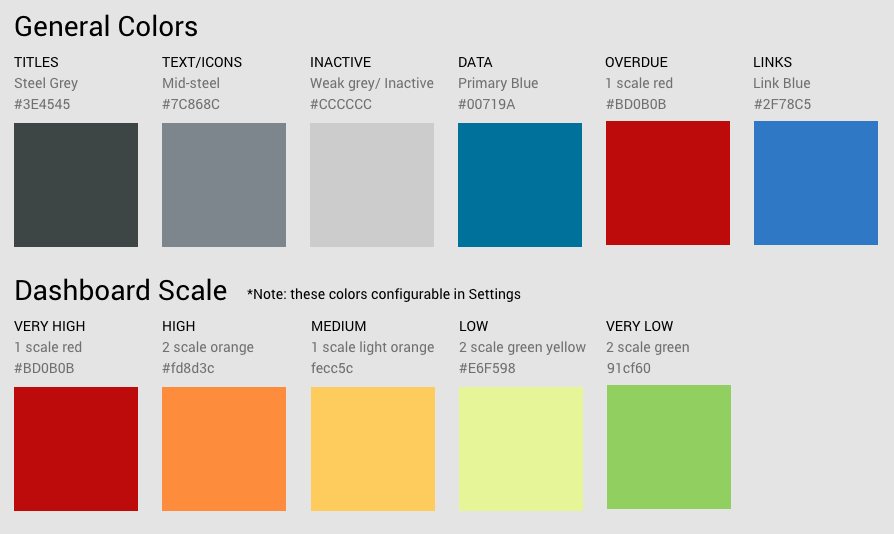
Dashboard scale colors -
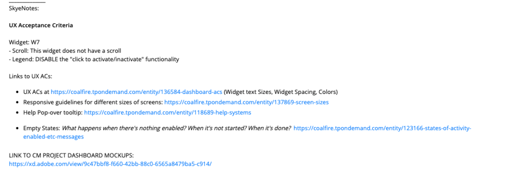
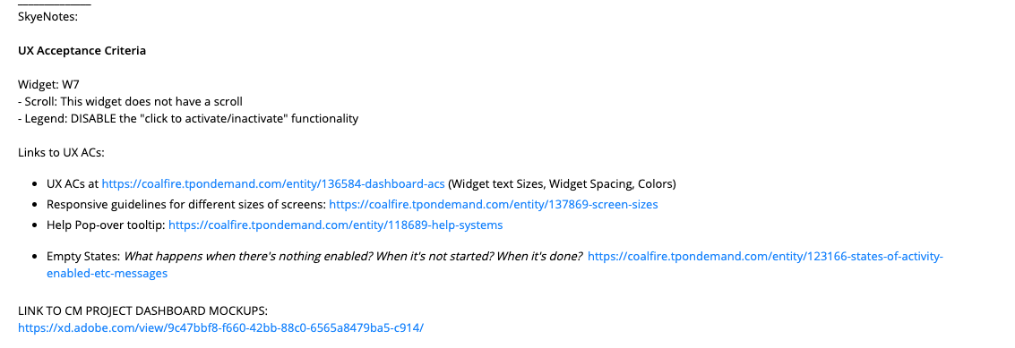
UX Acceptance Criteria Template (for PO) -
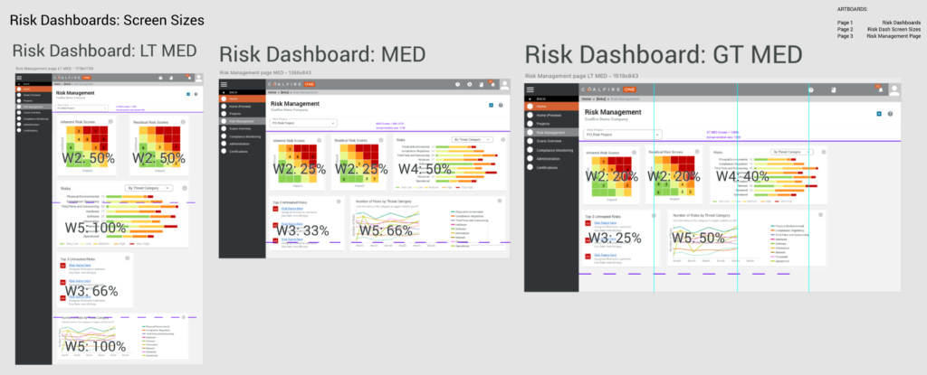
Dashboard widget sizes (for dev) -
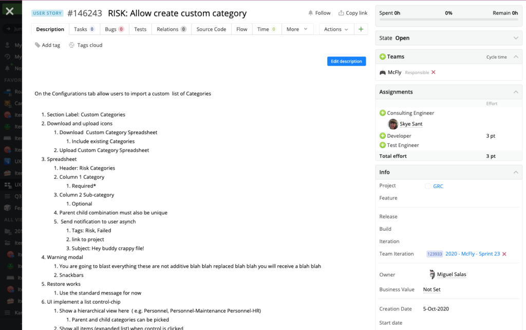
User Story (for dev + PO) -

Complete Risk Page functionality (all menus)
Communication/ Change Management
I assisted with the rollout through the business via presentations and demos to make sure everyone was aware of this new tool.
(Not pictured: training (plan and deliverables),
Help / FAQ/ Quickstart Guides, change management)

Outcomes and new North Star
- Outcomes:
- This makes the company more helpful (increasing retention and engagement) and the SMBs more professional and skilled (without having to be experts).
- The risks are dealt with and the company can be confident that they’re doing the right thing (eliminates pain points)
COMPANY
- Increased business capabilities (add-on modules)
- Expanded pricing models
- Opened new market for SMB clients
SMB USERS
- Accommodated SMB constraints (lack of money, time and specific talent) and opportunities (improve efficiency, revenue, innovation, relationships and decrease costs, need for expertise)
- Made them look cool, modern, competent
Lessons
- /User/ feedback is critical to prove business value – get it however you have to. You don’t need permission and don’t apologize for doing it. (In our case, The SMEs weren’t SMBs so they weren’t correct on many of the priorities – only by talking to users could we prioritize correctly.)
- To simplify the complex, look to the workflow and personas.