Bedtime mobile app (UR & UI)
I was asked to research and pitch an iPhone app that might help children to more easily fall asleep.
This project included:
- Ethnographic Research
- Strategy, Persona, Flow
- Gamification
- Heuristic Evaluation
- User Testing
- Illustrator/Photoshop
- Fieldtest App (Interactive Wireframe tool)
- Balsalmiq (Interactive Wireframe tool)
- User research: Skye Sant
- UX Strategy: Skye Sant
- UI Design: Skye Sant
- Input from users
- Presentation to Stakeholders
SUMMARY:
My observation study examined how young children primed themselves to fall asleep in the absence of a clock-based system. Many people simplify their bedtime routine by going to bed at the same time each night. They do this regardless of the day’s activities or efforts and regardless of whether they’re tired. Children in school often have bedtimes – the clock’s numbers determine when those children lay down in their beds and have to go to sleep. But come summertime these same children get to ignore a clock-based bedtime and instead actively facilitate a progression into sleep.
(This app was never brought to market.)
PRELIMINARY RESEARCH:
For my study I watched children during the summer (when they don’t have to use a clock to determine a bedtime) – how did they prepare to sleep? I directly observed and interviewed three school children across a range of ages from 8-14. In each case the participant had a general idea of a time of night they wished to be in bed (“after dark” or “after I finish cleaning up dinner”) but they didn’t use a clock to determine when to go to bed. These children were operating outside of their normal clock-based cue system. Question to answer: Once the participants decided to go to bed based on their own internal parameters, what strategies did they engage in to get ready to fall asleep? Was this process aided by technology? I observed three young children aged 8, 10 and 13. During the school year they each have to close their eyes and go to sleep at night based on a clock. During the summer, however, the children can go to sleep whenever they wish – how do they prepare to close their eyes and go to sleep in the absence of their usual clock-based cue?
Results from the study:
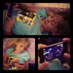
Participant 1 goes to sleep when her “eyes get dry and sleepy”.
FIRST PARTICIPANT The first participant, an 8 year old girl, says she decides to go to sleep “when the sun is gone and after the dishes are done”. The two days I observed her she went to her room after dinner cleanup and drew in a notebook until the waning light made it hard for her to see. At this time she told her parents goodnight, got ready for bed and watched YouTube videos on her iTouch for about 20 minutes, changing her position around 3 times, before telling me she was ready to sleep. She went right to sleep after putting down her iTouch. When asked how she decided to go to sleep, she said, “when my eyes get dry and sleepy”. The issues/opportunity I can see here is that the sun goes down at different times and according to different situations – what if this child needs more sleep and she’s relying on a sunlight cue that may come too late at night? What if it’s too early, like on a cloudy day? Also, going to sleep when her ‘eyes are dry’ implies that the movie kept her up all the way to exhaustion – and there may be a better time for her to slip into sleep if not for the distraction of the movie. In this case I’m not sure that technology is helping this girl get to sleep in an optimal manner.
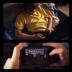
Participant 2 goes to sleep after he finishes playing games.
SECOND PARTICIPANT The second participant, a 10 year old boy, says he goes to sleep “when everyone is getting settled down” – when his older brother (a teanager) is on the computer and his parents are watching TV. He goes to his room and plays games on his iPhone until he “gets tired of holding up my arms”. This is always in a dark room, and he turns off his phone and goes to bed “after I finish the game”. I see some of the same issues as with the first girl – this boy is playing to exhaustion, which may not be optimal. In addition the games are usually long because he’s quite good at them, pushing off his sleep even later. The availability of gaming tech may be distracting this boy away from a natural sleep time.
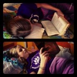
Participant 3 gets lost in a story, so doesn’t know how long it takes her to fall asleep.
THIRD PARTICIPANT The third participant is a 13 year old girl. She goes to sleep “after my sister does and it gets dark. Usually at the same time as my mom.” She likes to read before bed, changing positions frequently in order to support the heavy book. She reads for a substantial length of time, often longer than an hour, but can’t say how long she usually reads because she “gets lost in the story, usually, so I don’t exactly pay attention that way.” She goes to sleep when the book gets too heavy or she gets sleepy. Interestingly, though technology isn’t involved this child may also be putting off her natural sleep time. She is certainly going to bed later than she should because the feeling of sleepiness has to get so strong as to stop her from functioning – surely not an optimal situation. She also has to get up and turn off the light and sometimes that re-wakes her.
BRAINSTORMING
Needs/goals/tasks brainstorming:
I’m assuming that by the time a child decides to head to bed, the need for sleep is eminent and the child would be able to fall asleep quickly thereafter. If the child’s goal is to get to sleep in the easiest most pleasant way, how can we help the child achieve this goal?
Primarily I can see that DISTRACTION plays a big role in what the children do to get ready for sleep. This leads to several design opportunities:
- Might there be a better way to distract one’s self than with a high-attention device, so that one can stay aware of one’s own level of sleepiness?
- Is there something else that can be done before bed that has a shorter duration than a movie/game so that one can fall asleep faster?
- Is there a way to become even more tired, faster, so that one goes to sleep sooner?
- Is there a way to be both entertained (like with a video) and yet not very immersed at the same time?
General:
- Is there a way to involve the family in an activity that gets everyone ready for bed?
- Is there a way to discover what an optimal time is for the child to go to sleep?
- Is there a way to reward the child for getting optimal sleep?
- Is there a way for technology to make this process faster/deeper?
- What kinds of visuals are best to create good sleep?
- Is there a type of sound that would help a child fall asleep?
- How can the parents play a role in supporting the child’s sleep habits?
- How can we help children become more aware of their own sleepiness?
- Can an environment help to make a child fall asleep easier?
- Can processes or activities during the day help to prepare a child for a better sleep-time process?
- How can charting data relating to the sleep time, duration, and quality help?
- Is going to bed without regard for the time on a clock more or less effective to the children?
- Does technology vs non-tech distractions make a difference in quality of both falling asleep and of the eventual sleep itself?
Possible inspirations:
There are many design ideas involving helping people get to sleep. There are technological solutions as well as very old time-honored methods. Here are a few that come to mind in the general categories of Activities, Visual and Aural.
ACTIVITIES:
Writing in bed is a good way to settle down into sleep. A strength of writing is that it is entertaining without getting a person caught up in an activity for too long.
Reading poems or short stories is a good way to be entertained but not for long periods of time.
VISUAL:
Abstract patterns, such as those from the iTunes visualizer -these patterns could be entertaining but not so engrossing as to make the child unaware of their sleepiness.
Traditionally a mobile above a child’s bed helps to distract and entertain before sleep.
SOUND:
White Noise is a time-honored way to help calm the mind and block out other distractions. This is inspiring in its simplicity and application across cultures.
A more modern interpretation is an iPhone Binaural Beat App -this supposedly generates a complicated wave-form pattern that speaks directly to the brain.
Another avenue is a touch-screen radio which helps you to hypnotize yourself-This supposedly helps by playing music with a subliminal message behind it.
Design Opportunity:
I am exploring concepts behind making an app to assist children into sleep. The time before bed involves a lot of media distraction which sometimes keeps the children awake overlong; I will make an app that assists children in going to sleep gently, distracting them but not engaging their attention overmuch. After the app’s activity is done the children will go to sleep easily without being overtired.
HEURISTIC FEEDBACK
Based on Jacob Nielsen “Ten Usability Heuristics”
http://www.useit.com/papers/heuristic/heuristic_list.html
Feedback: (15 participants)
In the first screen of the ‘Options’ wireframe, the hyperlinked word is ‘settings’ and it should be ‘Options’, to be consistent with icon labeling.
Everything else is lovely.
* You are assuming a child knows how to read
* Should not have to login in phone
* Doubtful a child will choose appropriate length
* When the story ends, you underestimate children: they’ll play the app again
* It is not clear what “castle” does. You would tell a story in a castle?
* Doubtful a child will know what “ethnic” music is
The application and idea in and of itself is great and i did not find too many issues in the navigation.
Besides setting music options prior to the story, it would be nice if the user could make changes on the story interface itself while the story is on rather than have to step out of the story.
Re-focus:
I am exploring concepts behind making an app to assist children into sleep in the absence of a clock-based cue. The time before bed involves a lot of media distraction which sometimes keeps the children awake overlong; I will make an app that assists children in going to sleep gently, distacting them but not engagging their attention overmuch. After the app’s activity is done the children will go to sleep easily without being overtired.
The primary change from the preliminary app is one of user focus.
I recieved excellent feedback from my heuristic evaluations and I am not going to ‘fix’ these problems per se. After talking to several people and especially after thinking about Student 1’s evaluation I have decided that this app isn’t for children – the primary user is parents, who are turning on this app for/with their children. As such, this changes the setup structure – the new app needs to have a log-in screen and have provisions for multiple children. The parents will set up the Bedtime Story (in conjunction with their children, optimally) and then the child will take this to bed with them.
This will reconcile many of the pitfalls brought up in my heuristic evaluations: I am assuming that parents can read, that parents can set appropriate and desirable lengths and music, and that the ending of the story will be the end (because the app quits and the children would need the signin to play again).
This is a very big change and necessitates several manipulations of the app’s structure as well as more screens to facilitate the parent’s interactions.
If the secondary user is the child, then the next important change is in helping the child negotiate the app without bumping him or her out or into a forbidden area.
This falls under the heuristic of ‘Help users recognize, diagnose, and recover from errors’ as well as ‘User control and freedom’. There needs to be specific help and error screens so that children who might click the wrong icon or want to go back don’t end up in a dead end because of the parent-password firewall.
The third major change is making the app more flexible
There are things that the child can’t change once the story starts – things like setting and character. But there should be options that the secondary user, the child, can choose while playing the story – things like music, or the presence of subtitles. (This is in response to the feedback from Student 4)
As always, Consistency and Standards are paramount.
When anything is added to an app – and as the visuals are fleshed out – the need to be more fastidious is very important. There was an incosistant labeling in my wireframe – this sort of mistake is inexcusable in the final app.
Timeline Gantt chart:
https://www.tomsplanner.com/public/sant-hci


