EXAMPLE: Complex –> Clear [The Metric Page]
Good research, interaction design, and user testing helps us understand what elements, functions, and pages to prioritize and include in order to minimize cognitive load.
- COMPANY:
- This company is a large, enterprise, multi-national Real Estate (REIT) company with little digital/UX maturity
- ROLE: Principal UX Designer
- Informal Leader: Hired to pilot user-centered design in this company, I worked with a 5-person cross-functional team. I contributed to strategy and vision and fostered cohesion through communication but held no manager functions.
- Individual Contributor: As sole product designer I was responsible for UX & UI functions: User Research, Interaction design, User Testing
- ABOUT:
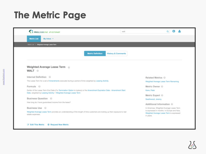
- The Metric Page is the page dedicated to each individual term in the KPI Dictionary, a comprehensive list of terms across the whole company.
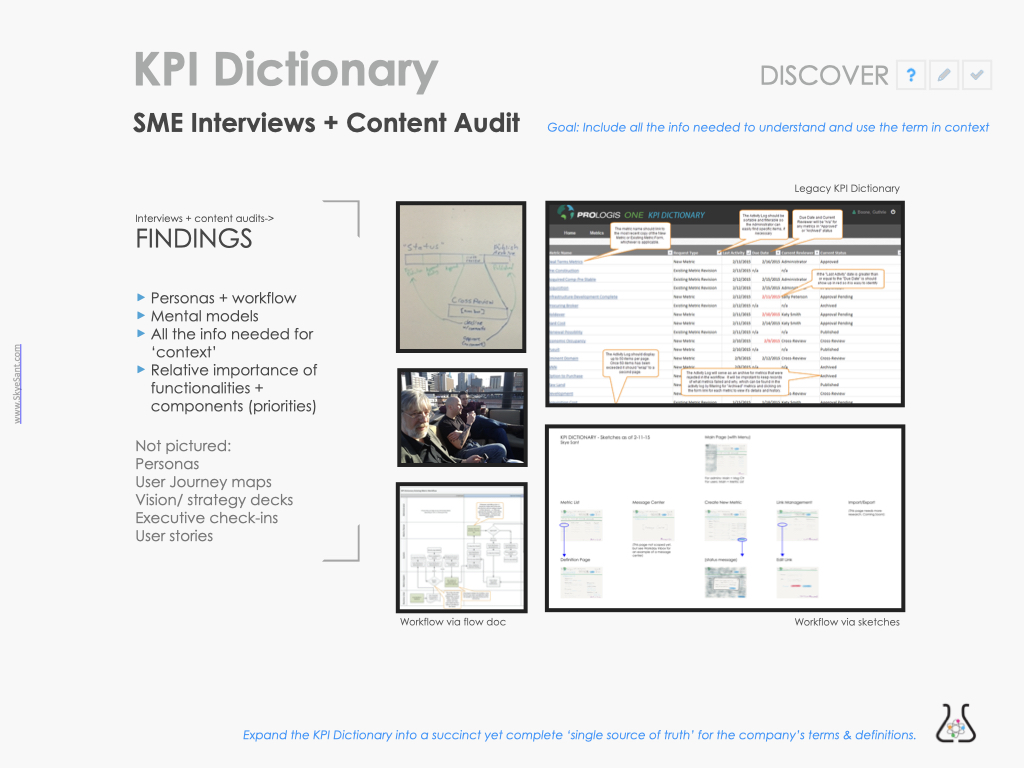
- Legacy form: A giant spreadsheet updated manually by Charlene.
- GOALS:
- Overall: Manual spreadsheet –> digital tool with company-wide access
- Metric Page: includes all the info needed to understand and use the term in context.
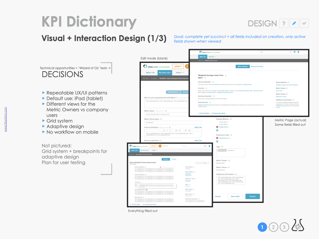
- SOLUTION: On the Metric Page, include every field the user might need – but no more.
- Researched to discover what fields people used currently
- Insight: different metrics had different fields needed
- Prioritized element needed in the UI
- Solution:
- Show only active and necessary fields in View mode
- Show all possible fields and option in edit mode
- Use feedback, usability test, and usage data to evaluate success
- Extend: next iteration, rollout, add to Pattern Library
- Lesson: Different modes (Edit/View) accommodate complexity and clarity.
- Researched to discover what fields people used currently
- OUTCOMES:
- Timeline: 4 months, under budget
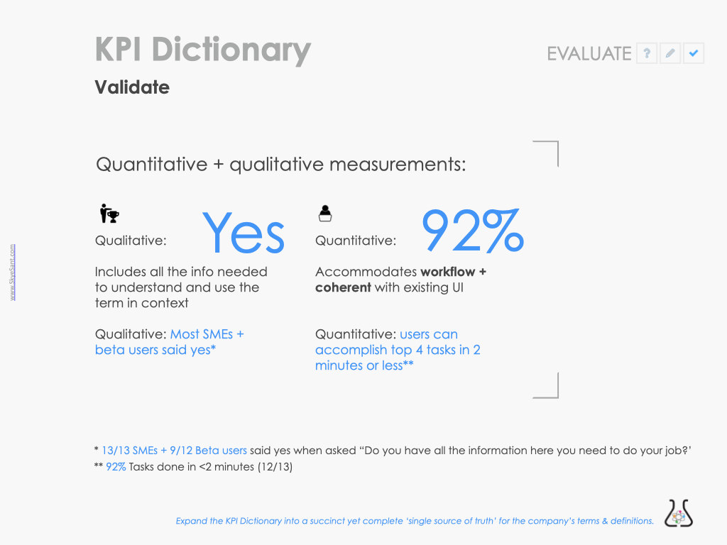
- Quantitative: 92% Success (accomplish top 4 tasks in <2 minutes)
- Qualitative: YES, includes all info
SOLUTION: On the Metric Page, include every field the user might need
DISCOVER:
We discovered what already existed for our users in terms of 1. content, 2. workflow , 3. information architecture, and 4. mental models.
Mapping the use and workflow both traditionally and visually, we teased out the relative priority of the features, pages, and components involved
Codify the research into a digital form – then iterate to improve on it (‘easy to use’)
DESIGN:
We watched people use our interactive prototypes.
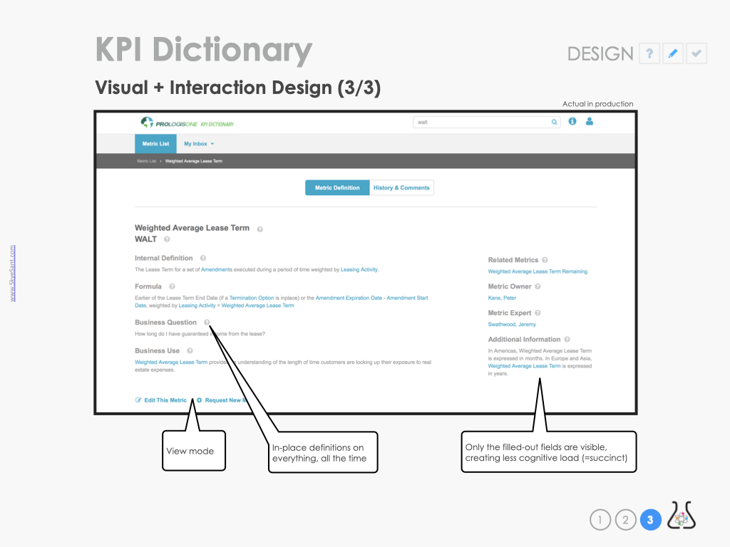
Our biggest breakthrough came when we realized that every term had it’s own special context of use, so to be complete, each term had to have a certain set of fields filled out – but this didn’t mean all our users needed to see, on the screen, every possible field.
To minimize cognitive load, we would show only the active & necessary fields
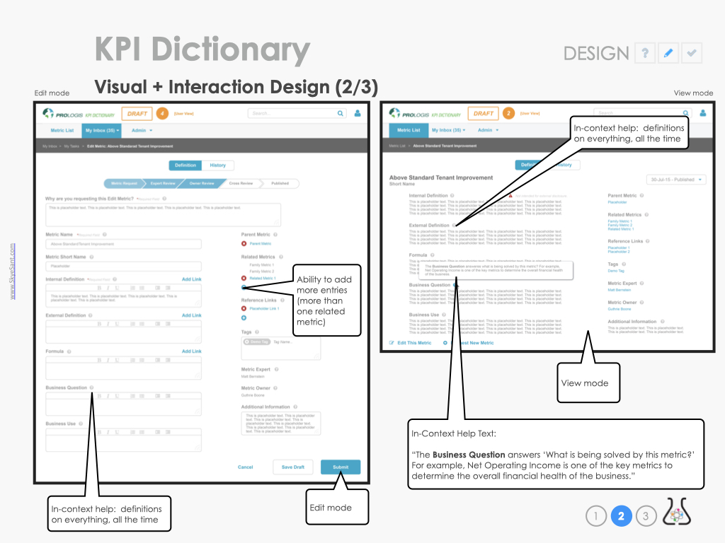
The edit mode (on the left) has many more fields and takes much more room (it also has the ability to add even more criteria fields, as needed).
Note: in-context help allows users to be more confident in their choices.
The Metric page has only and exactly what is needed for clear use, without any irrelevant-to-this-metric fields.
Going back to our goals, I tested for these two criteria: Do you have all the info you need to do your job? and Can you accomplish your task <2 min?
EVALUATE:
On the left, did each term include all the info needed? I measured this by asking our beta users if they had the info on the page to do their job, to which the answer was a resounding YES.
On the right, a little more quantitative: 92% of beta users could do their top 4 tasks in 2 minutes or less.
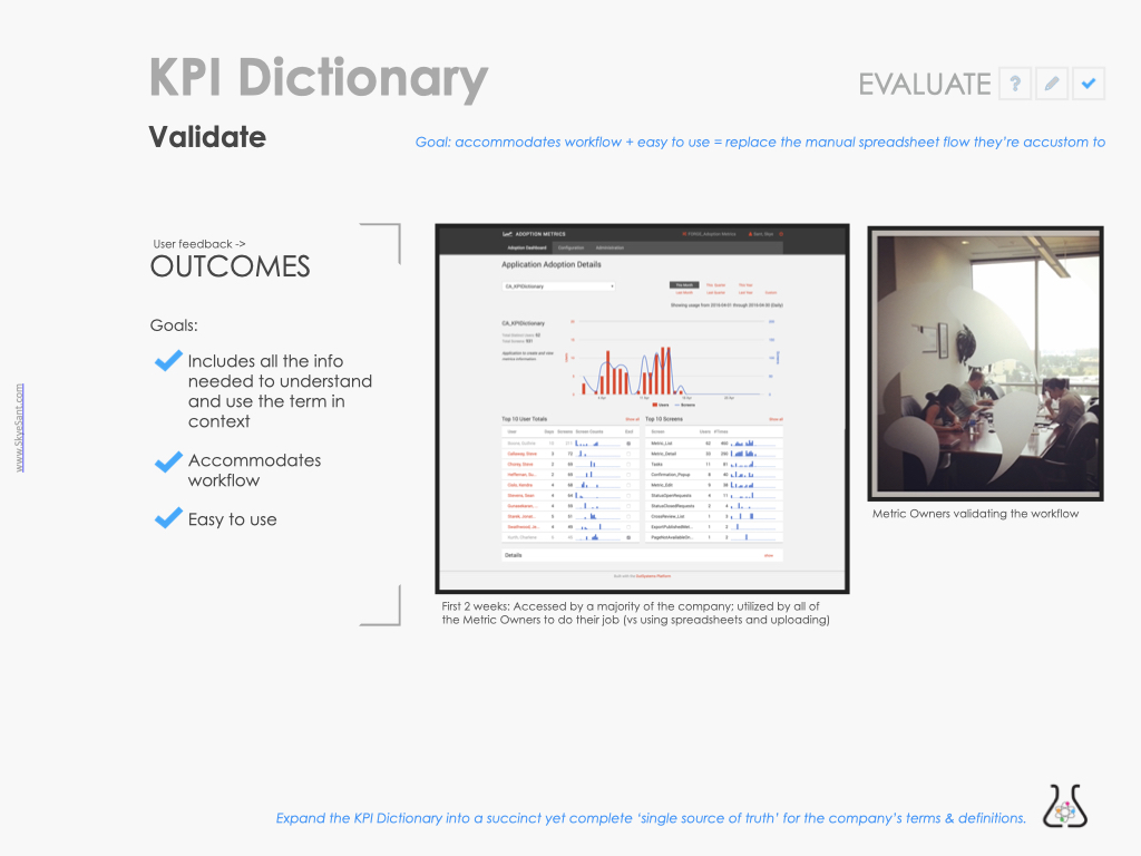
As an additional test of usability, I assessed whether it was at least as usable as the old method (of passing a spreadsheet) by looking at usage data.
Most of the business accessed this tool in the first 2 weeks and ALL of the Mertic Owners immediately started using it heavily.
Next steps for the Metric page and the KPI Dictionary
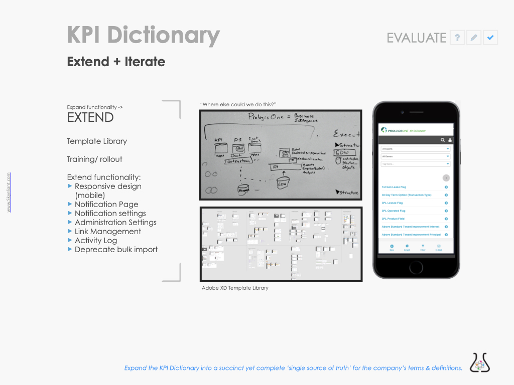
EXTEND & ITERATE:
More functionality, more workflow, and pushing a mobile design into production.
Rollout through the business to make sure everyone was aware of this new tool.
And, for the design and engineering team, templates and pattern library to codify what we’d made.
NOTE: This project was the deciding factor in digitally transforming the rest of the business.