Kyocera’s Mobile Training Tool
I was asked to create Kyocera’s mobile training tool, used to train sales associates working in phone stores on the use and audience for a line of new mobile phones.
Kyocera is a multinational electronics and ceramics manufacturer headquartered in Kyoto, Japan that manufactures mobile phones for wireless carriers in the United States and Canada. The1stMovement is an international digital agency with offices in Los Angeles, Denver and Hong Kong.
This vendor-focused project involved:
STAGES
- User Research
- Flow mapping
- Presentation to Stakeholders
- Iterative wireframes
- Heuristic Evaluation
- Prototype
- Final Visuals
TOOLS
- User Interviews
- Illustrator/Photoshop
- Annotated Wireframes
- PowerPoint
- Balsalmiq (Interactive Wireframe tool)
CONTRIBUTIONS
(as UX designer, contractor)
- UX Strategy: Skye Sant
- BA/ Market Research: Ryan Gaddis
- User Research: Skye Sant
- IxD: Skye Sant
- UI Design: Skye Sant
- Visual Design: The1stMovement’s Visual Design Team
- Gamification: Skye Sant
SUMMARY:
In order to better understand the skills, preferences and limitations of the associates who were the target users of this training tool I needed to hear about their experiences with these sort of training modules.
LIMITATIONS:
This training process isn’t voluntary – the associates who work at phone stores must complete this training. The associates are trained on all new phones that come into the market; they do not, however, get paid extra for this. The associates are expected to train on their own time while working at the store – without neglecting their priority of actively helping the customer who is physically in the store.

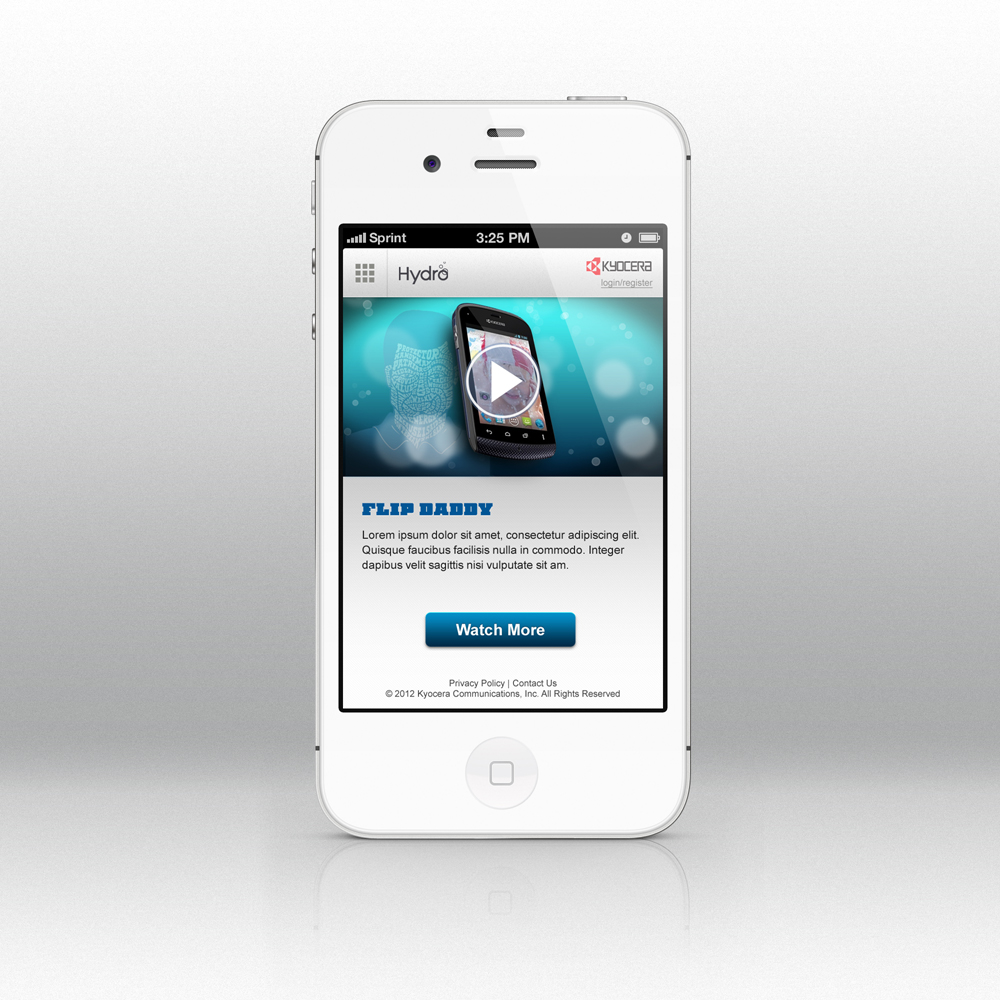
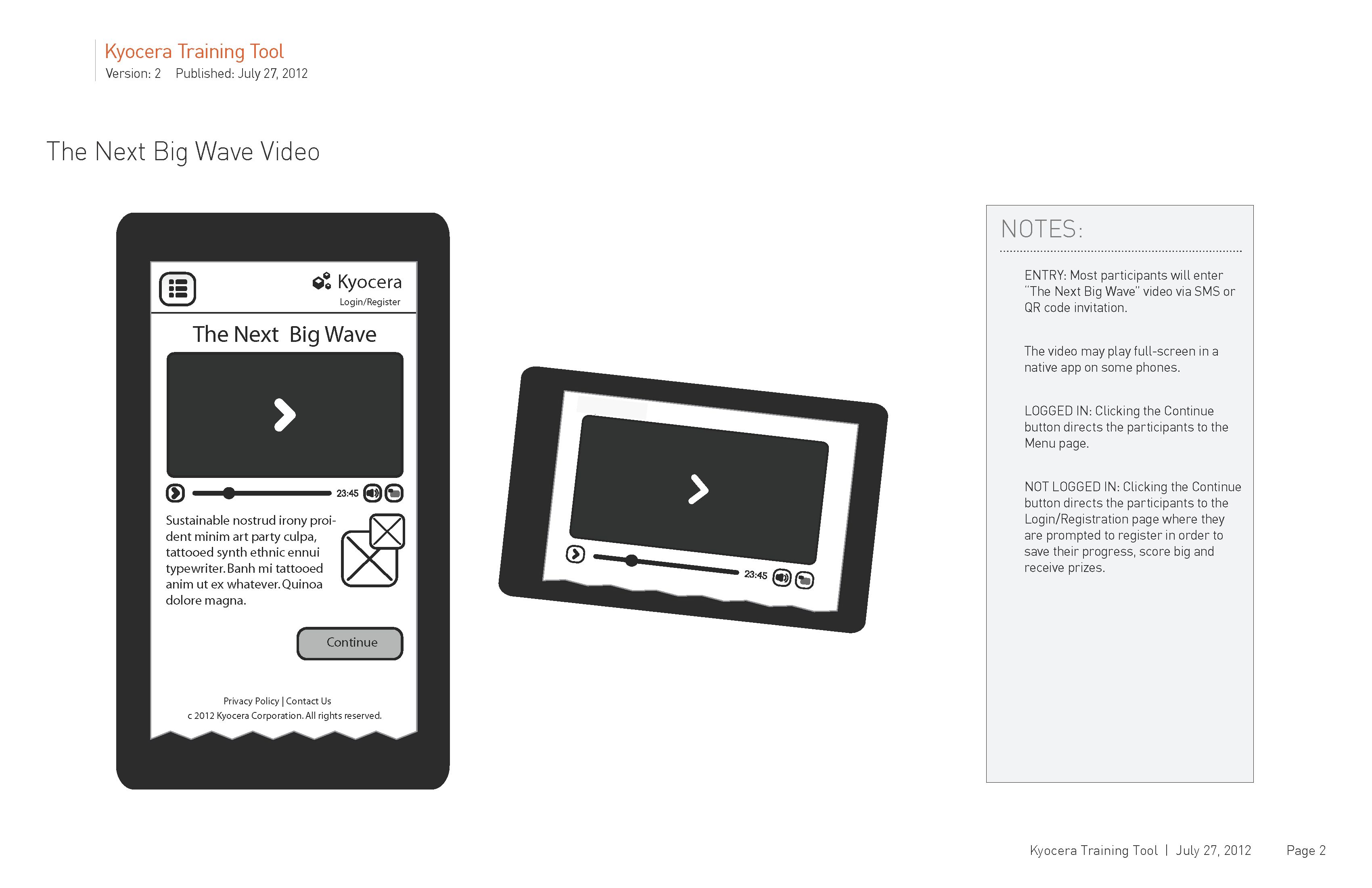
Mobile training app screen
RESEARCH:
The phone manufacturer did not factor in research on the user of this training app, but for me to design a user experience for this app I felt it necessary to hear about the associate’s previous experiences with training apps, both the good and bad. Luckily I got in contact with a local phone store and the manager agreed to meet with me over a pizza and bring some associates with him. 5 young men showed up and they had a LOT to say about training modules!
Armed with user insights, I proceeded to apply them to this user interface in order to create a user experience that was as pleasant as possible for the phone store associates.
DESIGN DECISIONS:
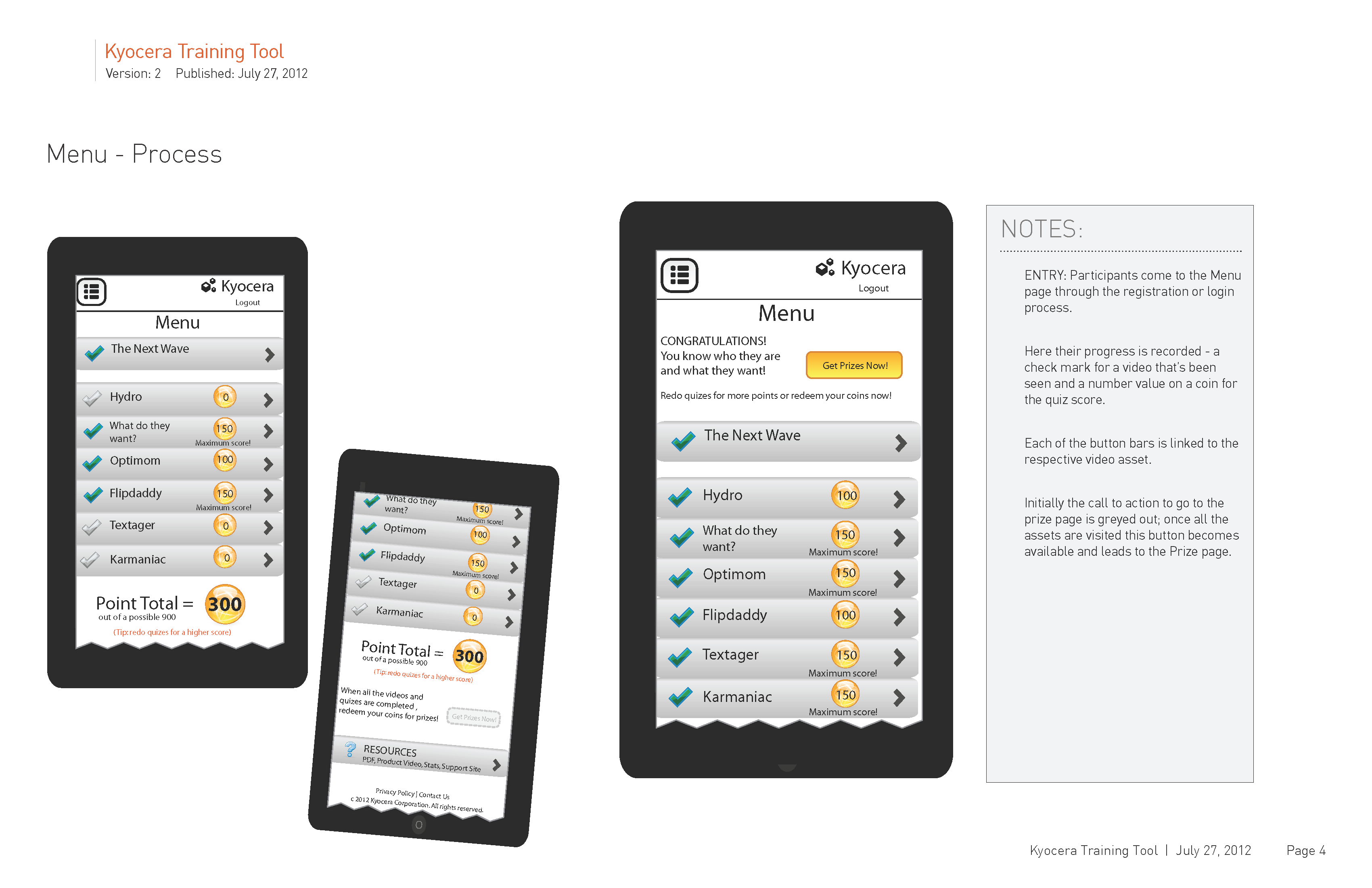
Using the insights gained through the user research phase, I designed a training tool that took into account the phone store’s associates’ needs and wants as well as the business needs. For instance, the associate is very busy actively helping customers – for this reason, it’s necessary that the training app be able to be picked up and put down at any time. So this tool was made to accomodate the automatic saving of progress as well as allowing the associate to 1. see his progress immediately and 2. start from wherever he left off.
There were other considerations for the associates’ time and attention. For instance, this training app was shortened from it’s original form (the associates were interested in information that helped them sell phones, not in any messages from the Chairman or history of the company) The training app was also made fun by the inclusion of tongue-in-cheek quizes on each of several short videos.
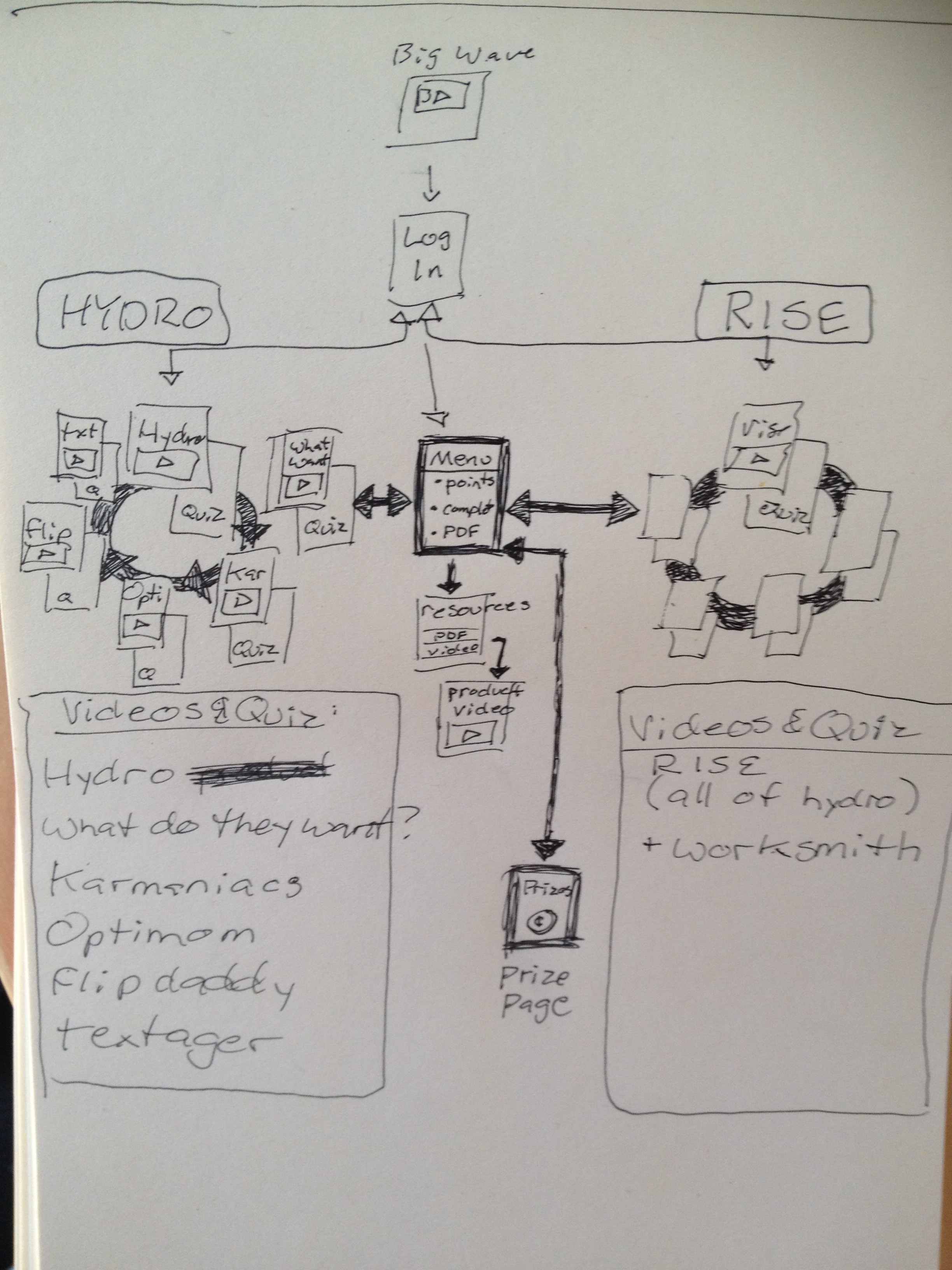
Approved sketches and revised context and flow for the training app.
-
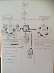
- Page flow
-
- Entry points

-

- Marketing flowchart

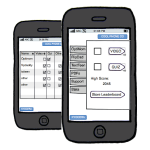
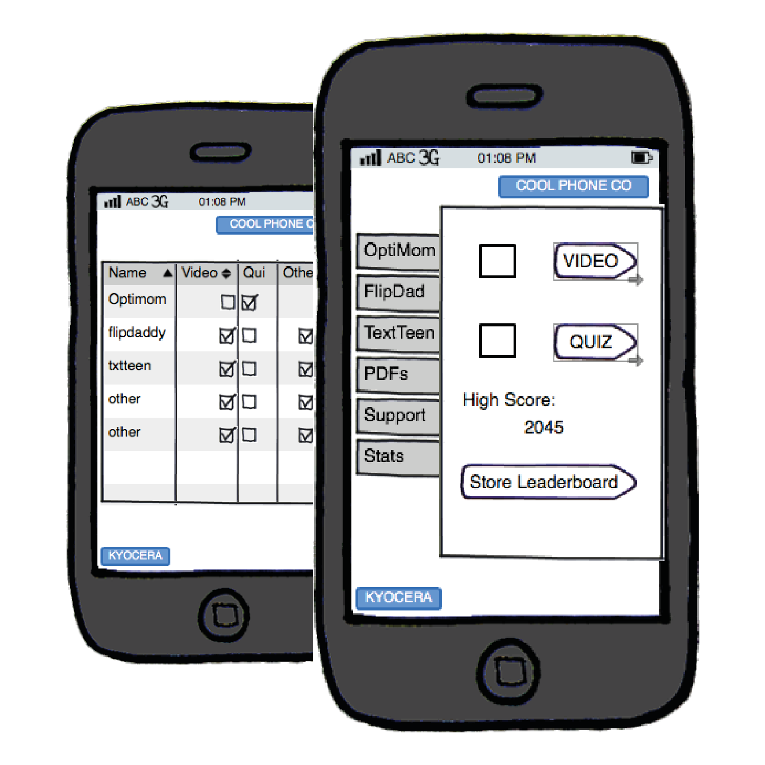
First I mocked up an interactive prototype to validate the screen flow of the training tool with users.
-
- Quiz score

-
- quiz – detail
-
- Quiz landing page
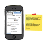
Next I expanded on this prototype in Illustrator to create the full wireframes, and then annotated the wireframes in order to include important information on the interactions for the developers.
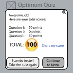
-
- Quiz – total scores
-
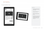
- Video page
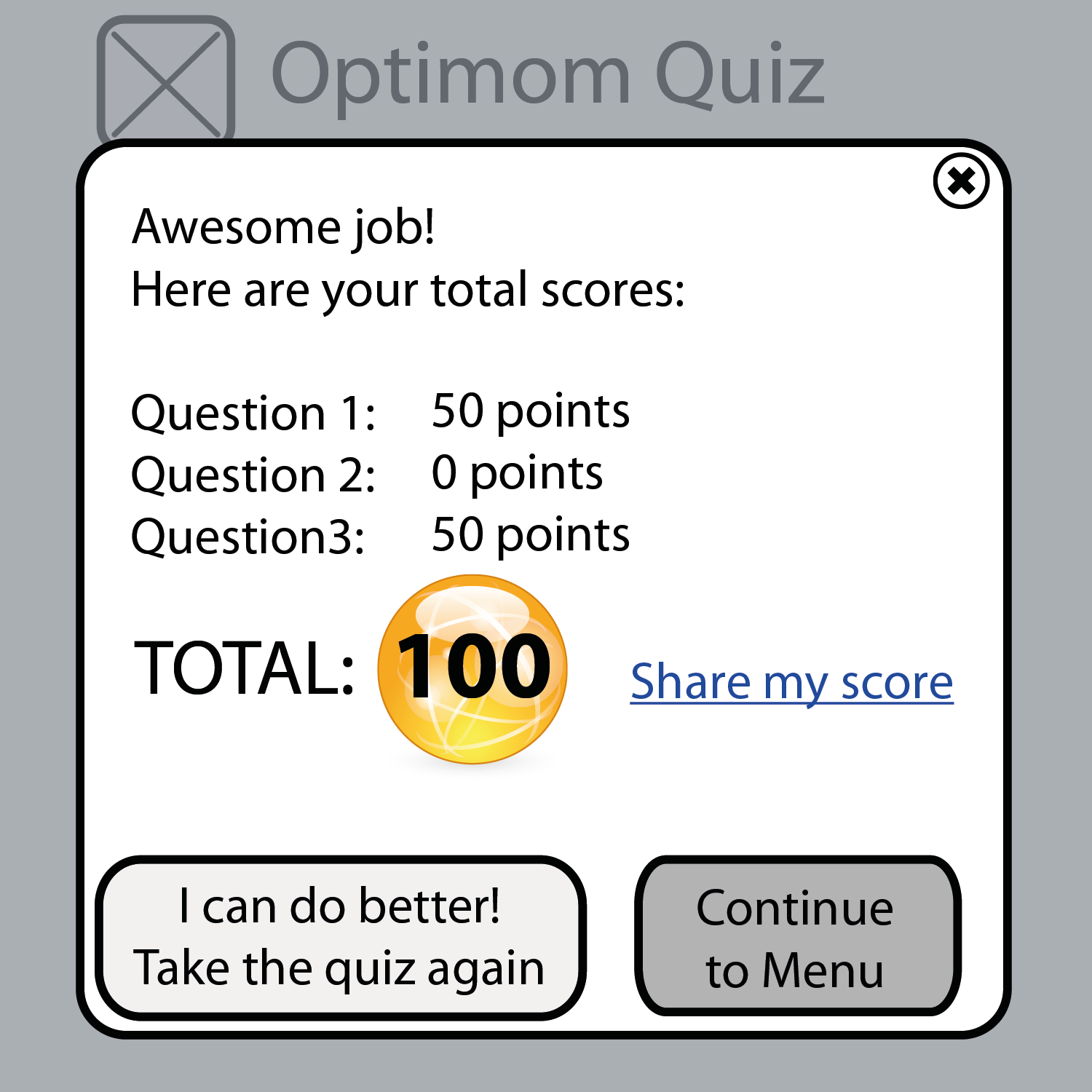
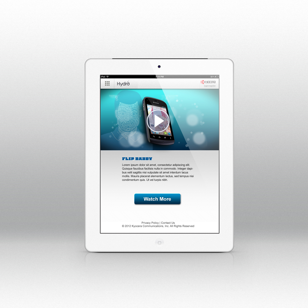
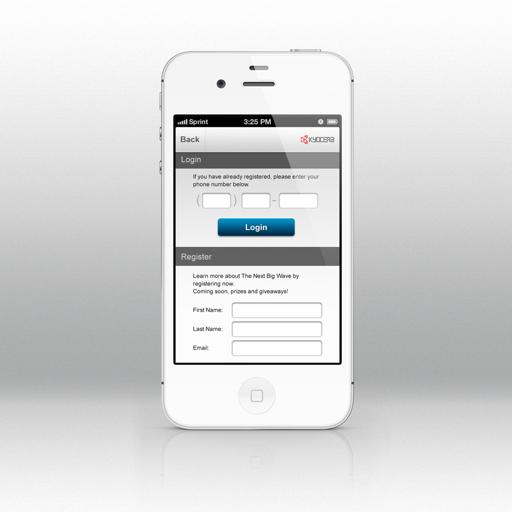
The visual designer mocked up some lovely high-fidelity visuals so that our client would have a good idea of what the final product would look like.
-

- iPad version
-
- Sign In page
-

- Video page
