UX Sketching
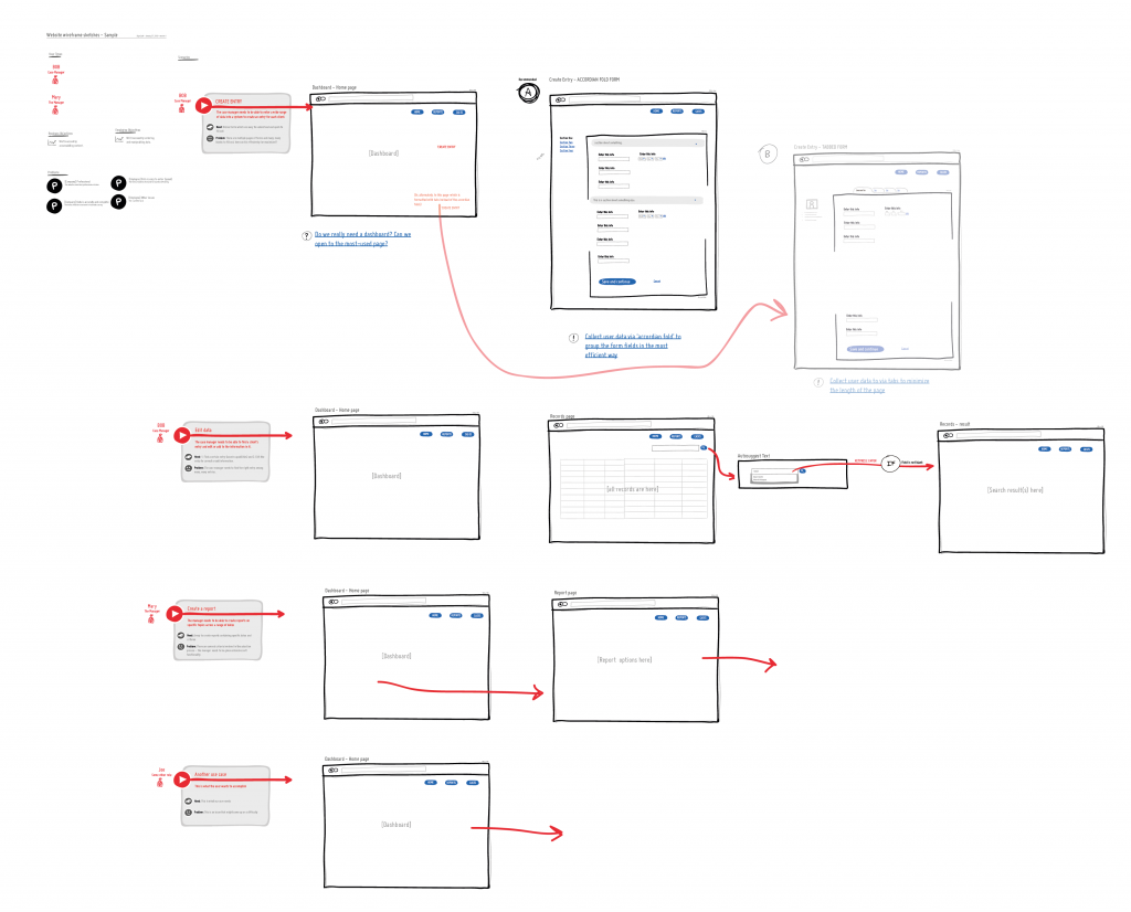
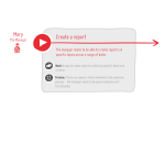
This is the process I prefer to use in tackling user experience and user interface projects – UX Sketching is a visual manifestation of my process.
This project could involve:
In a perfect world, every project I did would have a similar flow:
- 1. User research and discovery of insights.
- 2. Strategy creation. This can include identifying the top 5 tasks, writing up business strategy and/or market research, discovering user objectives, or running a contextual enquiry to identify any issues with an existing product.
- 3. Create personas and identify user journey and flow through the app/wireframe (including alternate flows)
- 4. ‘UX sketching’ (process illustrated above) to unify all the UX assets together in one document
- 4b. An interactive or clickable wireframe is often useful, especially for marketing and early user testing.
- 5. Formal on-the-grid user interface documents (wireframes with annotations) for the purposes of development requirements. This phase is best done in close conjunction with the programmer of the interface.
- 6. After a minimum viable product is produced, user testing and validation would be utilized to continually refine the user interface.
Many companies I work with use my skills a la cart, utilizing me for various parts of this process. I can certainly work within whatever business constraints exist.
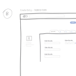
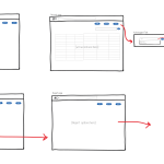
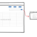
The interactive sketching notation is an emerging visual language which intends to enable designers to tell more powerful stories of interaction. Through a few simple and standardized rules, what the user sees (drawn in greys and blacks) and does (drawn in red) are unified into a coherent sketching system.
Jakob Linowski
I enjoy Mr. Linowski’s way of sketching out ideas for 4 reasons:
- I can work fast but not messy
- I can combine 4 essential UX assets: personas, business and user objectives, user stories (scenarios / journeys), and UI wireframes.
- I can make user actions and flow the focus, not static graphics
- I have the ability to easily iterate on different interface patterns.
A big thank you to Jakob Linowski (of Wireframe Magazine) who pioneered this ‘Interactive Sketching Notation’
Watch his video here »
CLOSE-UPS OF UX SKETCHING (Please click on the slides to enlarge):
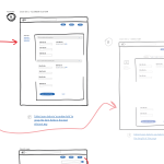
- Form – Preferred and Alternate
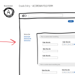
- Preferred – Accordion Form
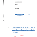
- Accordion Form Annotation
- Alternate Form – Tabbed
- Sort and Search
- Smart Search
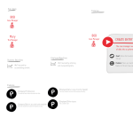
- Objectives
- User Scenario

