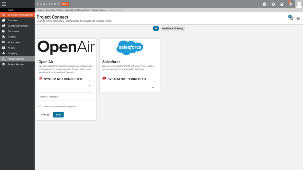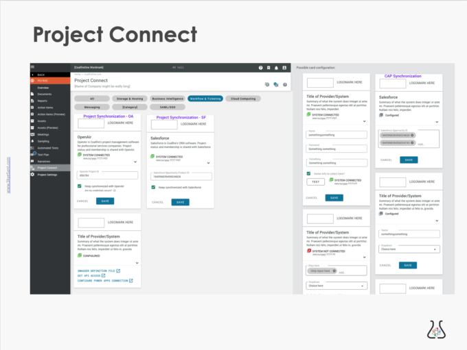
EXAMPLE: Complex –> Clear [Project Connect]
Helping the average Jo get their work done efficiently.
GOALS:
- Overall: Create features in a current cybersecurity platform for more efficiency and time saved. Goal: ‘modern & usable’ while being coherent with existing UI.
- ‘Project Connect’ Page: Help an average person connect with their existing system via API to ‘hoover’ in exactly the data they need, easily, in order to upload it directly to our platform.
Executive Overview
- COMPANY:
- This company is a mid-level company with standard digital/UX maturity.
- ROLE: Director of UX/ Product Design
- Leader: Hired to create the first internal UX department in this company, I formally managed a 3+ person UX team. I also created product design strategy and vision and fostered cohesion through communication.
- Individual Contributor: As a senior product designer I pitched in to do UX & UI functions while teaching my team to do User Research, Interaction design, and User Testing
- ABOUT:
- Our clients needed to give us large quantities of company-specific information (eg the names & locations of all their servers).
- Legacy form: export a spreadsheet with data from an existing system – manipulate, sort, exclude columns and send in email. (Usually done by IT guys only)
- GOALS:
- Overall: Create features in a current cybersecurity platform for more efficiency and time saved. Goal: ‘modern & usable’ while being coherent with existing UI.
- Project Connect: Help an average person connect with their existing system via API to ‘hoover’ in exactly the data they need, easily, in order to upload it directly to our platform.
- SOLUTION: Create a central place to connect to APIs, and walk the user through uploading data to our system.
- Talked to the devs/ IT people using APIs – identify difficulties
- Insight: highly technical and exacting, multi-step, credentialed
- Paper mockups and Design Sprints helped create an initial design. Evolve to clarity through ethnographic observation.
- Design:
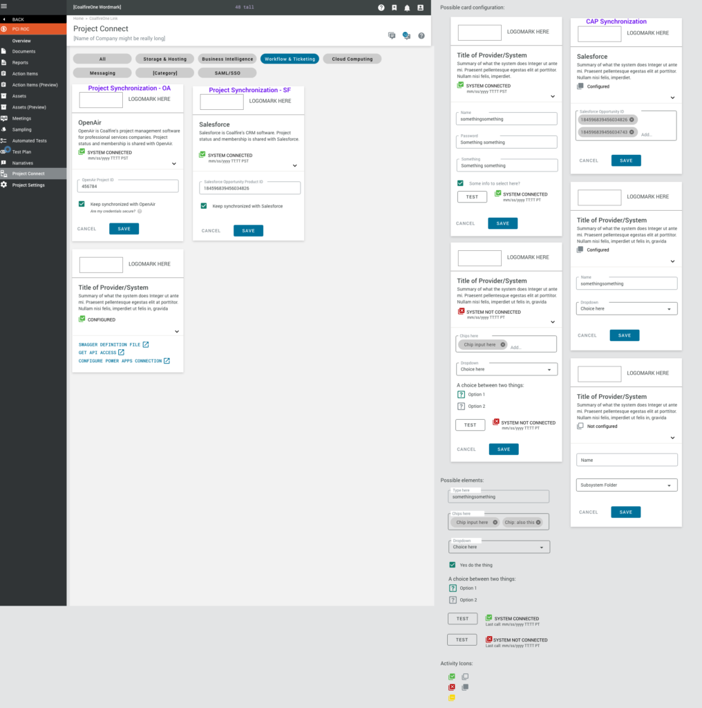
- Create Project Connect page to store and set up API connections
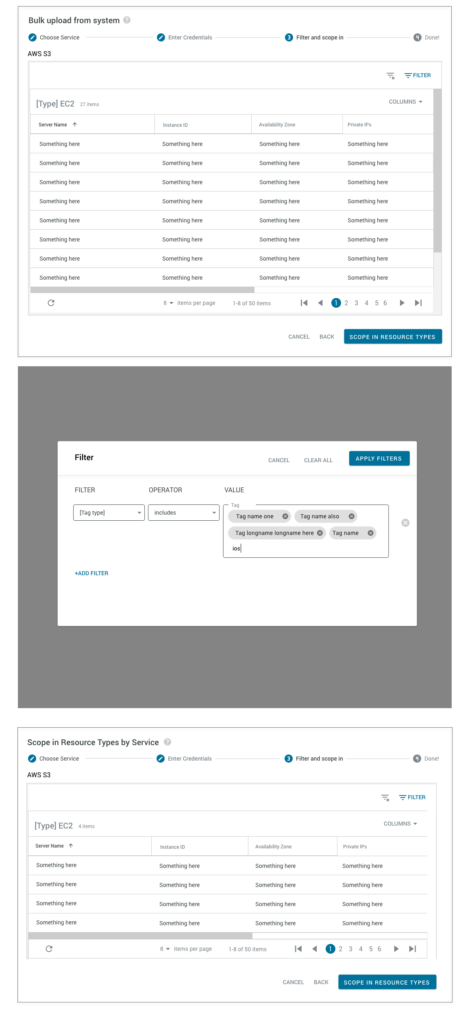
- Create stepper to upload data from the existing system to our platform (make choosing the right info easy)
- Informal validation: ‘hallway testing’ and customer feedback to qualitatively judge ease of use. (less helpdesk calls, less assessor time spent here, lower the bar for use = increase efficiency and efficacy)
- Extend: More API connections, Help system documentation, add to Pattern Library
- Talked to the devs/ IT people using APIs – identify difficulties
- OUTCOMES:
- Timeline: 2-week research sprint
- Qualitative: given the ‘ol thumbs up by 6/6 assessors tested (hallway testing)
For more details, see each tab.
Through interviews with subject matter experts and competitive reviews we teased out the necessary workflow and the priorities of components. Because this was new functionality and we had no previous forms, there were several interaction patterns to choose from.
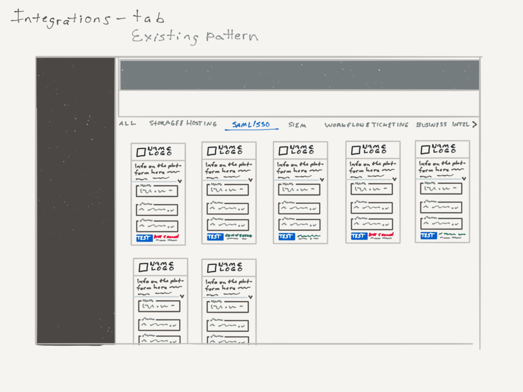
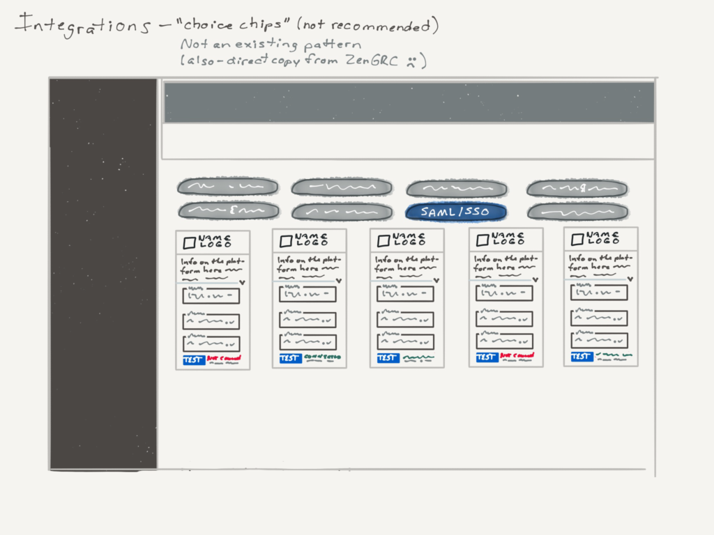
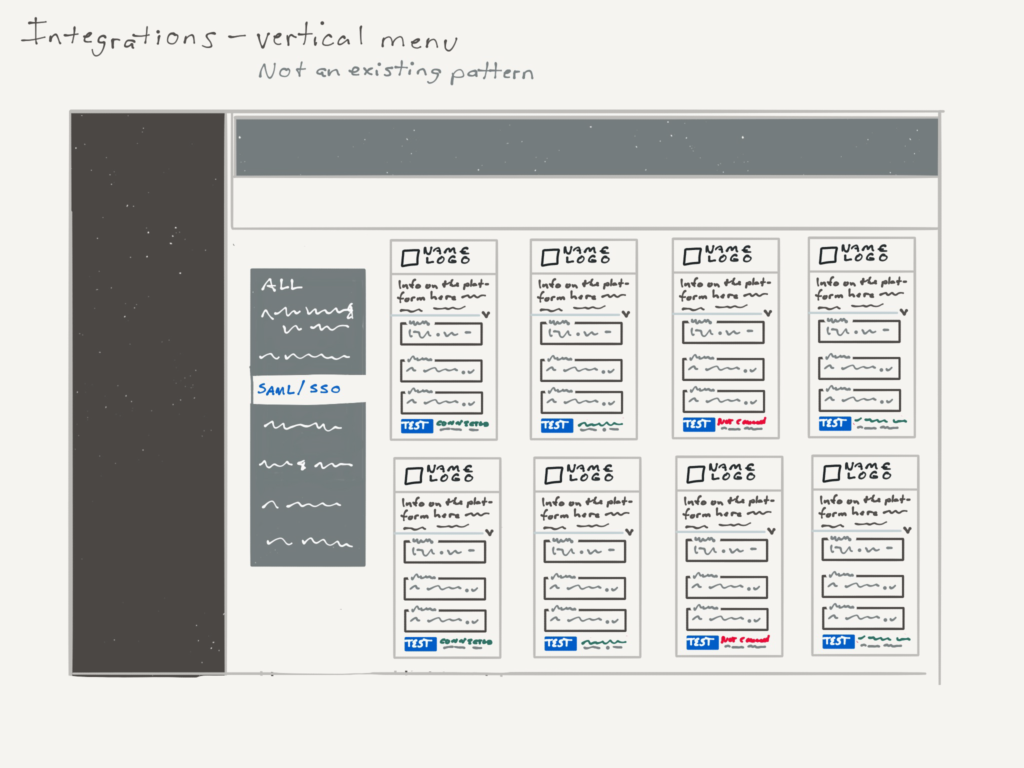
In the end, we used a ‘choice chips’ pattern to surface similar groups of APIs.
After the Project Connect was set up, the user could upload data directly from their existing machines.
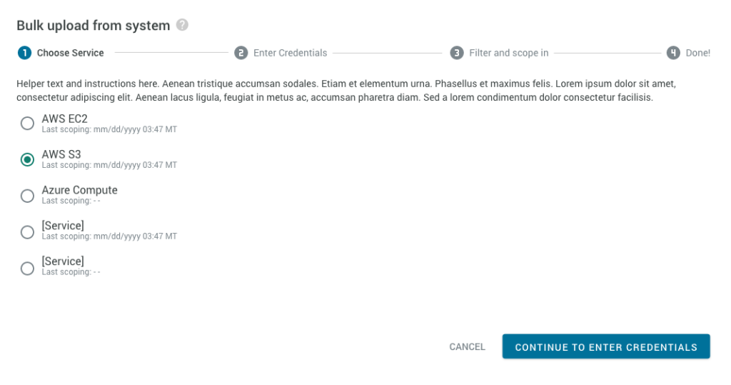
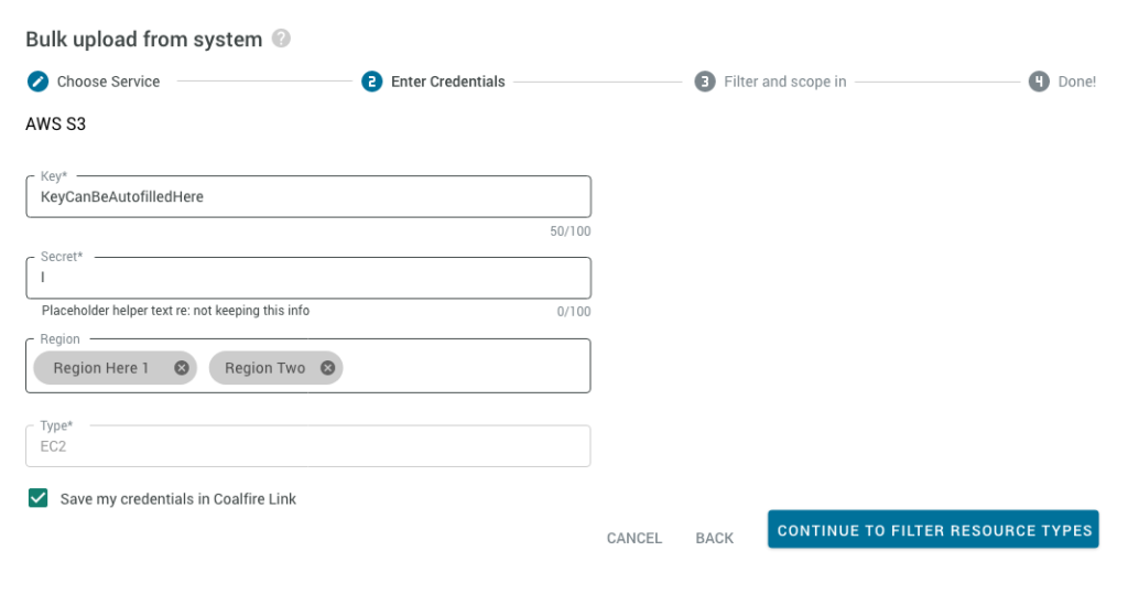

Screenshot of our MVP
