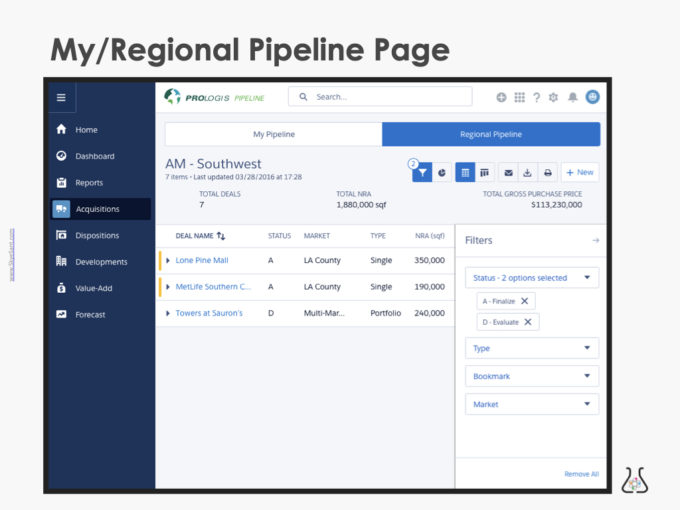
EXAMPLE: Mockup –> Production [My/Regional Pipeline]
The My/Regional Pipeline page is an example of the process involved in going from mockups to a final UI in production
Executive Overview
- COMPANY:
- This company is a large enterprise multi-national company with low digital/UX maturity
- ROLE: Director of UX Strategy
- Leader: Hired to create the first internal UX department in this company, formally managed a UX team and informally lead other cross-functional personnel. Also created product design strategy and vision and fostered cohesion through communication
- Individual Contributor: As a senior product designer, pitched in to do UX & UI functions while teaching my team to do User Research, Interaction design, and User Testing
- ABOUT:
- Capital Deployment is the decisions the company makes about where to spend money – buying, selling, improving, or developing land or buildings. The My/Regional Pipeline page is a place to see what stage decisions are in and therefore estimate deal completion and money flow.
- Legacy form: Personal spreadsheets, emailed and consolidated.
- GOALS:
- Create a tool to gather the info from the agents in the field and surface it in an ‘always up to date’ (and transparent to the whole business) digital platform (spreadsheet –> digital tool)
- Make a page that distills the complexity of multiple deals across many geographies more clear (for the purpose of discussing, updating and showing WIP in a large meeting)
- SOLUTION:
- Designed for two personas in mind: Agent (enter + move deals along) + Executive (evaluate, motivate and advise) across a diverse global geography
- Using mockups, interactive prototypes, and an in-production MVP, we ran ethnographic user tests to correct our designs (increase usability, respond to the business and work around technical constraints)
- We pivoted to use Salesforce (lightning) instead of custom design
- Evaluated as part of the CDP Pipeline
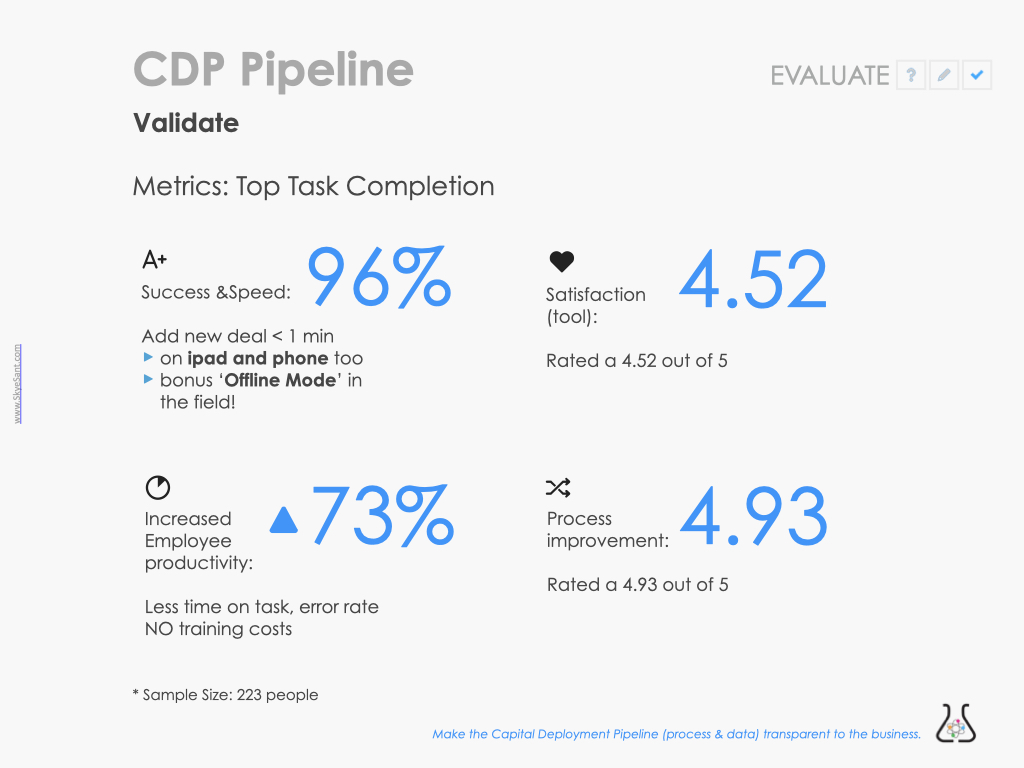
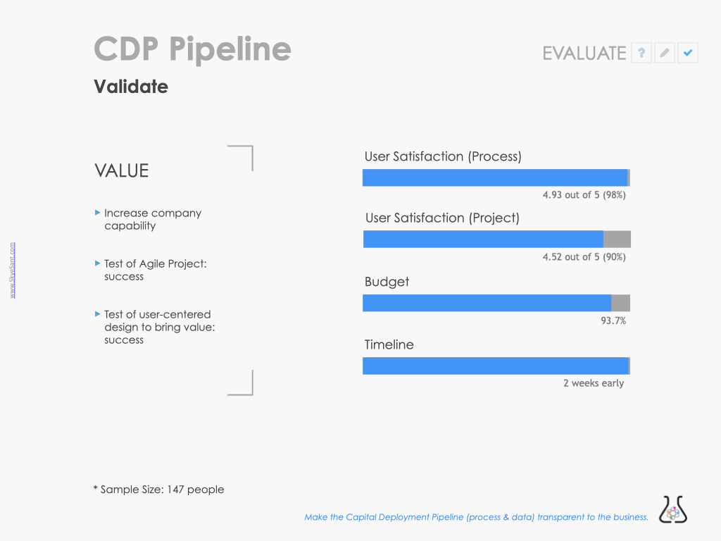
- OUTCOMES:
- Timeline: 6 months (overlapping test/development), on time and on budget
- Quantitative:
- 96% Success (add new deal <1 min)
- 73% Increase employee productivity (less time on task, error rate, training)
- 4.52/5 Satisfaction rating (tool)
- 4.93/5 Satisfaction rating (Process improvement)
For more details, see each tab.
Experience and Design Principles:
User Centered Design:
Make a tool by and for the field.
Modern UI:
Clean and coherent with existing patterns
Ease of Use
Transparency of Data:
Visible, up-to-date, clear data
Mockup 1 –> mockup 2 –> interactive prototype
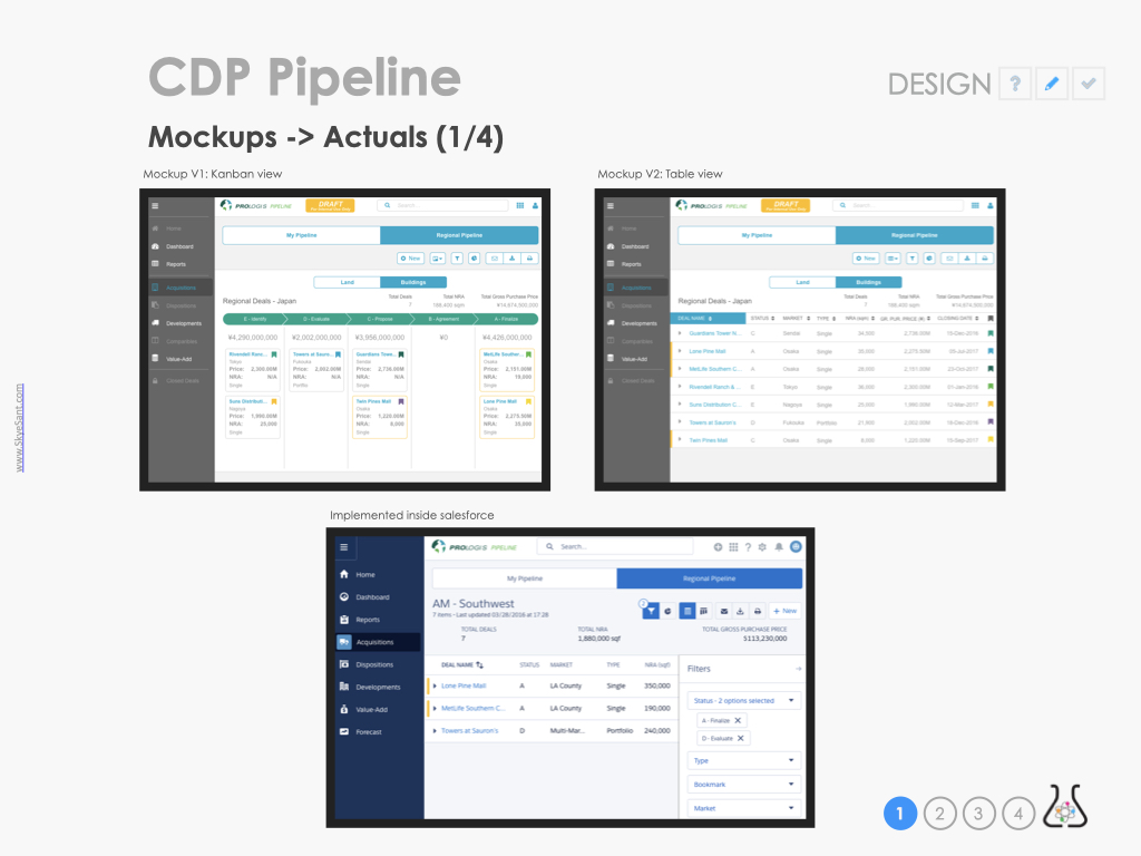
The starting design mockup, a Kanban board.
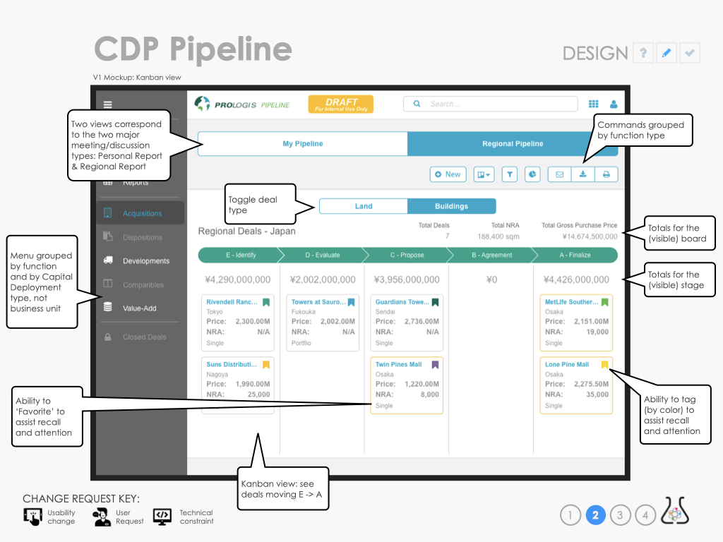
On the top, there are two views available via toggle
Below this, functions grouped by type
On the page itself, Another toggle to select the deal type
Totals visible across each segment of the board
Under each deal phase are cards, with the ability to tag and favorite them.
After doing ethnographic usability testing throughout the US, changes were made because 1. improved usability 2. by request of the business 3. because of a technical constraint/opportunity.
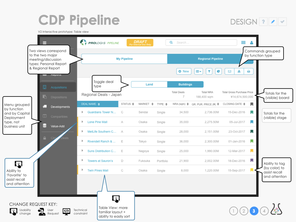
This meant we lost the ability to easily see totals for each stage.
There was a pivot here to use Salesforce (lightning) instead of the low-code platform we were planning on. This caused some design changes due to technical constraints and opportunities.
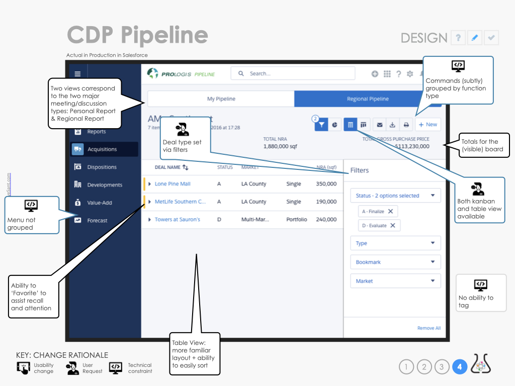
Note:
– On the Left, the nav is grouped differently, by business unit, and the commands on the top of the page are using a default salesforce pattern
– On the top, there are two views available via toggle but the ability to group by deal type is now in a filter.
– The ability to tag isn’t supported so was removed.
Ethnographic testing was done using InVision and Lookback. The business, devs and product people really enjoyed seeing people interact with the tool.
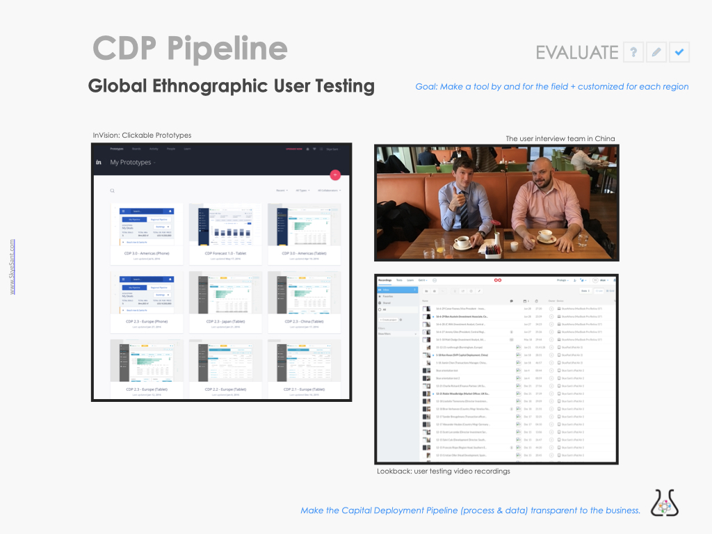
– On the right, videos of users running through the usability test
The Regional Pipeline page was evaluated as part of the CDP Pipeline.