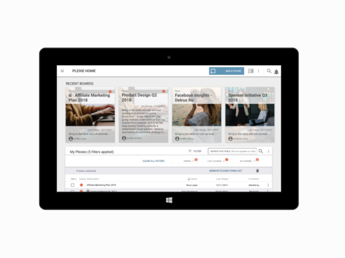
SYNOPSIS: Plexie (communication)
As Xyleme’s first digital product designer, I worked under the CEO to establish an internal ‘innovation lab’, create the initial agile team and then we designed and brought to beta an ‘informal learning app’ (Plexie) in under a year.
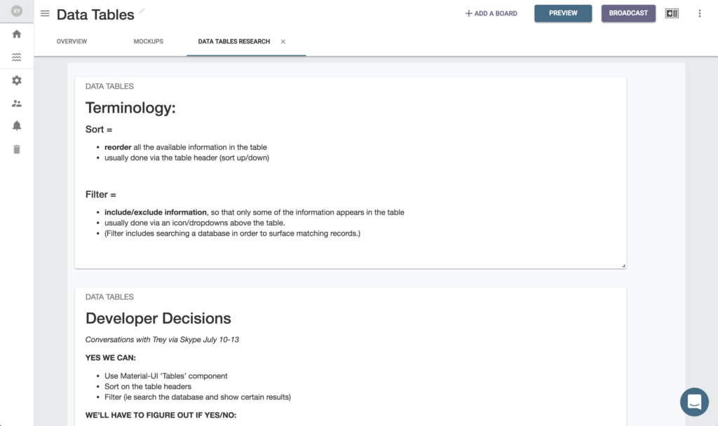
Plexie is an early-stage startup that aims to create an online team collaboration and knowledge sharing platform that isn’t just pages of text, long time-sensitive chat logs or list of tasks – Plexie will help teams collaborate in a more thoughtful, human way to inspire community, cohesion, and understanding
This internally-focused project involved:
STAGES
- User Research
- Product Strategy
- Dashboard Research
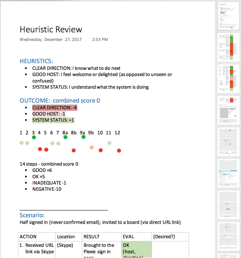
- Heuristic Evaluation
- Gamification Research
- Sitemap, Data Mapping
- User Journeys
- Flow, Concept, and Process Mapping
- Information Architecture
- Conceptual Illustration
- Iterative Wireframes
- Prototype (interactive)
- Final Visuals
- Prioritized Roadmap
- Development – user stories, etc
- User Testing (validation)
- Multiple Presentations to Stakeholders
TOOLS
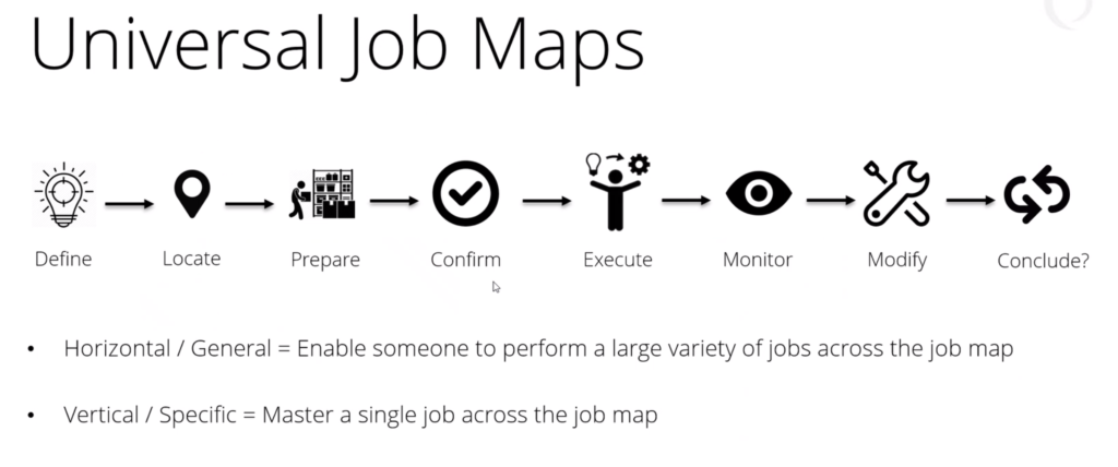
- User Research/ Interviews: Jobs To Be Done framework
- Pattern Library (created)
- Illustration
- Illustrator/Photoshop
- Sketch App
- Annotated Wireframes
- InVision App (Interactive Prototype)
- Lookback (user research screen recording)
- LucidCharts
- PowerPoint
- Trello (project management)
- JIRA (development)
CONTRIBUTIONS
(as Executive UX Digital Product Designer)
- UX/Product Strategy: Skye Sant, Caleb Brunel, Greg Schottland
- BA: Caleb Brunel
- User Research: Skye Sant, Caleb Brunel, Plexie Team
- Illustration: Skye Sant
- Interaction Design: Skye Sant, Plexie Team
- UI Design: Skye Sant, Plexie Team
- Visual Design: Skye Sant, Plexie Team
- Product Owner (user champion): Skye Sant
BACKGROUND:
As opposed to other ‘transactional’ online collaboration and knowledge management tools that generate pages of text, long time-sensitive chat logs or list of tasks, Plexie facilitates ‘relational collaboration’ for teams working toward a shared goal – helping you create more complete and compelling content that illuminates the story of your work.
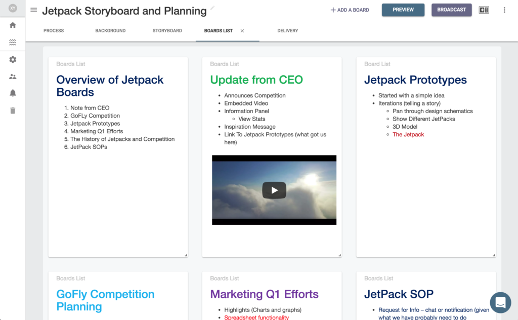
Plexie values personal autonomy and shared knowledge transparency, encouraging you to do your work wherever and however you want to and then helping you aggregate all the parts into a modern card-based interface to create a compelling story that will inspire community, cohesion, and understanding.
Plexie allows you to more easily inspire and persuade by illuminating the best story of your work.
PLEXIE: MOBILE DESIGN
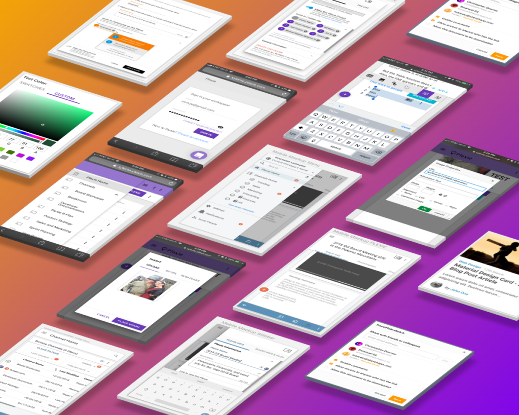
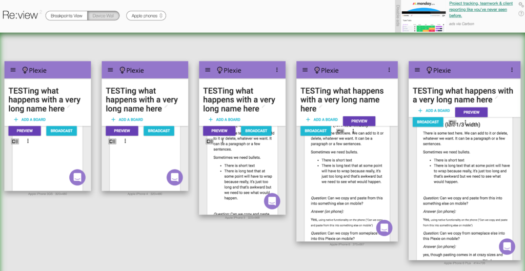
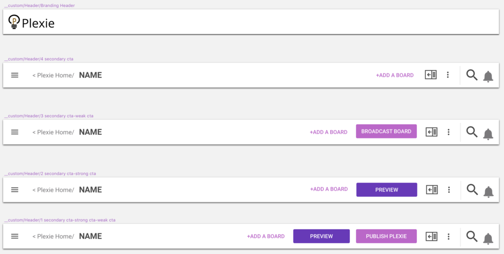
Because one of our core personas + use cases was a busy person using Plexie on a bus, we designed the mobile experience to allow someone to access the full Board on an iPhone or Android device. Just like on the desktop, we used Goggle’s Material Design guidelines so that the interface was uncluttered and calls to action were clear.
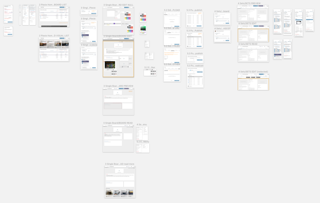
I designed the mobile, phablet, tablet, and desktop applications together, so they were entirely coherent across any number of form factors. Our first palette was a light blue and orange; this was later changed to purple and blue.
Some example wireframes:
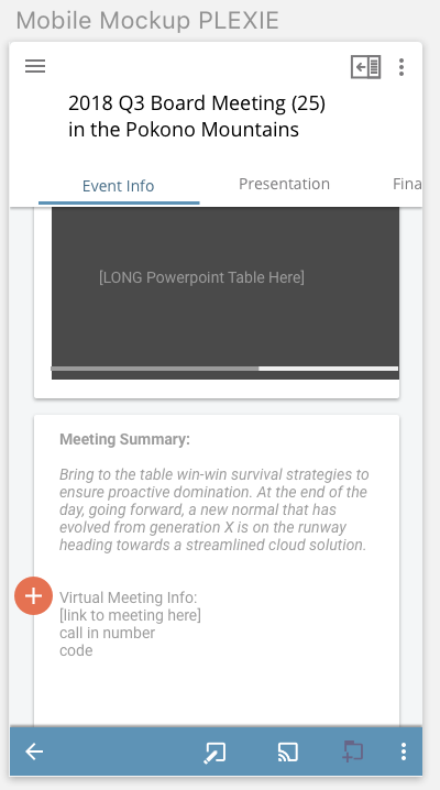
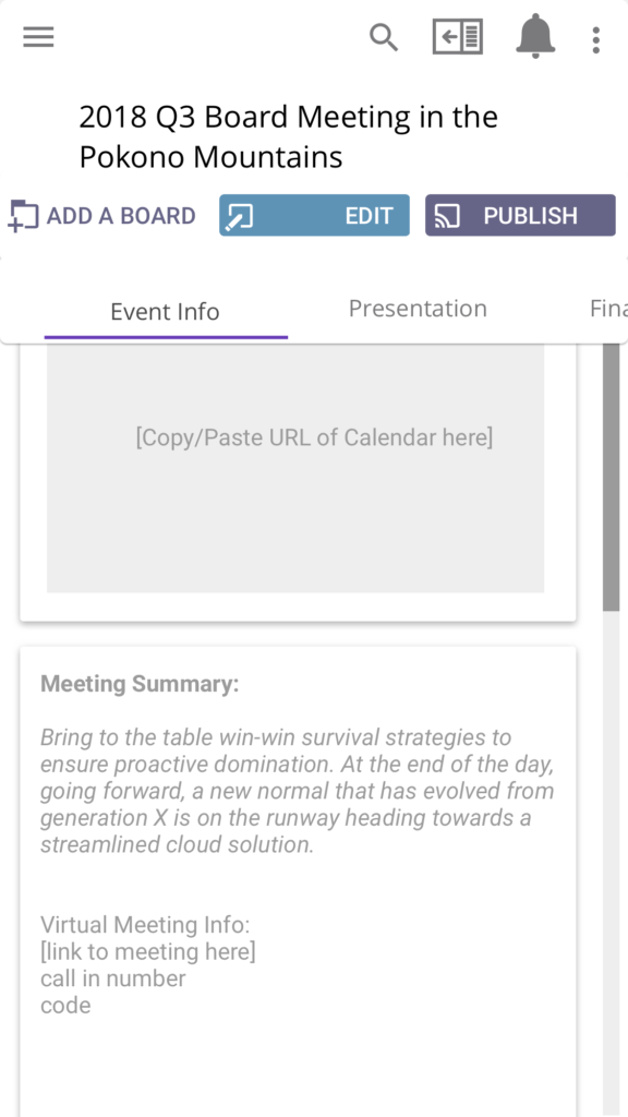
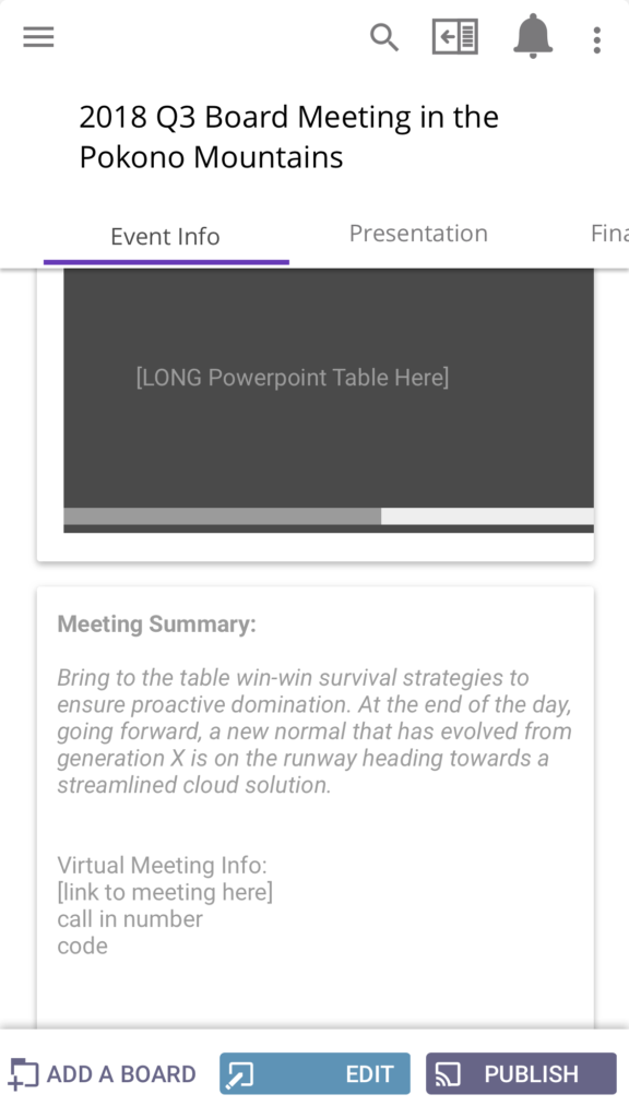
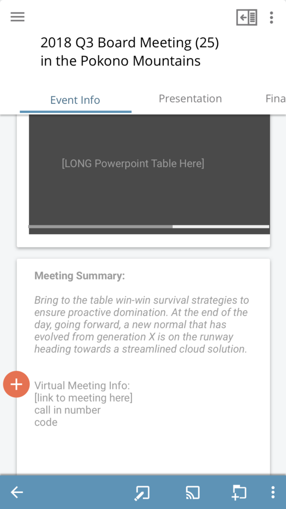
EVENT BOARD [wireframe]
This is a design for a Q3 Board Meeting Plexie Board (Android).
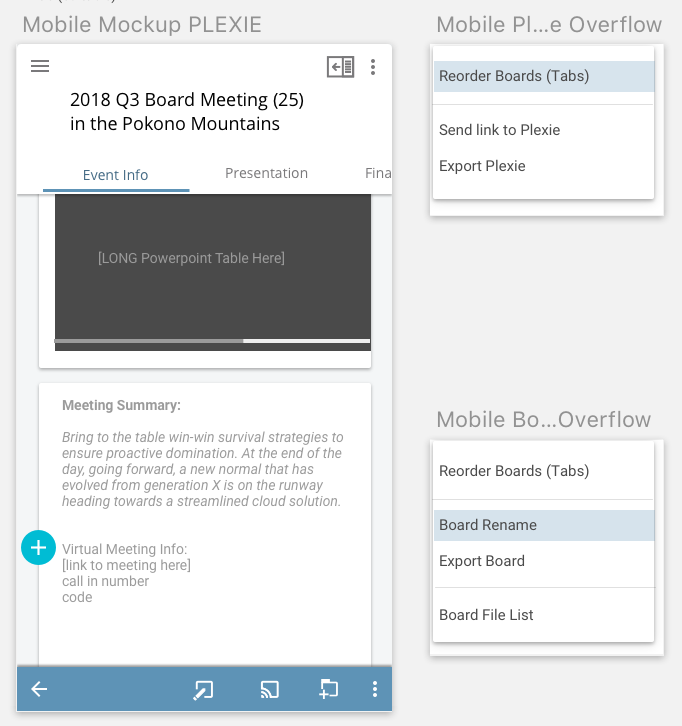
EVENT BOARD [wireframe with notes]
This wireframe of a Q3 Board Meeting (left) has notes showing the developers what the overflow menus look like (right).
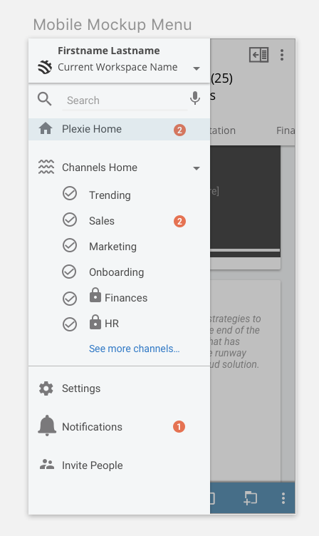
MOBILE MENU [wireframe]
Note that the menu needed several functionalities:
- change workspace
- Ability to go to the Home Page
- See Channels, with the ability to see/hide Boards (expand/collapse)
- Badges (in orange) indicating new unread boards
- Other pages – Settings, Notifications, Invite functions.

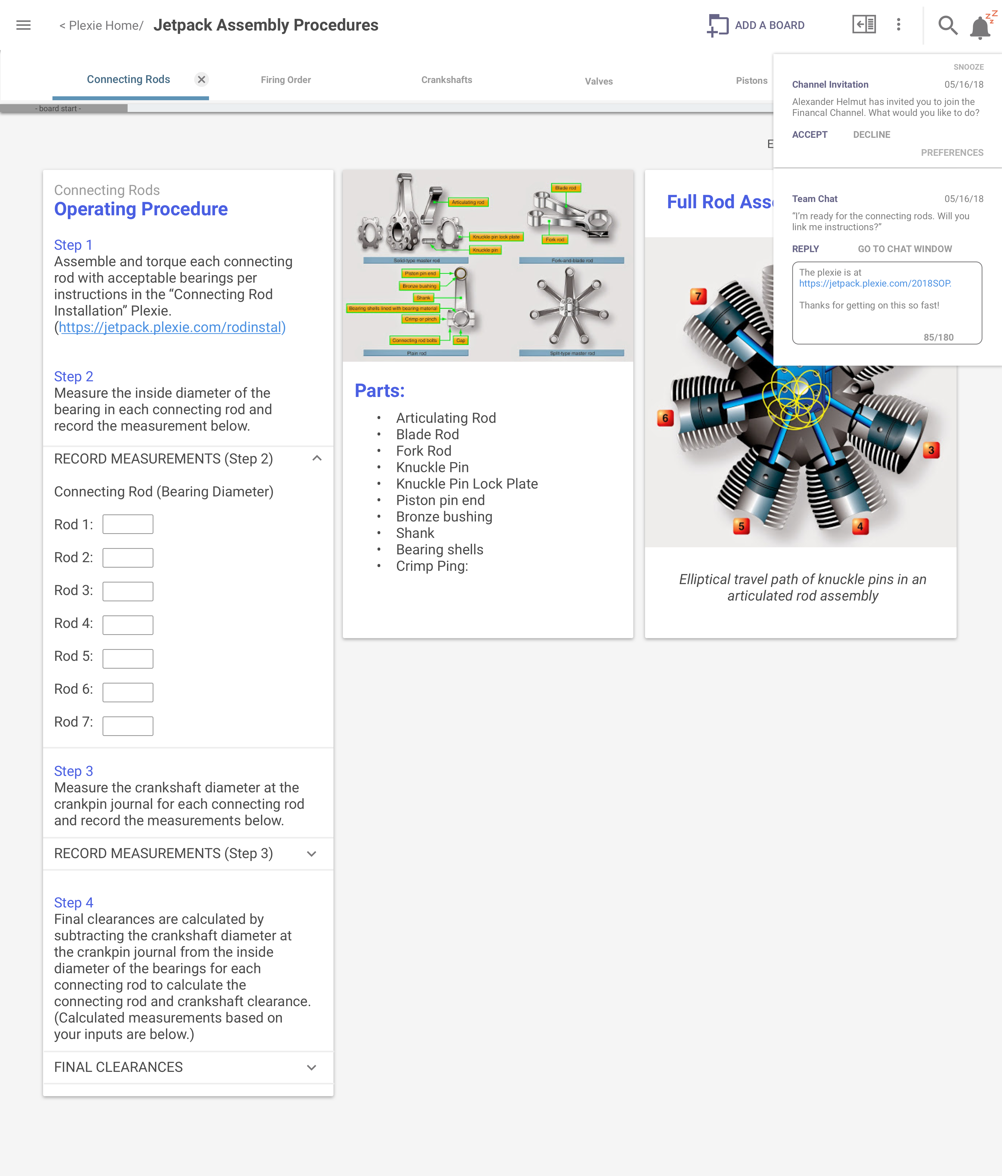
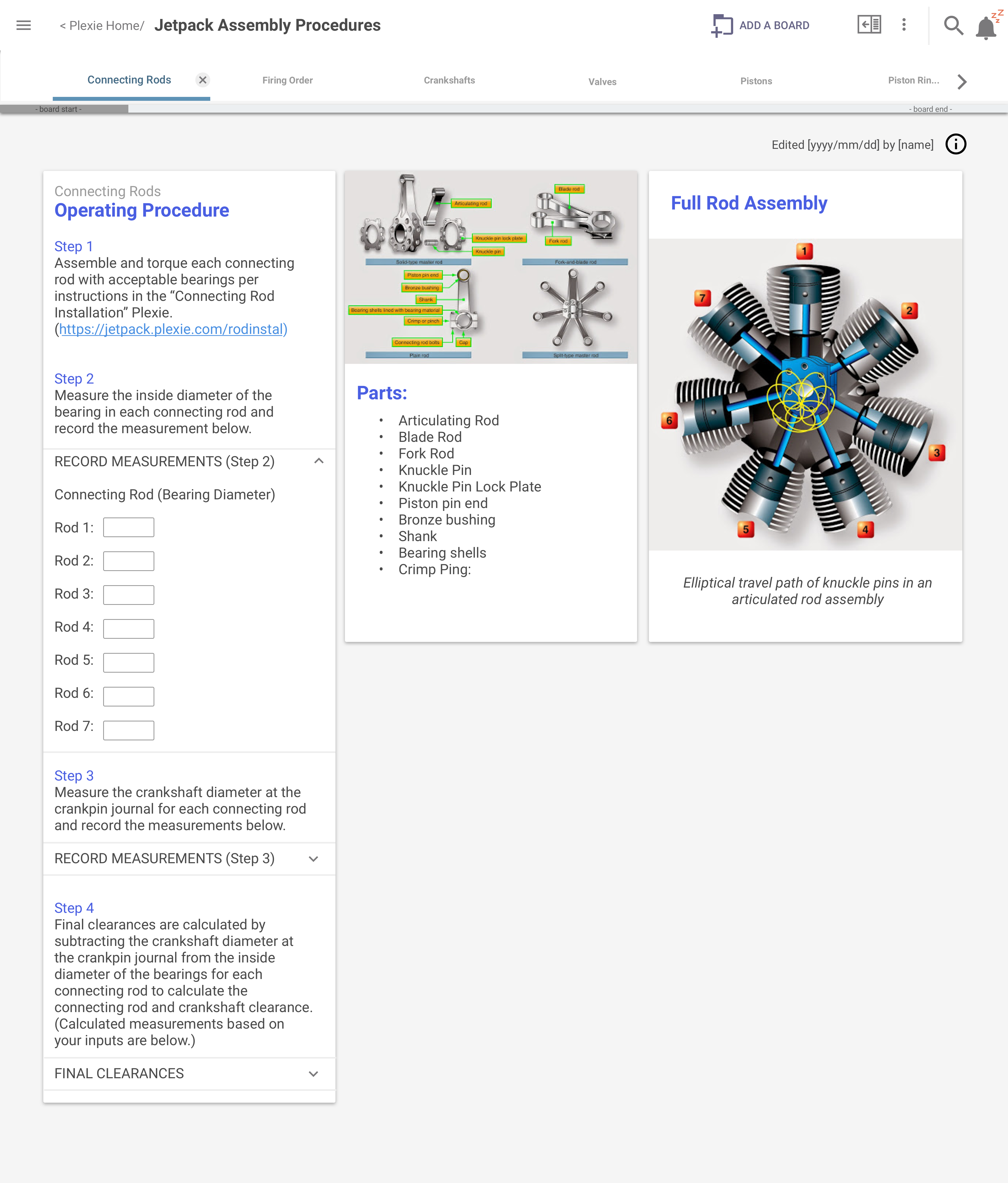
PROCEDURAL BOARD [wireframe]
Note that the way tabs work here is the same, functionally and visually, as they work everywhere else.
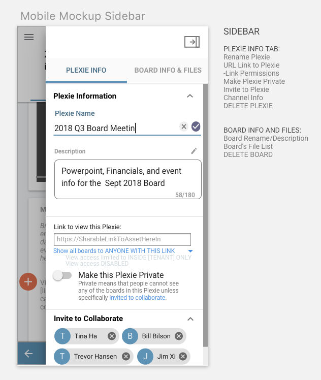
INFORMATION SIDEBAR [wireframe with notes]
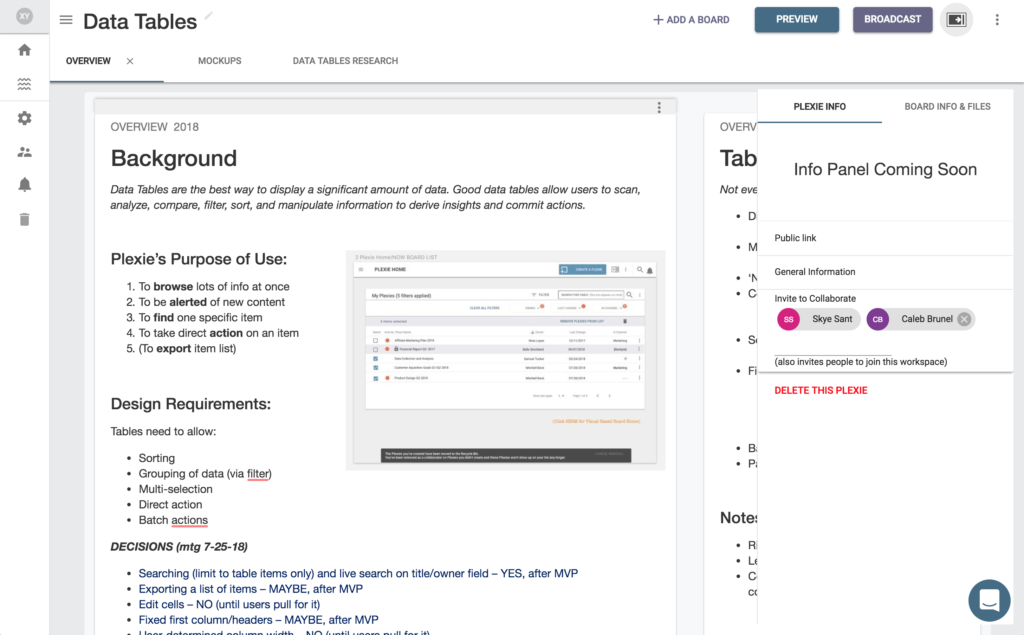
On the left is the design for the information sidebar where users can title their plexies and configure other settings.
On the right, the capabilities of this sidebar are listed.
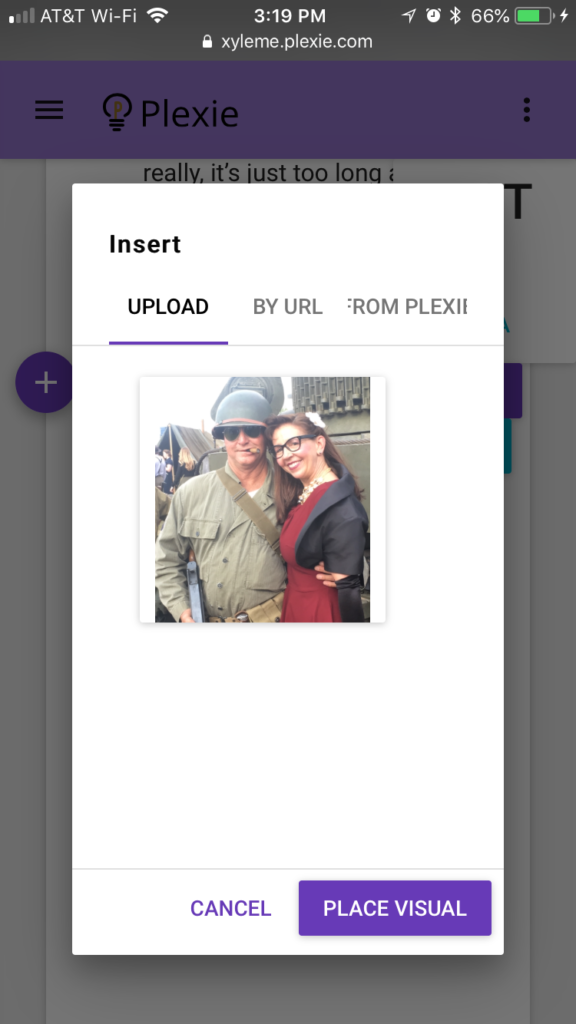
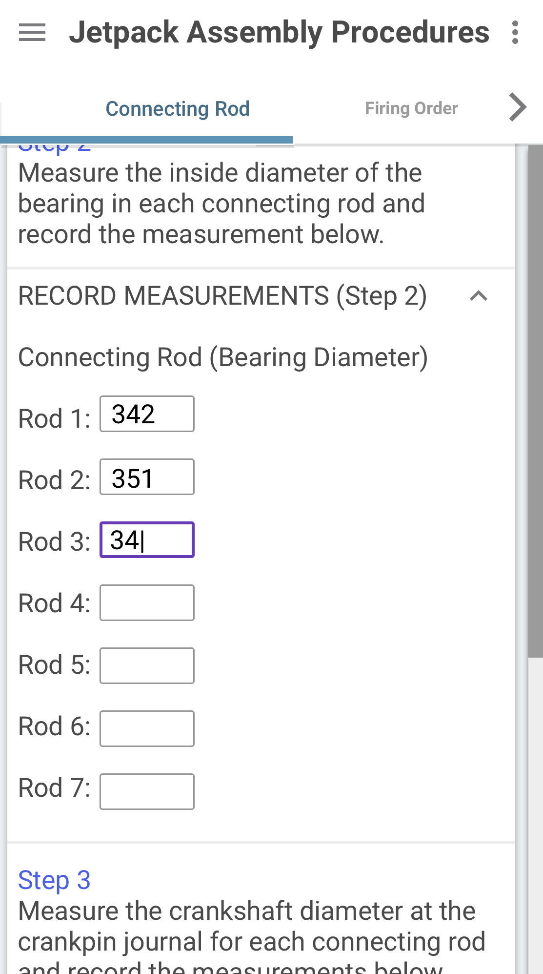
UPLOAD VISUAL [test]
Testing the upload functionality
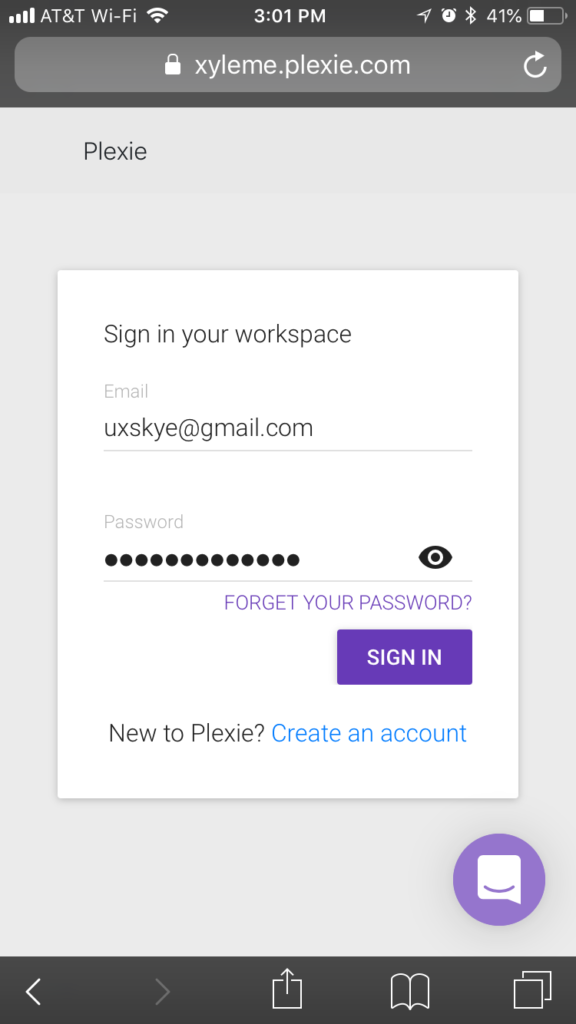
SIGN IN PAGE [test]
This was a simple sign-in page, without the background or visual design, in order to test functionality.
PLEXIE CASE STUDY COMING SOON
