SYNOPSIS: CF1 Dashboard
As Prologis’ first user experience product designer, I worked with the Head of Operational Strategy and the PrologisOne team to conceive and create the company’s first online operational and executive dashboards, used by the entire company and expanding to this day.
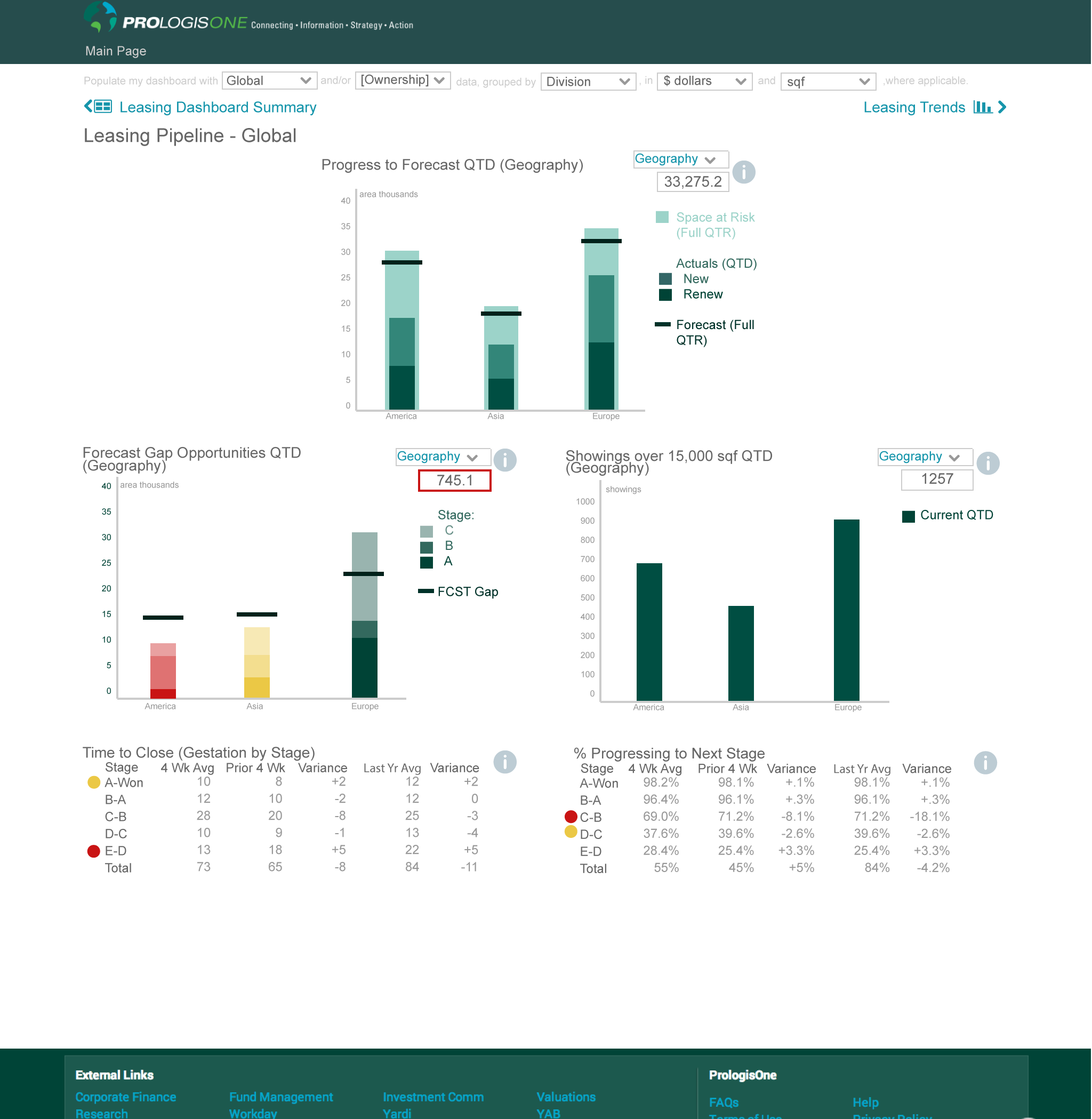
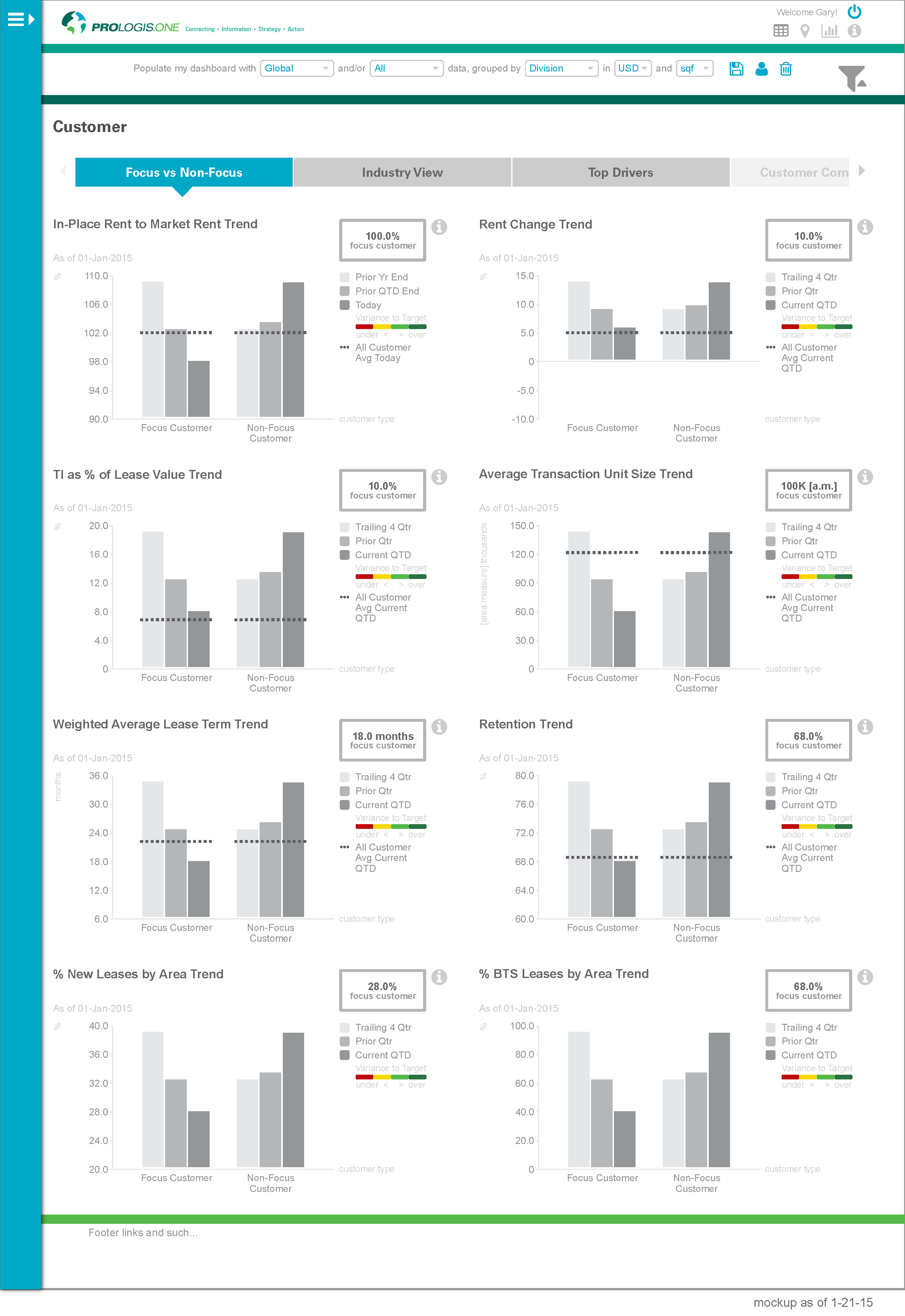
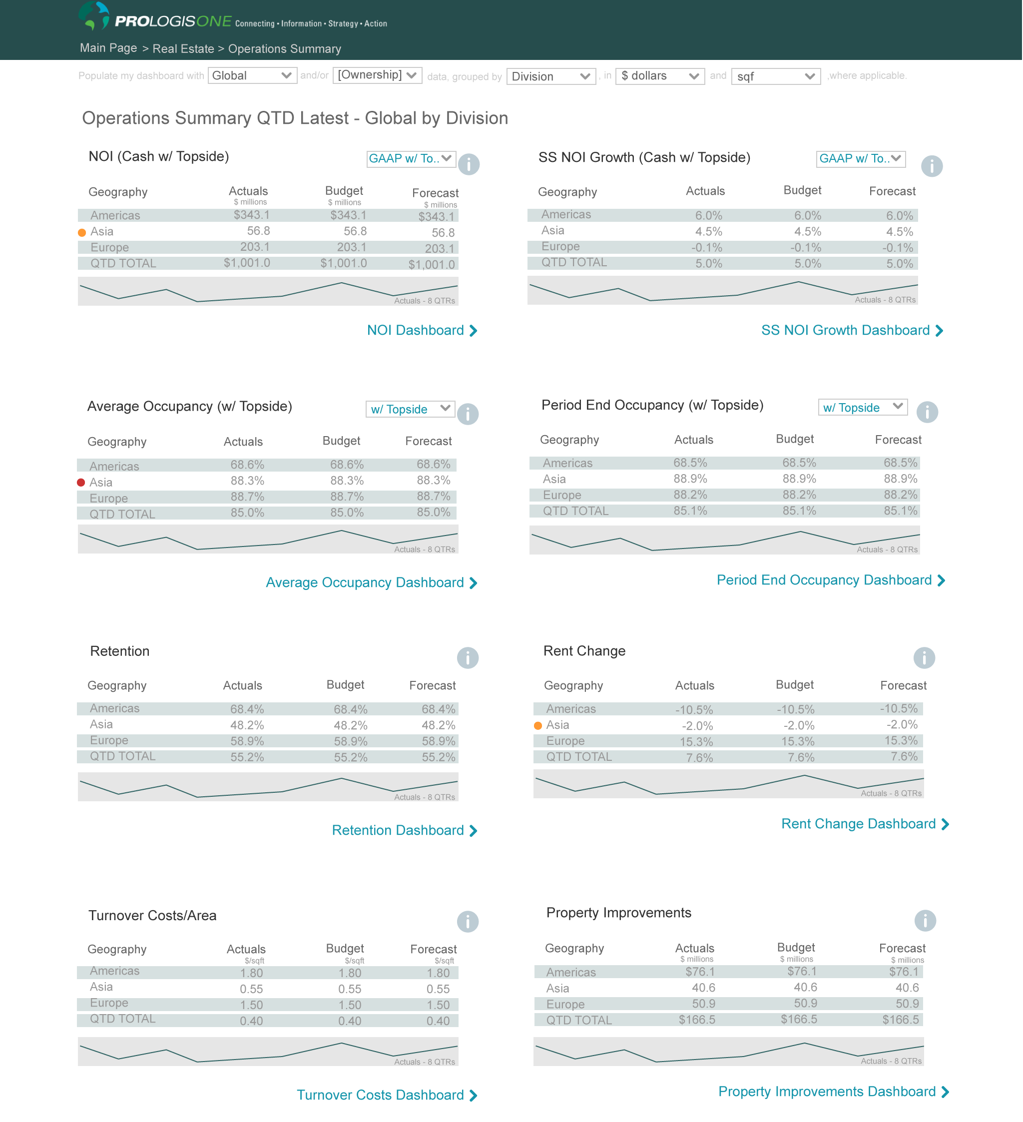
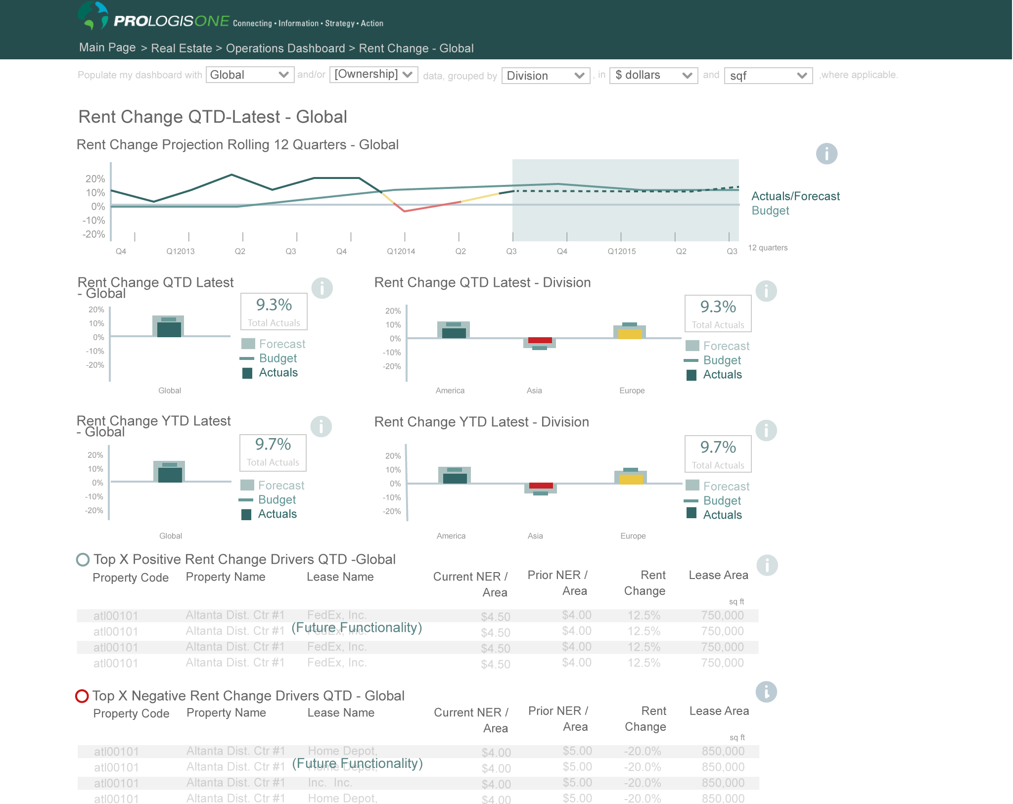
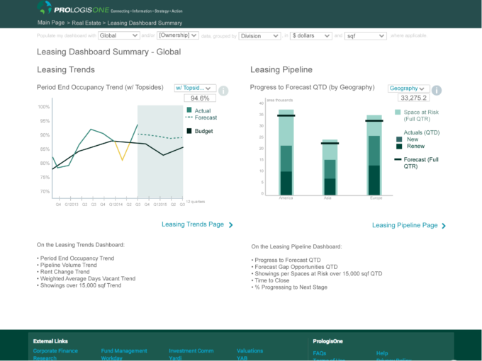
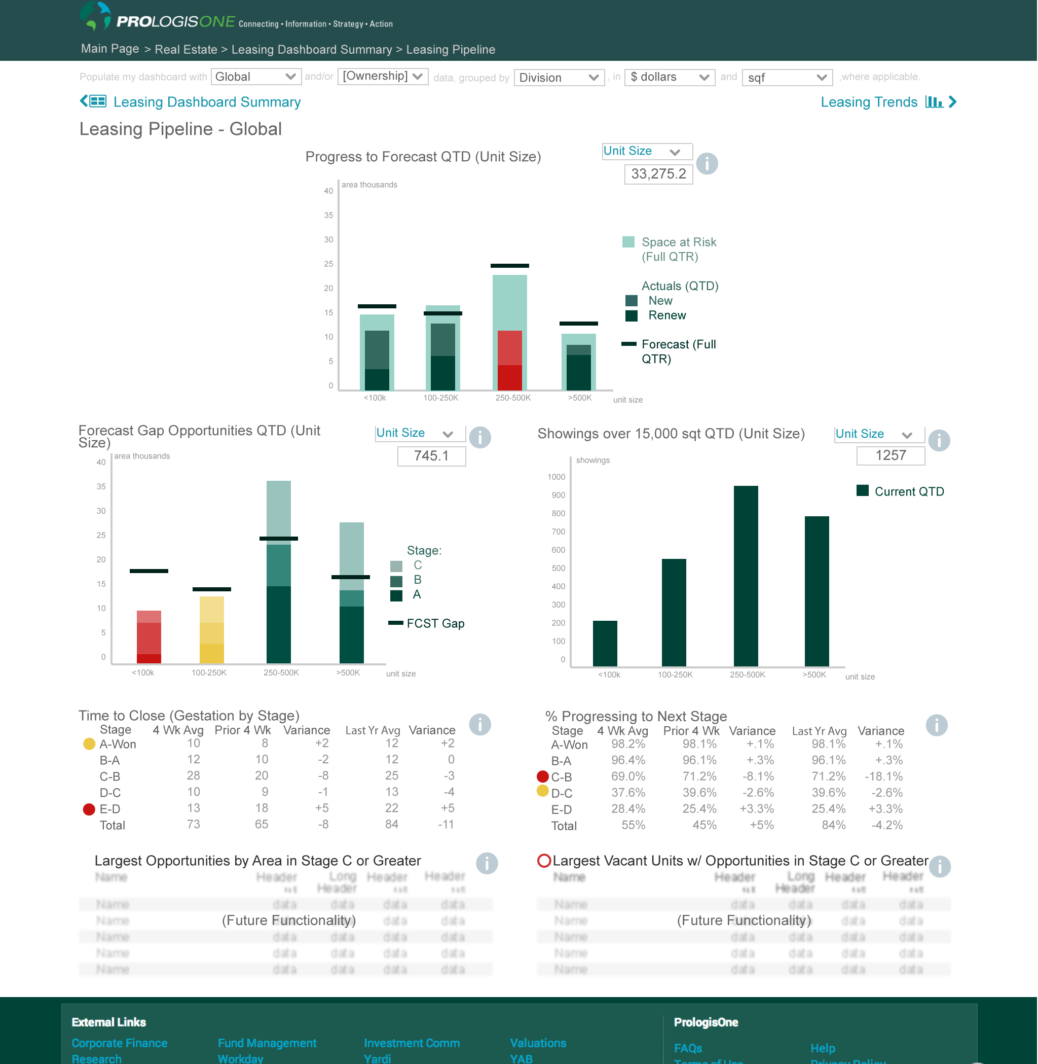
Instead of pulling the information from various sources and older Excel-based and other outdated formats, a central online dashboard provided internal employees the most up-to-date data in one convenient place and easy-to-use formats. The two most critical aspects of designing these dashboards were encouraging immediate situational awareness and surfacing context (to tell the whole truth).
Ultimately, this initiative grew to 5 component projects, accessed from the Control Dashboard, including:
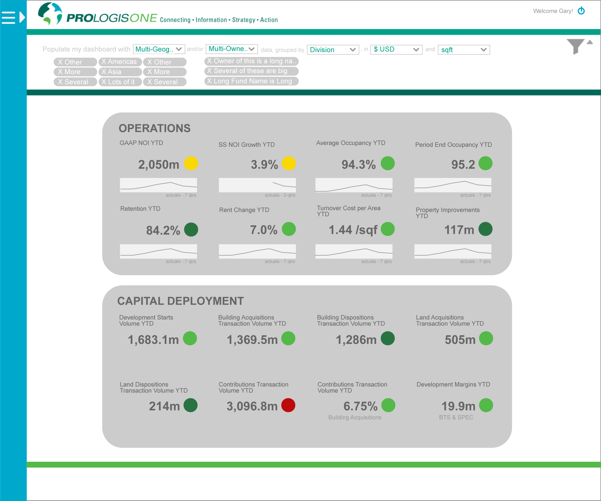
- Executive Overview (Control Dashboard)
- Operations
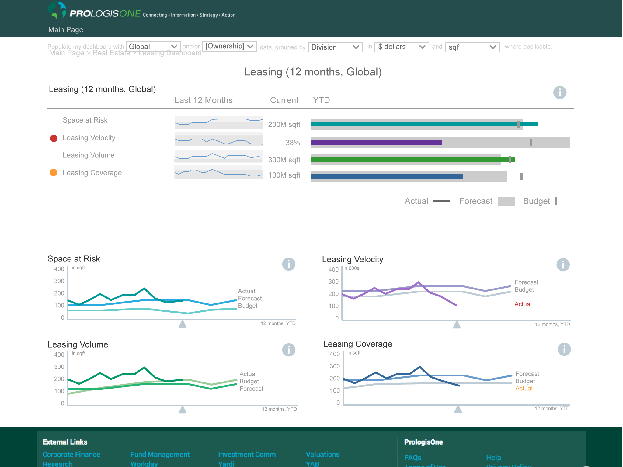
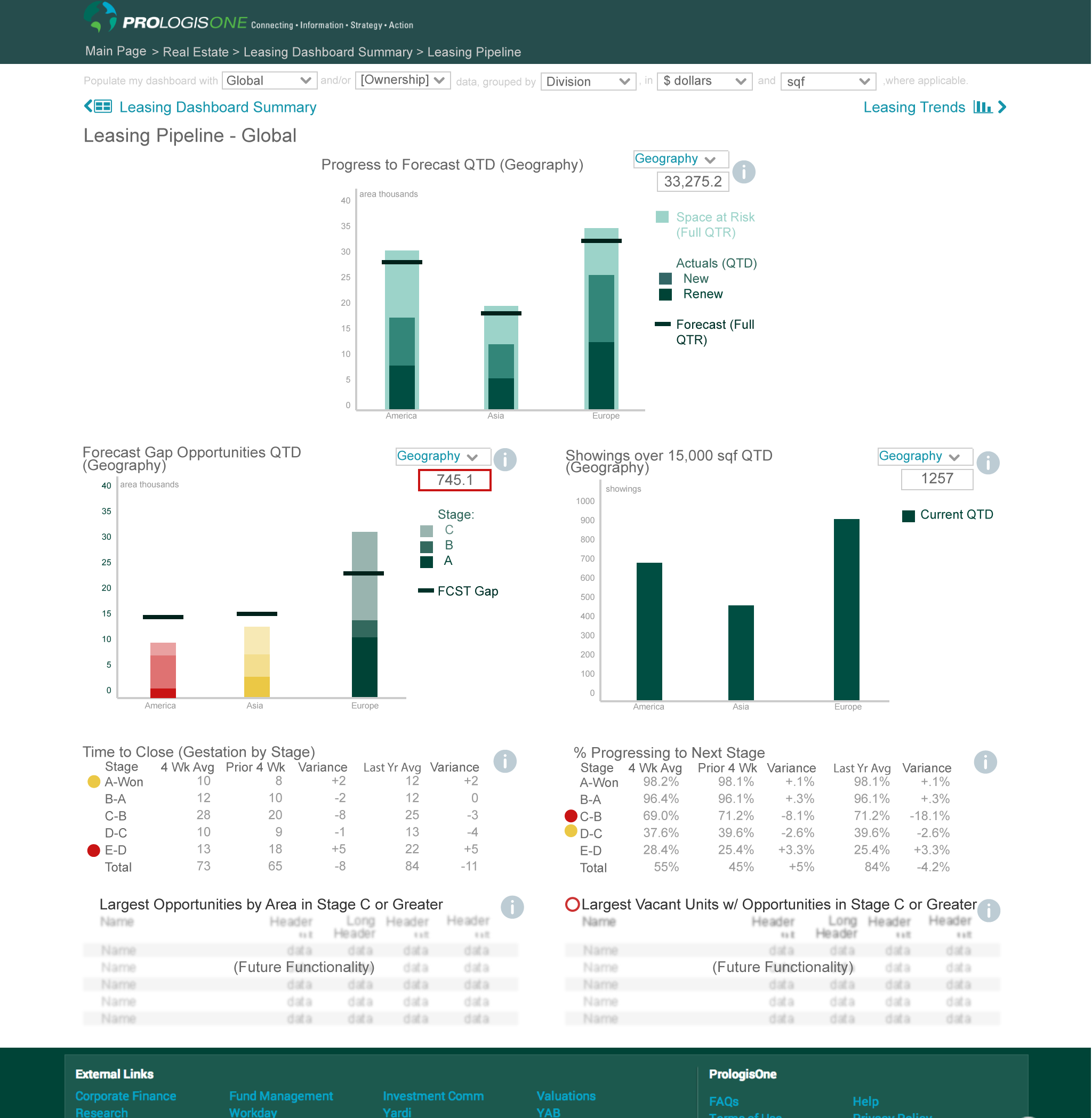
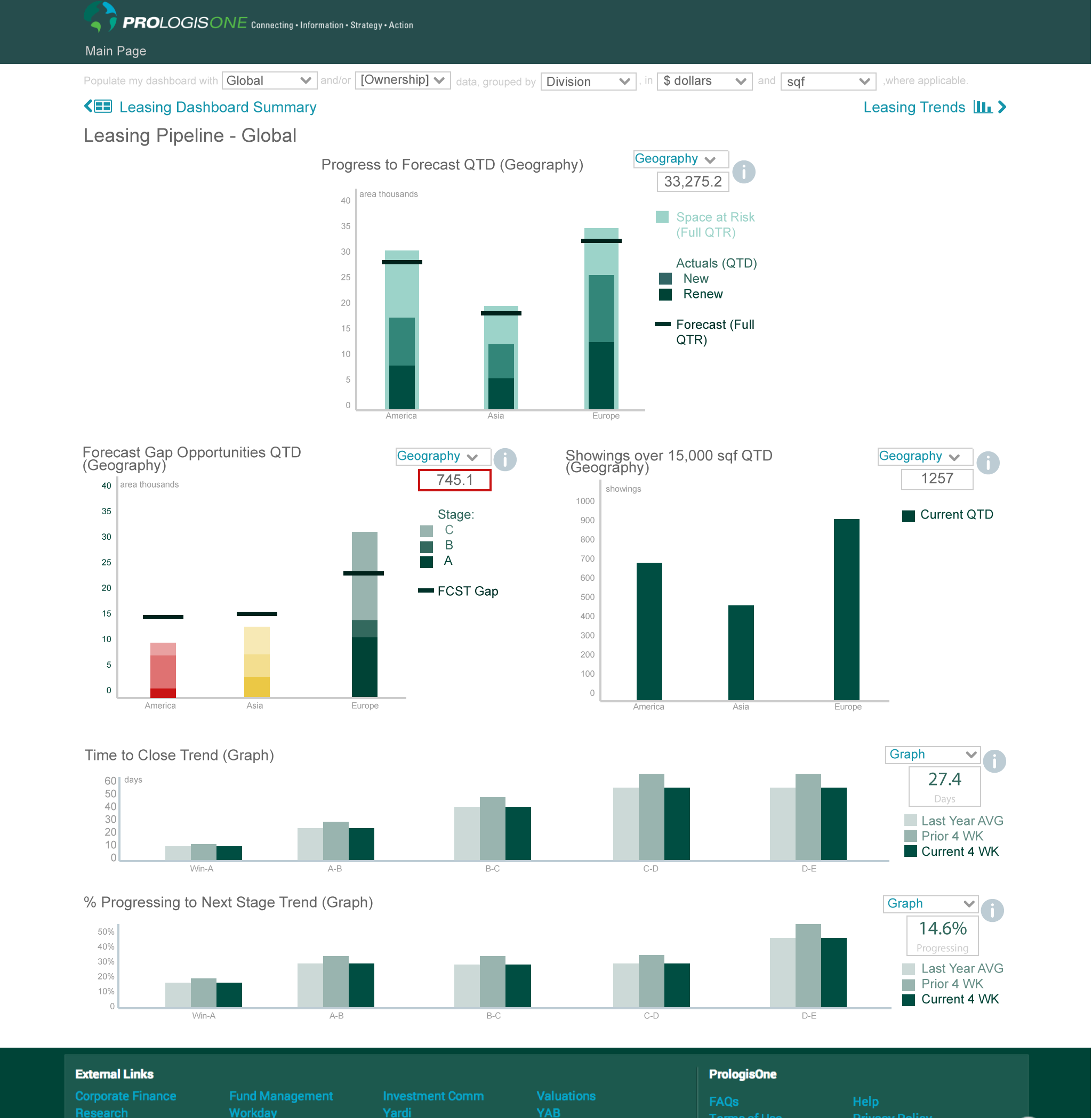
- Leasing
- Funds
- Customer (expanded to a responsive mobile app)

Hover over to scroll content
This internally-focused project involved:
STAGES
- User Research
- Product Strategy
- Dashboard Research
- Sitemap, Data Mapping
- Personas & User Journeys
- Flow, Concept, and Process Mapping
- Information Architecture
- Conceptual Illustration
- Iterative Wireframes
- Prototype (interactive)
- Final Visuals
- Prioritized Roadmap
- Development – user stories, etc
- User Testing (validation)
- Multiple Presentations to Stakeholders
TOOLS
- User Research/ Interviews
- pattern library (created)
- Illustration
- Illustrator/Photoshop
- Sketch App
- Annotated Wireframes
- InVision App (Interactive Prototype)
- Lookback (user research screen recording)
- LucidCharts
- PowerPoint
- Trello (project management)
- JIRA (development)
CONTRIBUTIONS
(as in-house Director of Internal Digital Strategy/ Product Designer)
- UX/Product Strategy: Skye Sant, Rachael McClellan, Julie Thiessen
- BA: Guthrie Boone, Charlene Kurth, Julie Thiessen
- User Research: Skye Sant, P1 Design Teams
- Illustration: Skye Sant
- Interaction Design: Skye Sant, Shawn Jenkins, P1 Design Teams
- UI Design: Skye Sant, P1 Design Teams
- Visual Design: Skye Sant, Shawn Jenkins, P1 Design Teams
- Product Owner (user champion): Rachael McClellan
BACKGROUND:
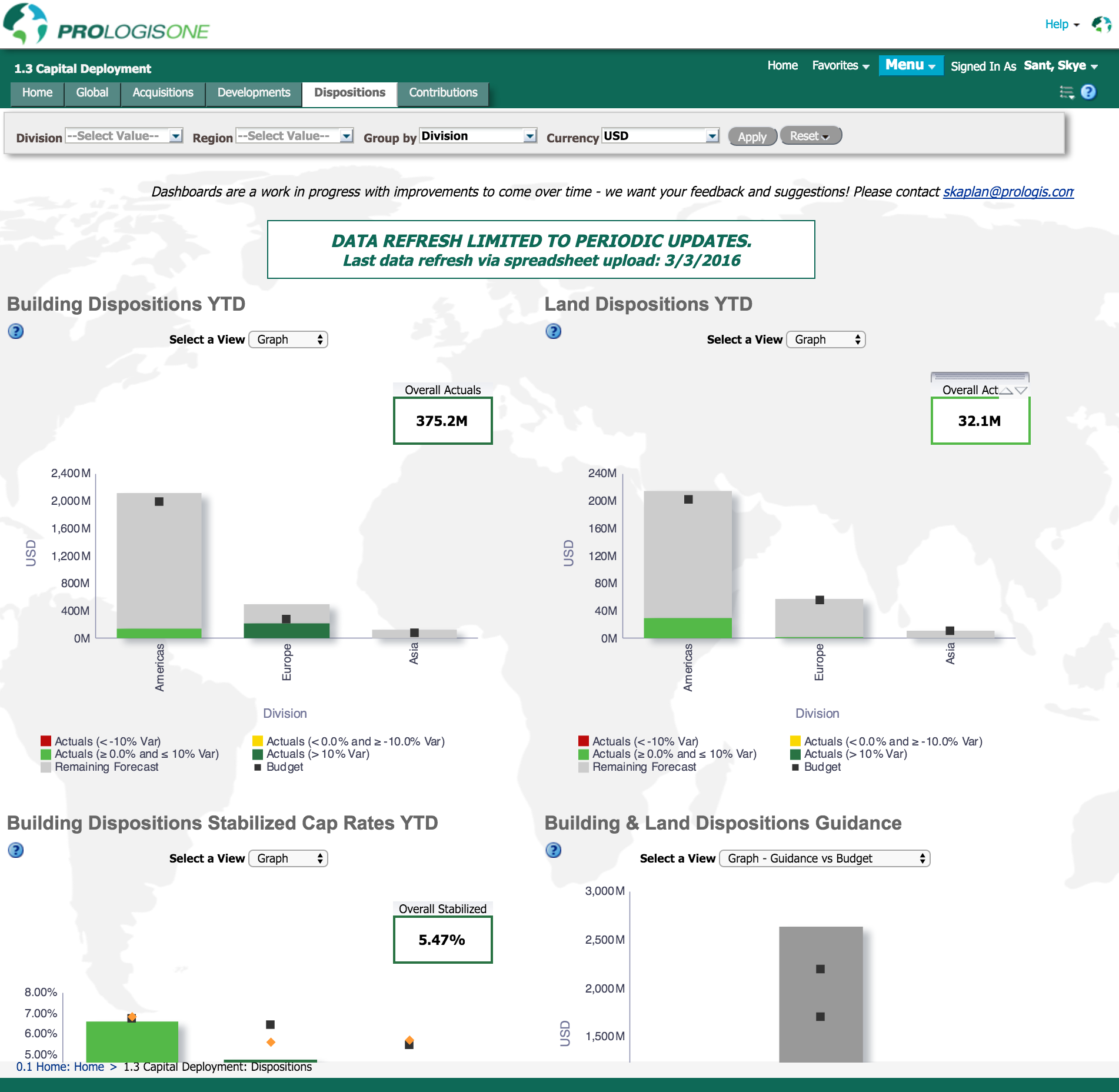
Prior to these modern online dashboards, Prologis was running their business using raw data, antiquated or hard-to-query systems or manual manipulation of spreadsheets. With data out of context or incomplete, it was difficult for the executives or the field to know what was happening at any given time, let alone make strategic decisions. With tons of raw data and a business whose core accelerator is real-time relevant information, Prologis was a perfect candidate for a modern, usable dashboard project: PrologisOne
This was of such obvious value that the initial ‘executive dashboard’ quickly expanded into 5 component projects, each sponsored by its own business leader from a relevant department inside the company. The dashboard made possible real-time strategic decisions – indeed, even facilitated predictive options.