SYNOPSIS: ThinkTank (collaboration)
As Director of User Experience for ThinkTank, I designed and created ThinkTank’s first mobile app.
ThinkTank’s Collaboration-as-a-Service
This consumer-facing SaaS project involved:
STAGES
- User Research
- Product Strategy
- Mobile IxD research
- Concept Mapping
- Information Architecture
- Conceptual Illustration
- Iterative wireframes
- Prototype
- Final Visuals
- Development – user stories, etc
- Multiple Presentations to Stakeholders
TOOLS
- User Research/ Interviews
- iOS/ Android HIGs
- pattern library (created)
- Illustrator/Photoshop
- Annotated Wireframes
- PowerPoint
- Balsalmiq (Interactive Wireframe tool)
- JIRA (development)
CONTRIBUTIONS
(as in-house Director of UX Strategy)
- UX Strategy: Skye Sant
- BA/ Market Research: Justin MacLean and Mart Lume
- User Research: Skye Sant
- IxD: Skye Sant
- UI Design: Skye Sant
- Visual Design: Travis Allison
- Gamification: Skye Sant
BACKGROUND:
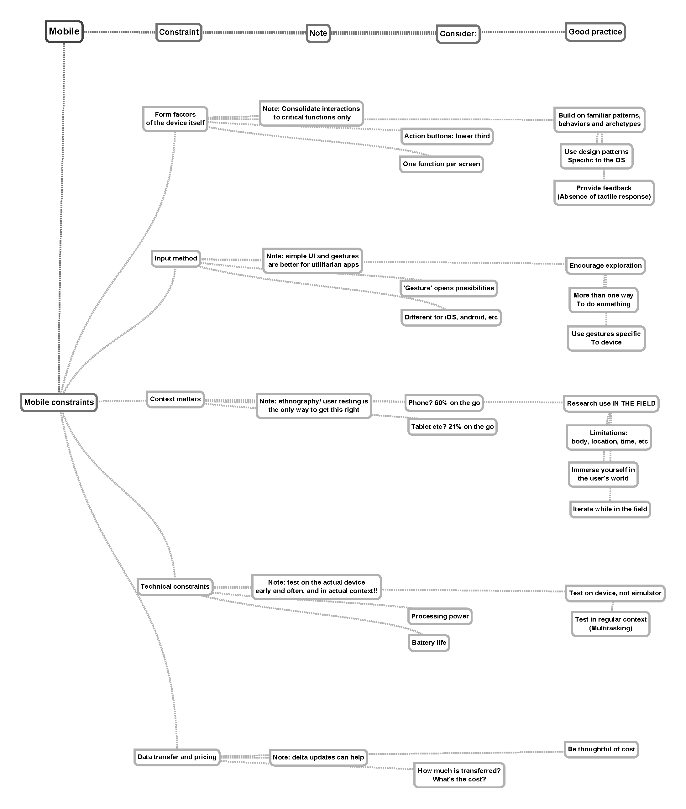
This app was specifically designed for a platform rooted in complexity – servicing a global audience, processing huge amounts of data in real-time & being used concurrently on mobile and cloud-based desktop platforms.
LIMITATIONS:
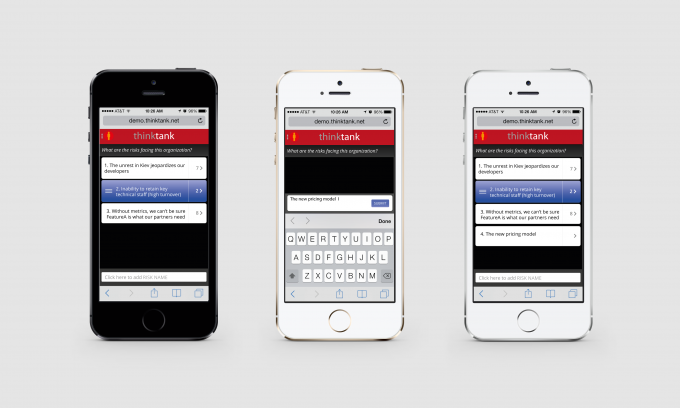
Because of time and money constraints, we could not create two separate native apps. So instead I designed a hybrid of responsive design and clever programming to mimic the look and feel of a modern app.
The desktop platform had a huge UX debt and we were slowly bringing it up to modern visual design and interaction standards. So though the mobile app needed to be coherent with the feel of the desktop platform, the company actually pivoted around and became ‘mobile first’, giving the app a place of enormous importance.
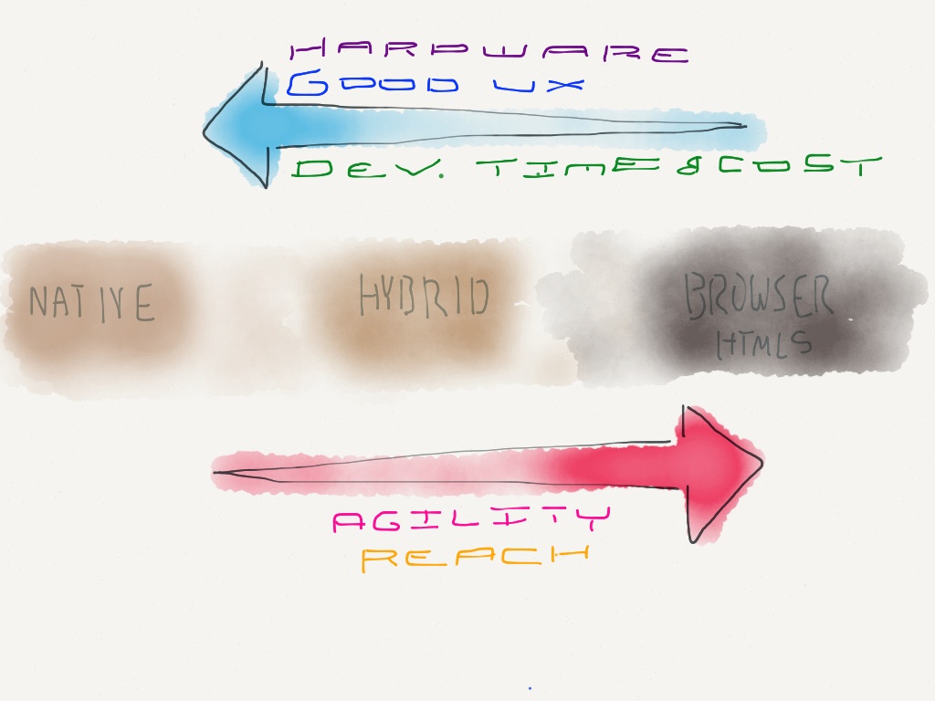
Tradeoffs 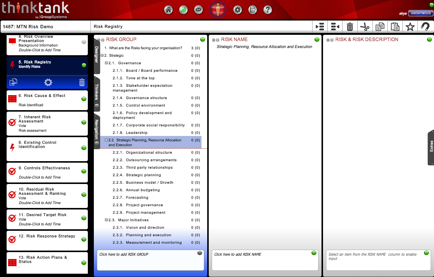
Original ThinkTank (desktop) 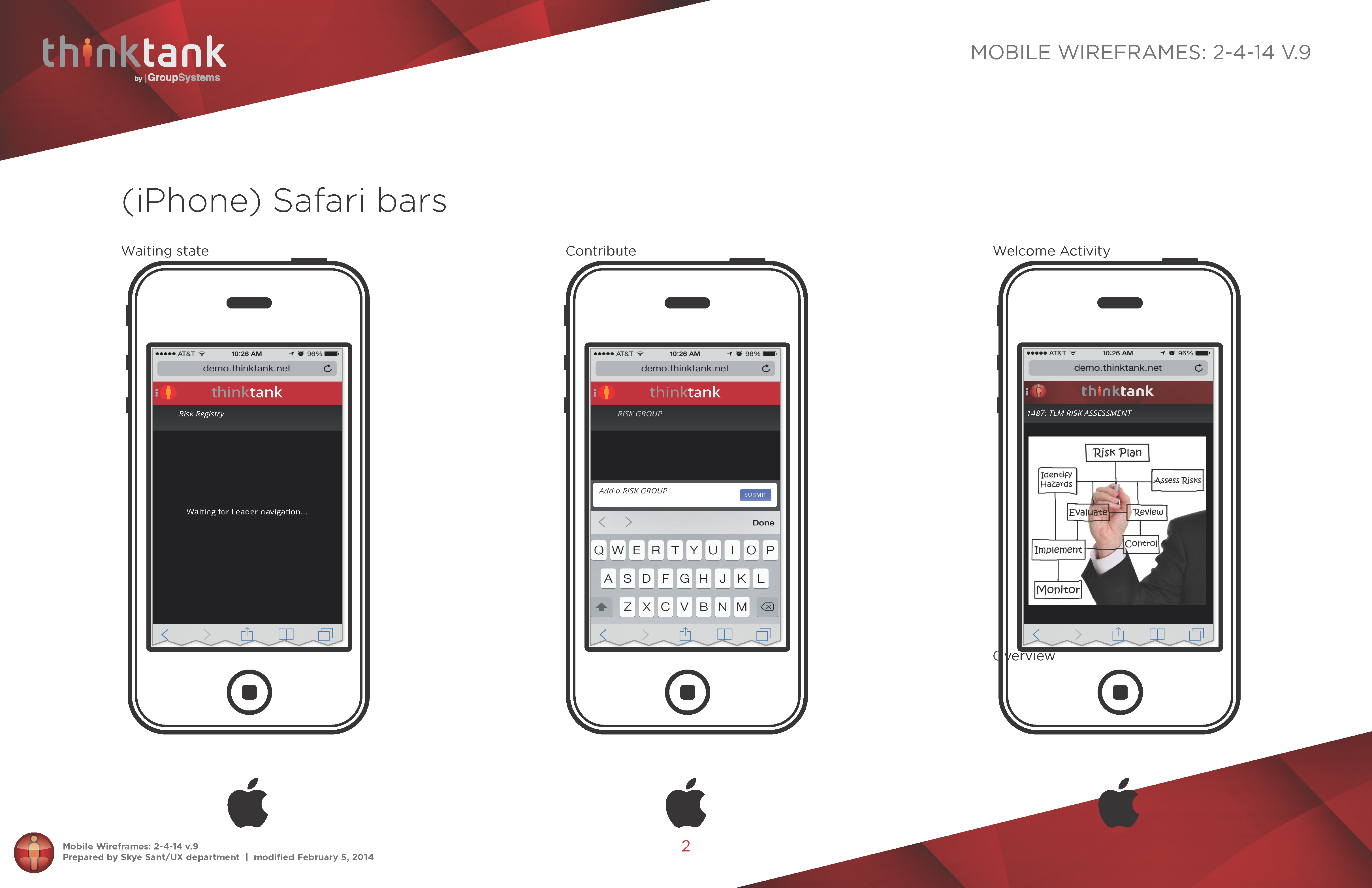
Screenshots
RESEARCH:
First, I researched the best practices in modern mobile interaction design
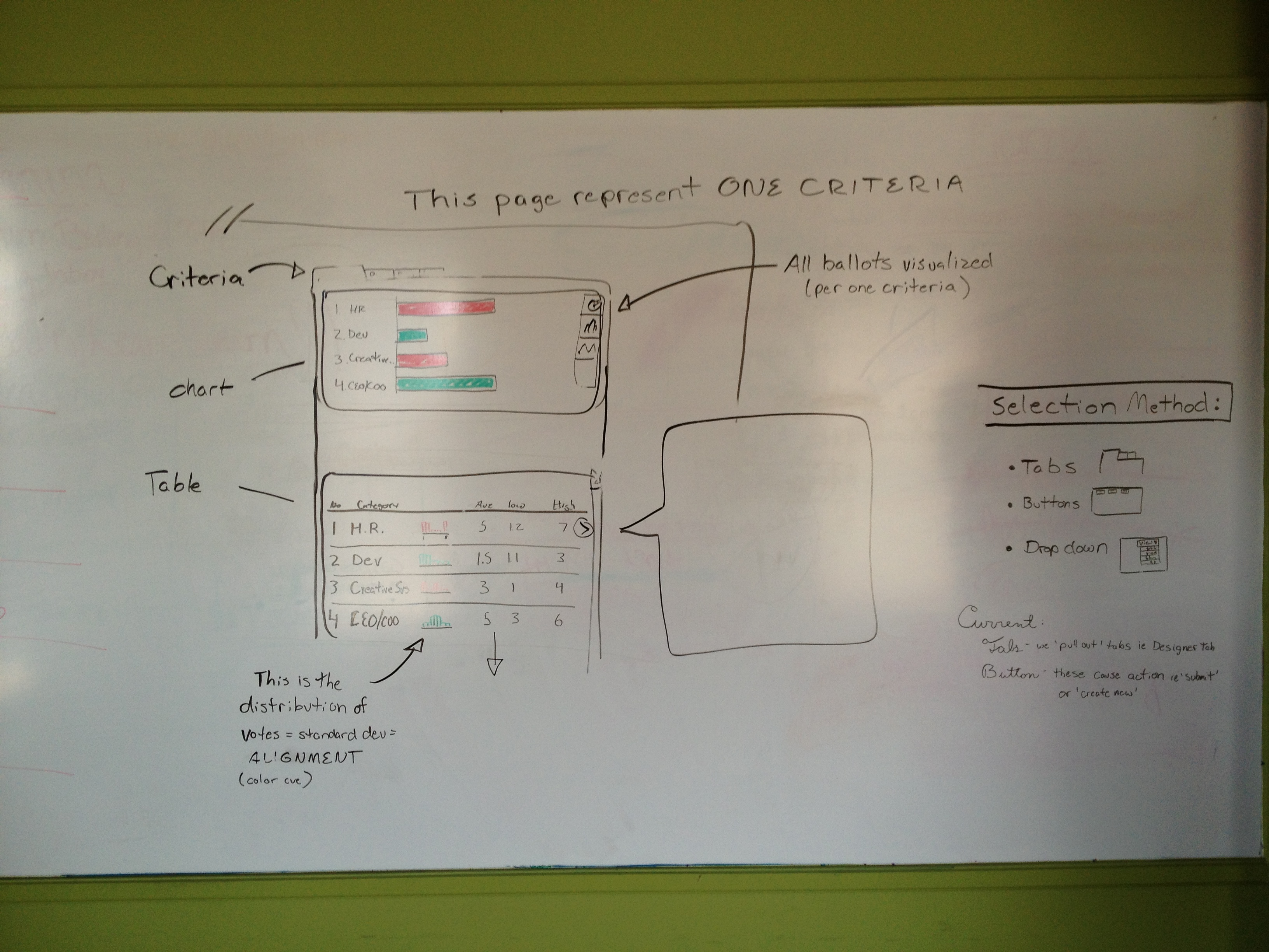
Whiteboarding interaction 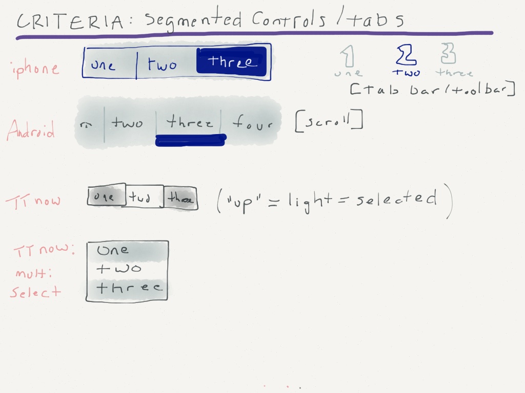
Patterns 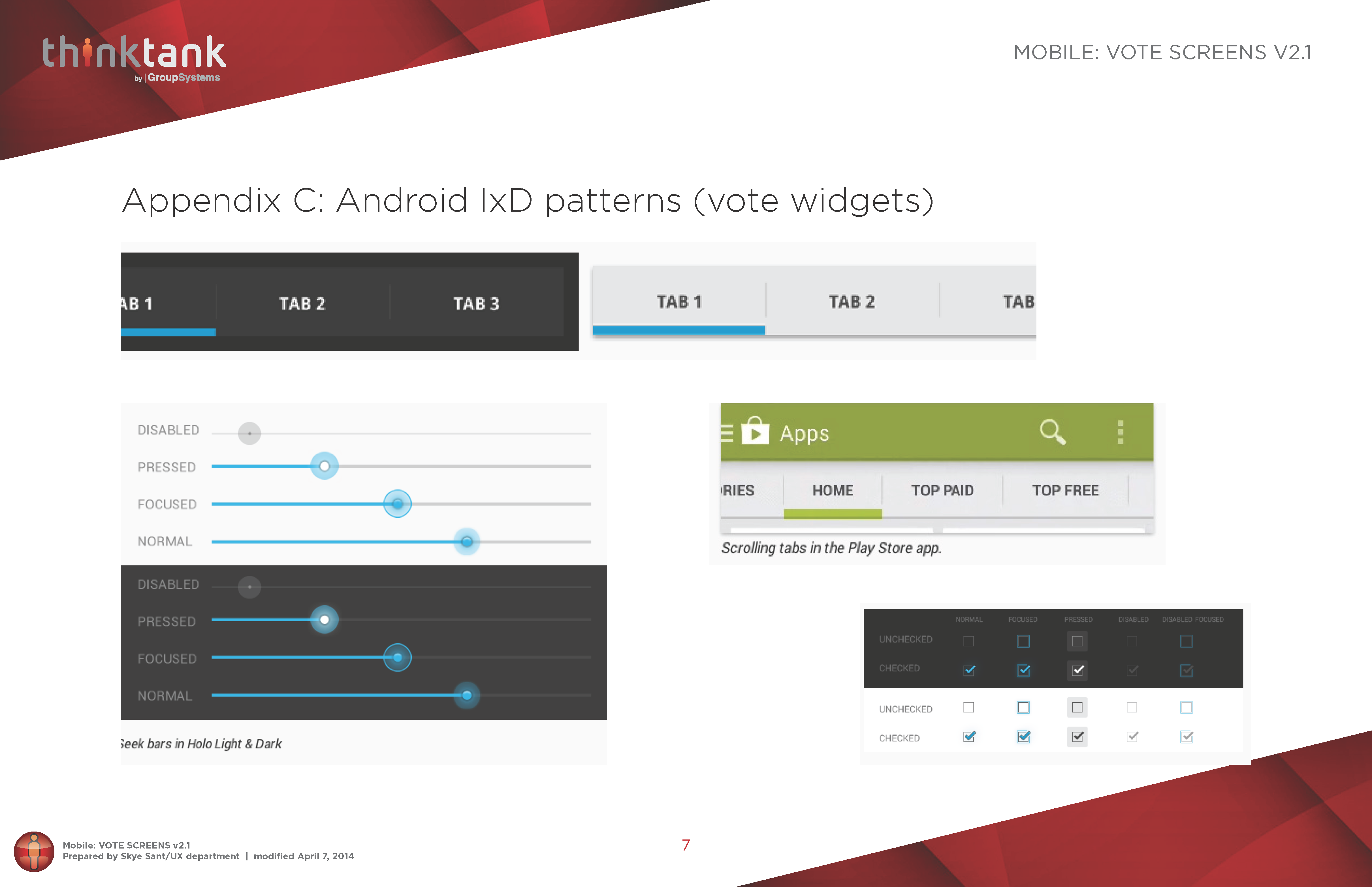
More patterns
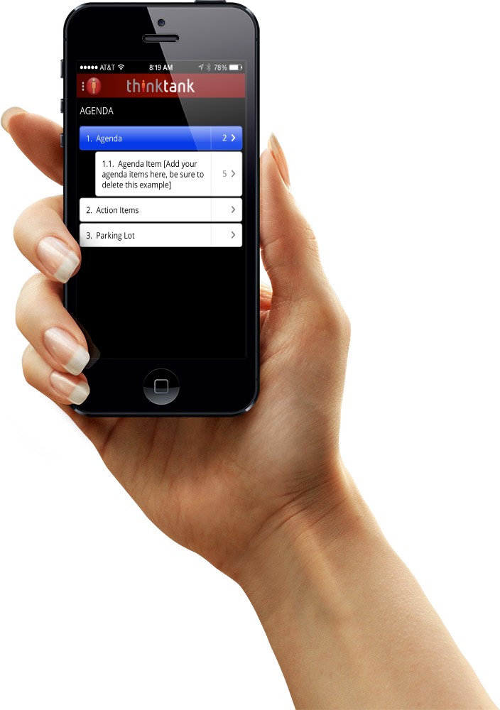
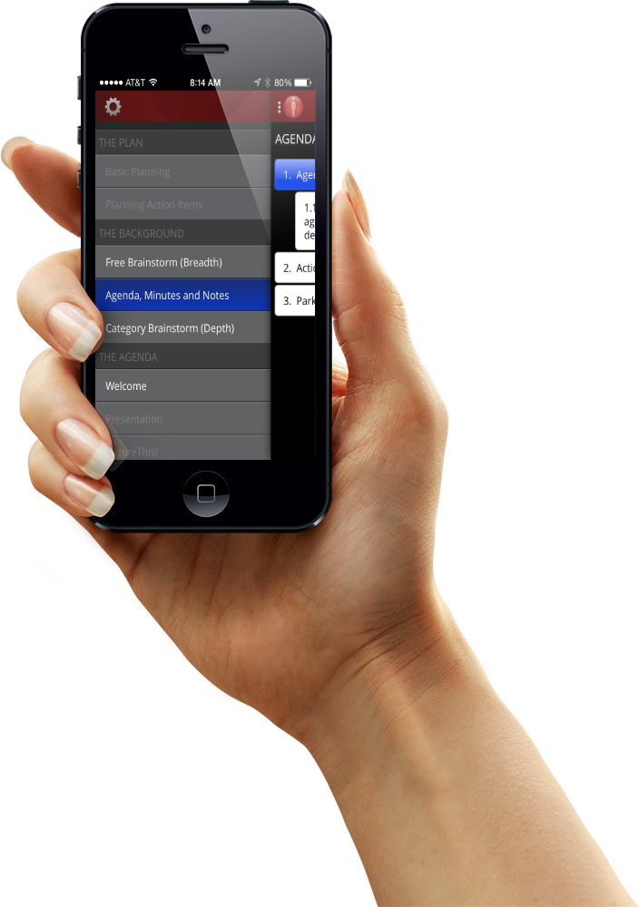
INFORMATION ARCHITECTURE:
The structure underlying the app is crucial – we took the time to make this robust enough to scale but limited enough to be coherent.
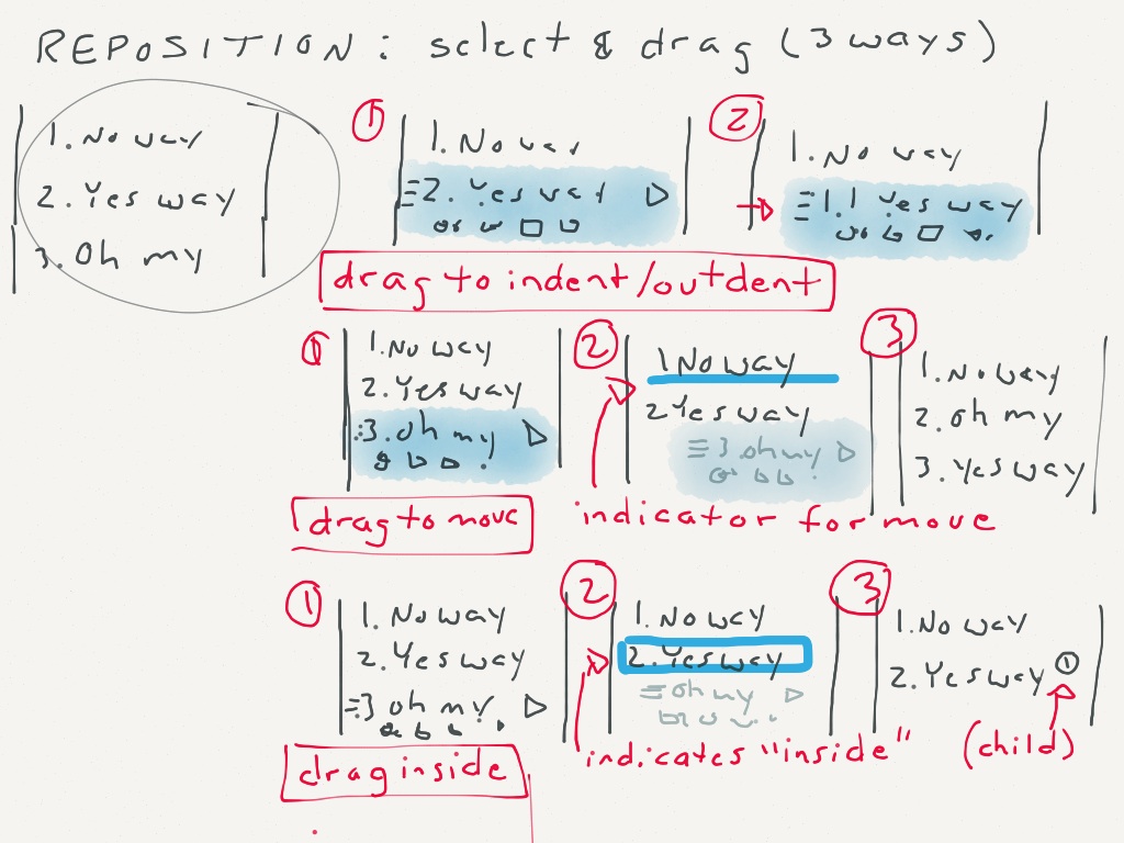
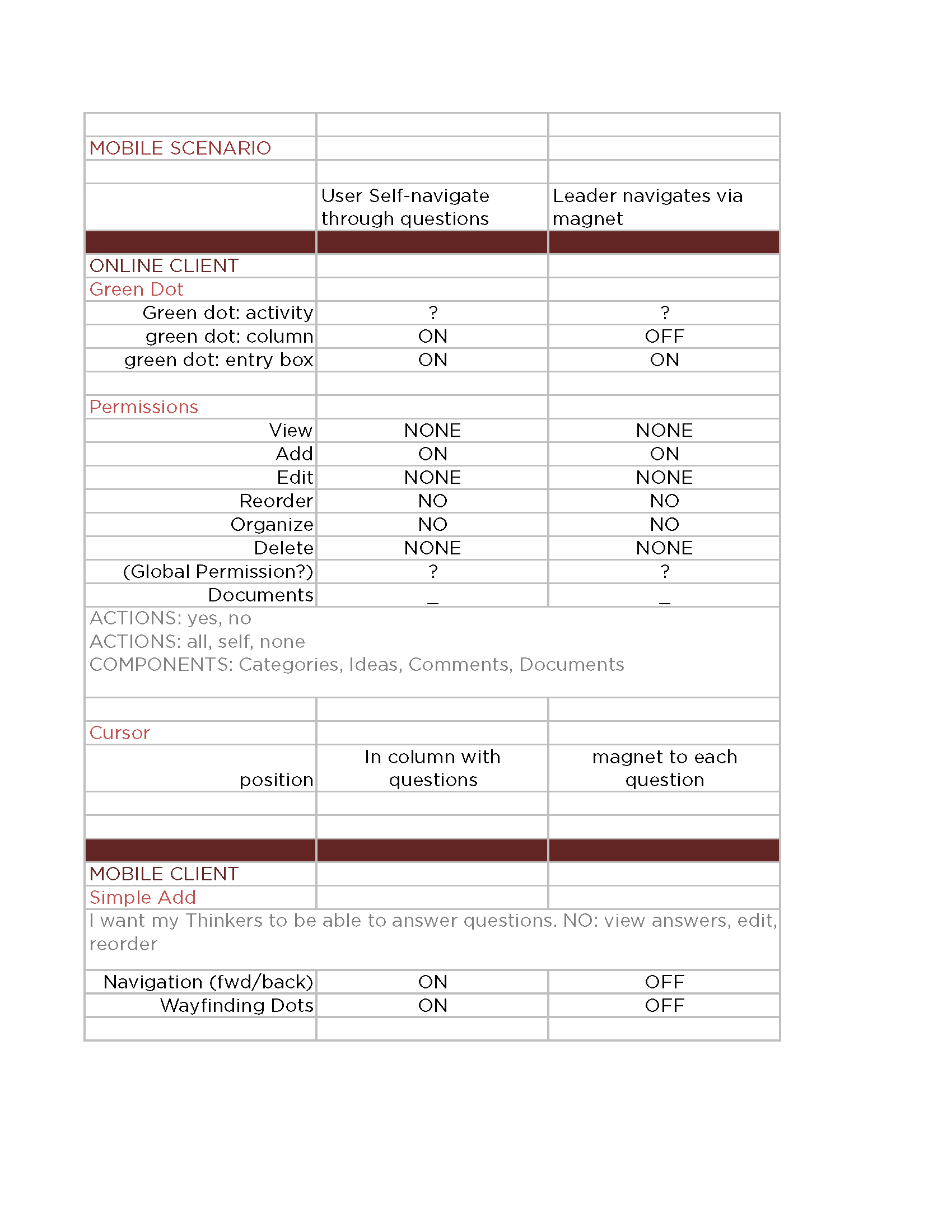
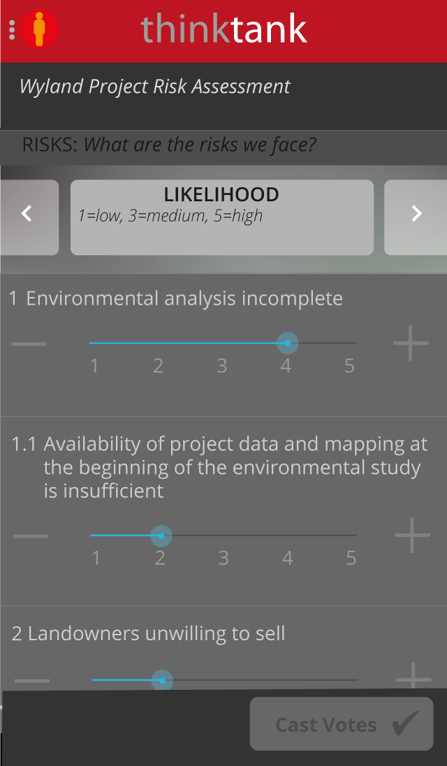
First I mocked up an interactive prototype to validate the screen flow of the training tool with users.
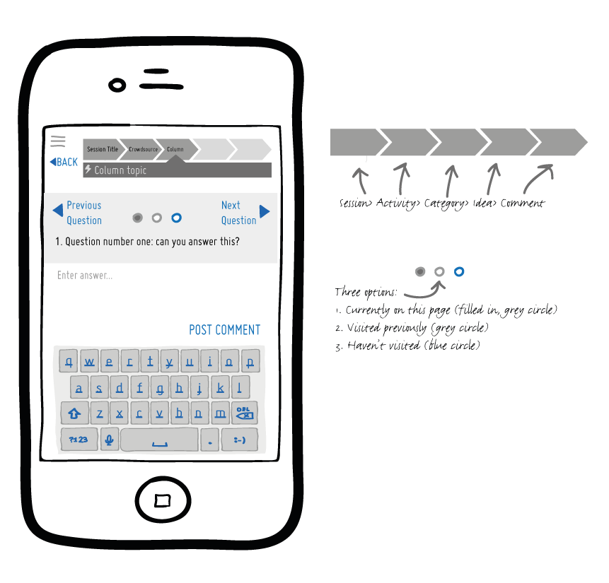
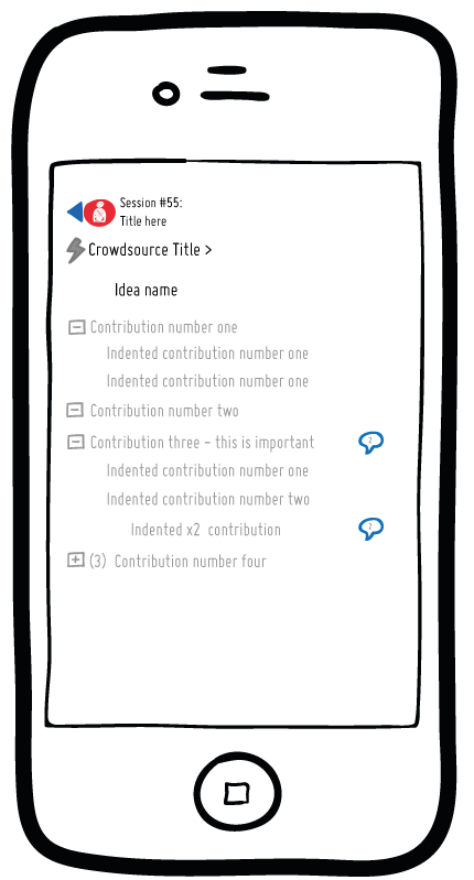
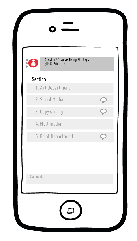
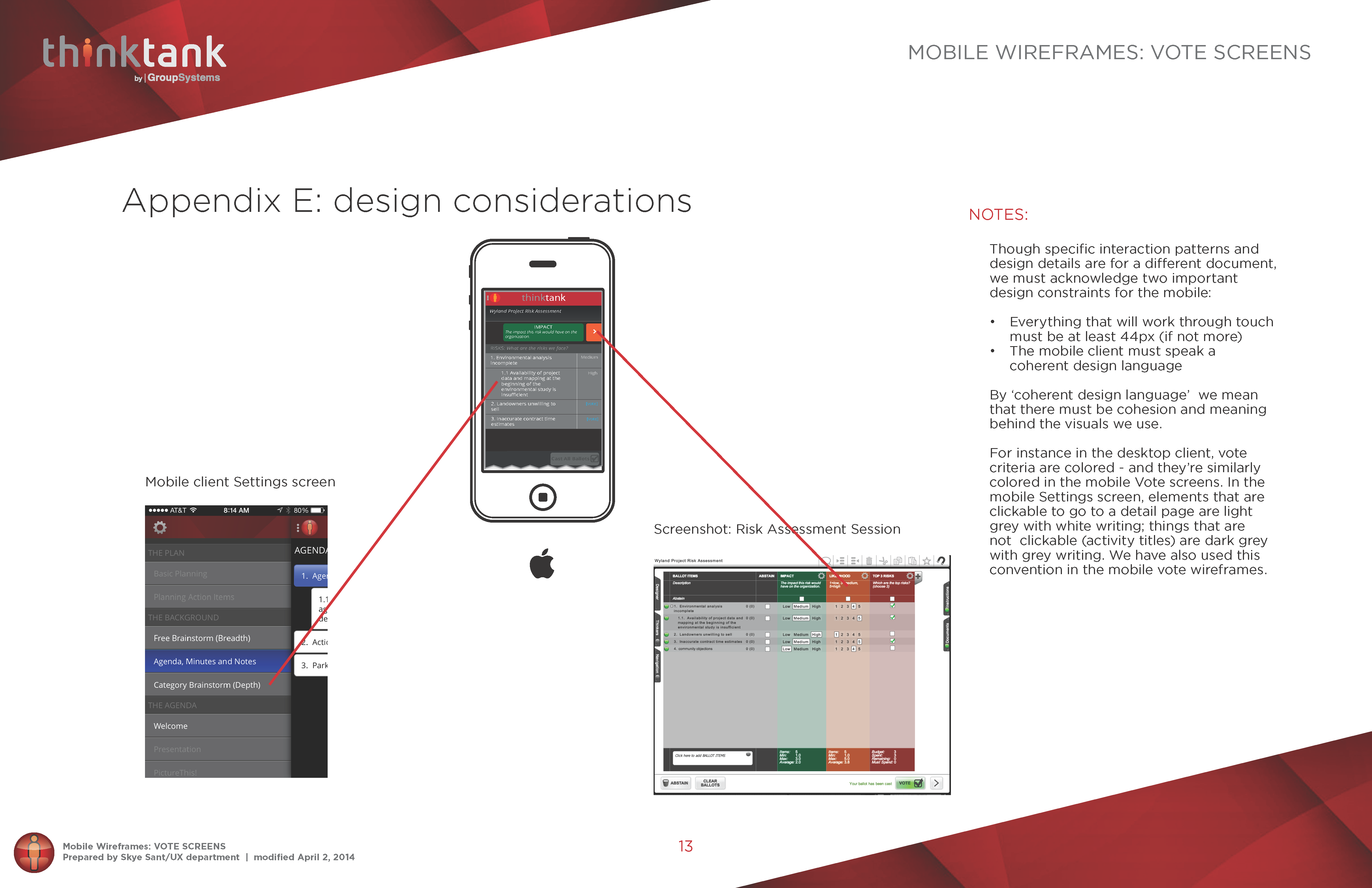
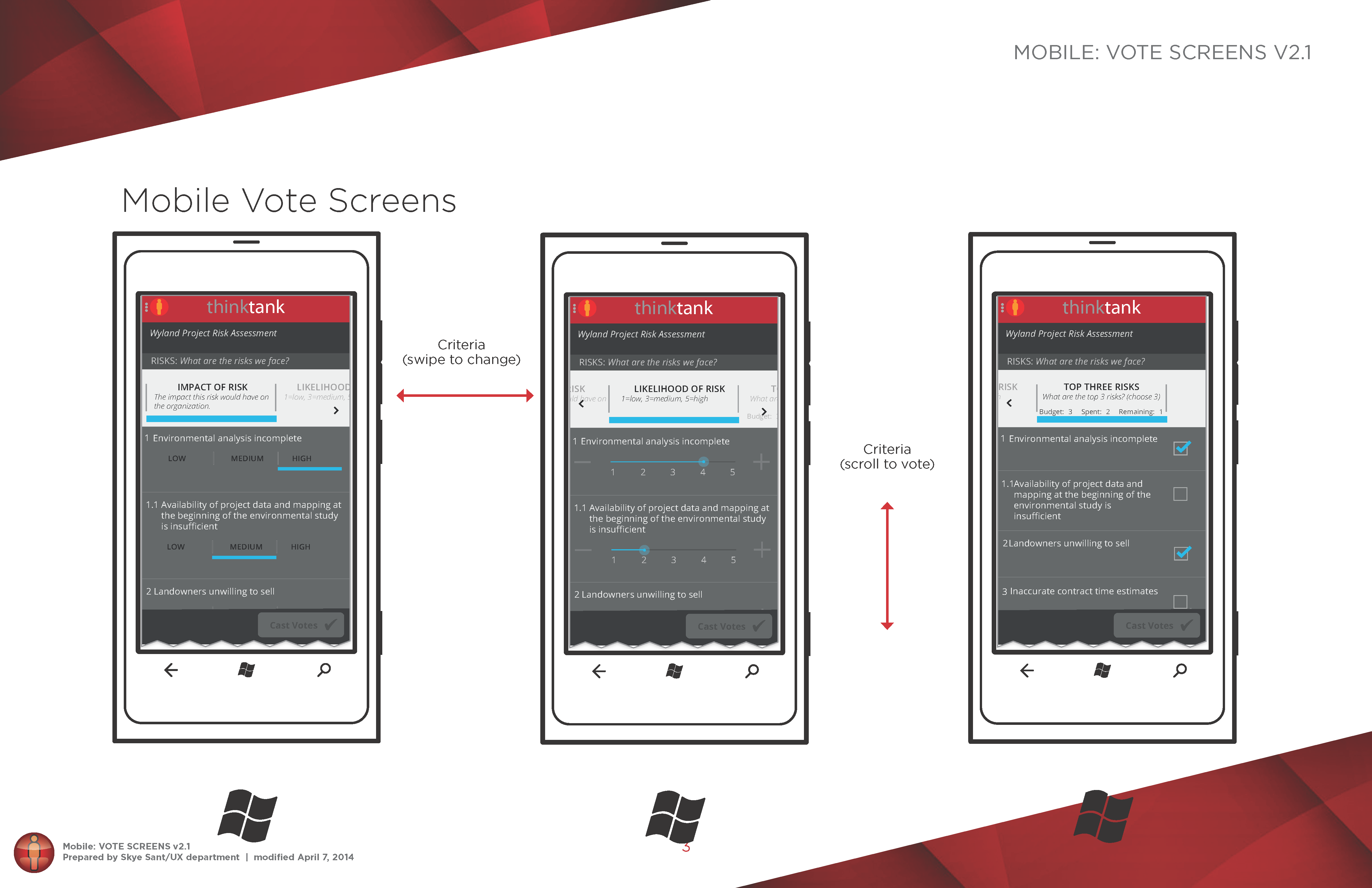
Next I expanded on this prototype in Illustrator to create the full wireframes, and then annotated the wireframes in order to include important information on the interactions for the developers.
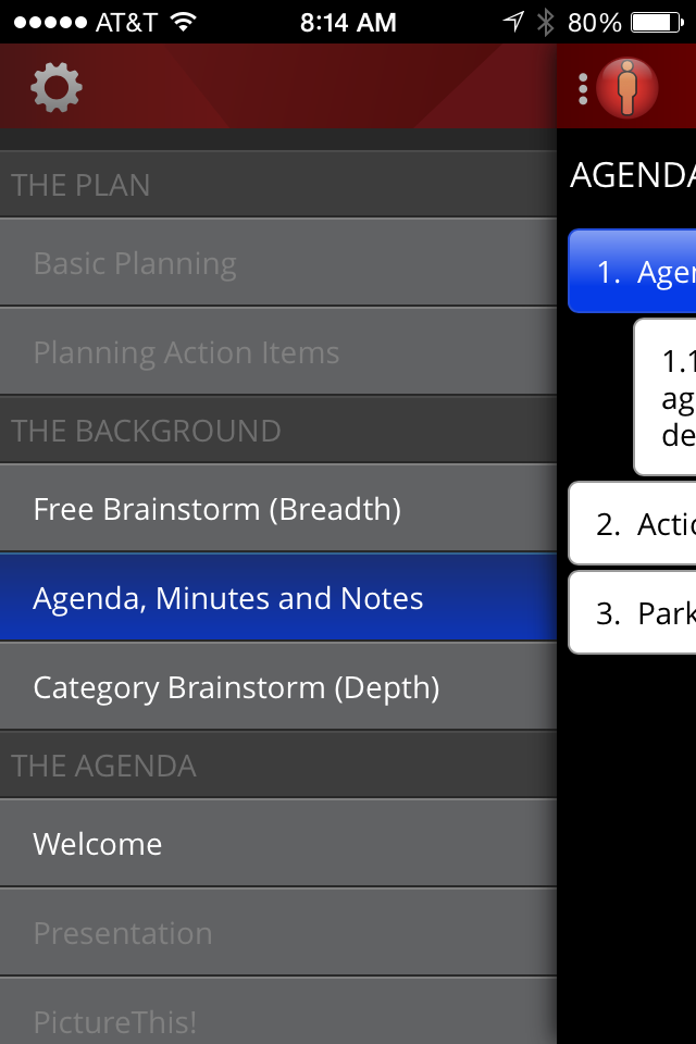
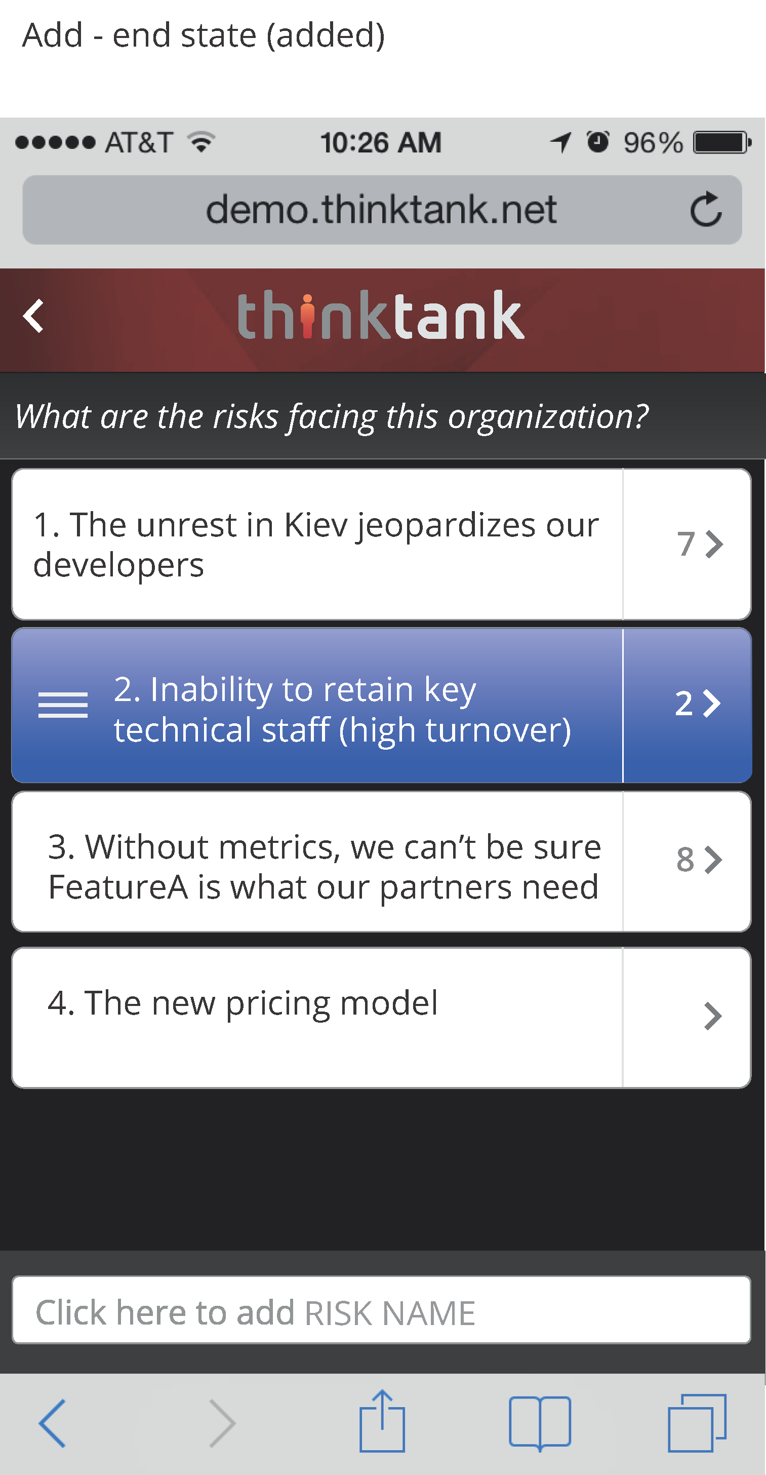
Each of these design documents went through multiple iterations with users and stakeholders all the way up to the CEO.

The development team lived and worked in Lviv, Ukraine. They stayed up late and I got up early so we could all touch bases – and then I worked while they slept, and they got up and programmed while I slept. It was very quick and Agile, indeed!