

I turned a Home Page Redesign into the shared vision and strategy for five product surfaces
Goal: Create a vision and the strategy that results in a coherent, focused experience across a multi-sided SaaS platform
Task: I turned a doomed “Home Page Redesign” project into a shared North Star vision 5 divisions co-created, which funded roadmap across 5+ product surfaces in ’25/’26/’27 and improved user engagement.
“Turns out – we’re shipping our org chart.
5 divisions are using the Home page as advertising space. And they’re not wrong, according to their own priorities – which are the only priorities the company has.”
– Root-cause analysis email to my boss
45% -> 84% Engaged
Clicked the most critical content immediately
+370% B2B Reach
More unique learners clicked assigned content
36.4% -> 55% Start
Platform content start rate (action on first click)
5 Divisions Created One North Star Vision:
We will deliver a focused and expertly tailored experience that guides learners to efficiently discover the most relevant content for their needs.”
Company Context:
The Pluralsight platform is a multi-sided enterprise Learning Platform.
- ~500,000 active learners
- ~$400M ARR
- Search API handling ~4.4M queries a month
- The discovery surfaces I owned reach 87% of learners
Project Summary:
- The Ask: redesign a cluttered home page.
- The Problem: 5 divisions using Home as advertising space; no purpose for the page
- The System Fix: a shared vision + strategy (prioritization framework)
- The Output: a clear, focused redesigned Home Page; shared vision
- The Outcomes: Engagement, Reach, Retention | Org alignment on vision & strategy across 5 shared product surfaces | 20/27 H1 2026 Roadmap Items
*Drag the center divider left or right to compare the before and after designs for the Home page
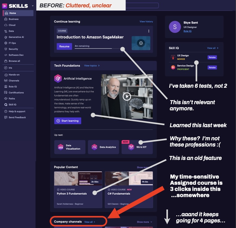
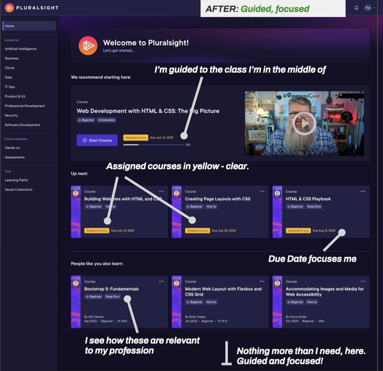
Problem: The cluttered Home page exposed five divisions competing for space and no shared purpose for the experience.
Operating Context: Third year of a turnaround. No added headcount, three org reductions behind me. Reported to the CPO. Partnering with five Division leaders and 6-12 delivery teams across engineering, design, and product management. A platform serving roughly 500,000 active learners, and a discovery surface reaching 87% of them.
“A product surface used by 5 divisions, like the Home page, needs a shared vision and purpose co-created by 5 divisions.”
– from my pitch to company leadership
Engagement & Retention Down
- Companies pay us to assure Learners do assigned content
- Learners can’t find their Assigned content
Cross-Division Company Conflict
- No shared purpose for Home
- 5 divisions competing for space
In the 3rd year of a turnaround, ‘page space’ seemed to my leader-partners to be a business win. It’s difficult to
- Convince leaders & teams to take the time to ALIGN before redesigning
- REMOVE content from a page
- Push an approved 1 sprint activity to a 3 sprint activity
- And above all, gather 5 division leaders into one room for 2 whole dedicated days
Home page chaos was the symptom – the fix was to align the business to the purpose of the shared product area. Aligning that goal with each division’s already existing OKRs and getting full buy in for this made me a great leader for this job.
A Home Page redesign that didn’t solve the root issue would have been a failure.
Playbook: I brought five divisions together to define one vision, turned it into decision criteria, and validated the riskiest assumptions before rollout.
What I Did
- Vision Workshop (2 days, 5 division leaders + Executive team)
- Strategy: easily applicable ‘Criticality’ framework (so the tactical teams could apply this vision). [case study coming soon]
- Home page redesign
- Lean UX/user validation testing
Before: cluttered and unclear
After: guided and focused
Tradeoffs: What came off the page, and who gave it up
- Assessment team. Pre/post test results moved to the Assessment landing page.
- Hands-On and Labs. Engineering course recommendations moved to Software Development.
- ML team. Recommendations capped at the top 3 to 5 per learner.
- All five Divisions.
- Feature advertising moved to each content type’s own landing page.
- New information architecture for Navigation, Home, (Content) Landing Pages
Before
- A cluttered home page, with every content type everywhere.
- Assigned Content (what companies pay us for) is obscured.
- Company in conflict
North Star Vision
- Focused
- Expertly Tailored
- Guided
- Efficient
- Relevant
- Prioritized
After
- Learners see the most relevant next action before reading a word.
- /Criticality/ drives the layout instead of content type.
- 5 divisions in alignment.
When removing content, it’s important to assure that the end result is more usable than when we started.
To assure that the vision and strategy (applied Criticality framework) would result in positive user experiences, we ran quick, few-day Lean UX user validation testing to test our top 3 riskiest assumptions.
Results: 6 of 6 task success, 6.8 of 7 ease, 66-second average completion – way better than the current Home page.
Results: The shared vision aligned five divisions, raised assigned-content click-through from 45% to 84%, and shaped 20 of 27 H1 2026 roadmap items.
Outputs:
5 Divisions aligned on a shared North Star
Home Page that's 'guided and focused'
I was made owner of the Home page
Outcomes:
Guided experience across 5 product surfaces
20/27 H1 2026 Roadmap items
I mean, I really wasn't a fan of taking time away from production to 'draw on the wall'...
But I gotta admit - in this company, I've never been working in a room with that many leaders, together.
And the results speak for themselves. ”
– E.L. , Senior Content Operations Leader
UX Outcomes: Life Improved*
Our platform is complex and multi-sided. With 6+ personas, it was important that we improved the lives of all of them, be they internal colleagues or external clients. *Thanks to Jared Spool for the UX Outcome Hypothesis model
- By making /criticality/ drive the page instead of content type, we improved the enterprise B2B learner’s life (and every other learner persona) by replacing a scan of forty options with one obvious next action.
- By surfacing assigned work at the top of Home, we improved the enterprise B2B admin’s life by making assigned learning easy to start (without chasing their teams to do it).
- By publishing one shared criteria for what belongs on Home, we improved our company’s experience by giving every team a defensible answer to “why isn’t my widget here?” that they could apply inside their own planning.
Current Status (a/o Q4 2026)
- “Guided and Focused” is the current experience principle governing Home, Search, Browse, Recommendations, and Navigation
- Rolled out to active users (results as noted)
- Changes/ improvements receiving roadmap investment across 5+ divisions for 2025 & 2026 (est 2027)
I build senior capability by handing people the work one level above them, with cover, using my own projects. This way, they get to work directly with me, division leaders and the executive team on something that matters to the business.
- A junior designer co-facilitated the design sprint with me, so facilitation became a capability for her and her team.
- A manager on my team carried this vision and the Home redesign at board level and was later promoted to Director.
Lesson: Announcing a strategy is not enablement, so I built the decision criteria into the processes teams already used.
What did I get wrong here, and where did I fix it?
Mistake: Team meetings & All-Hands is not enablement
In a rush, I treated the enablement – helping teams understand how to apply the vision and strategy inside their own product areas – as communication. I announced the vision at a Product All Hands…
…but teams who weren’t in the room didn’t have what they needed to apply the vision to their own areas, so I had a lot of 1:1 meetings to redirect the teams working on our shared surfaces.
Not a good use of anyone’s time, and far too reactive for teams moving fast.
The Fix: Build the strategy into existing processes
On the next project, B2B Analytics Page, I announced the vision, the framework, and then built it into the documents and rituals where decisions already happen. This looked like:
- Eisenhower matrix in the default Discovery doc
- A checkbox in roadmap intake.
- A qualifying question asked of every feature in quarterly planning.
Teams had the guardrails in their own workflow (not a slide, ha!). Roadmap proposals came in already framed by the vision & strategy, even before design was formally involved.
Project Information
Shaping Vision and Strategy Across the Org
-
Design
Done Q1 2025 over 3 sprints (6 weeks)
-
Client
Pluralsight. B2B SaaS, EdTech. ~ 1,900 employees.
PE-backed, in stabilization. -
My Role Then
Director, UX Product Design and Research, Learning Experience. Reported to the CPO.
-
Scope & Span
Search, Browse, Home, Navigation, Recommendations. Discovery surfaces reach 80% of platform users.
-
Team & Reach
15-person org (2 managers). Aligned 5 Divisions at the leadership level and 6+ delivery teams (engineering, design, & PM).
-
Platform Type
B2B SaaS, multi-sided (Enterprise admin, individual learner, internal authoring)
-
Status (a/o Q4 '26)
In production at www.pluralsight.com; roadmap investment across 5+ divisions for 2025 & 2026 (est 2027)
-
Tags
Cross-Org Alignment, Decision Frameworks, Platform Coherence, Vision